01
Source / design
Is the useful information already weak, blurred, low-separation, or too dependent on similar tones?


Troubleshooting
Find where stencil lines first become faint or disappear, from the source file and final size to printing and paper-to-skin transfer.
tattoo stencil too light · faint tattoo stencil · disappearing stencil lines · stencil troubleshooting
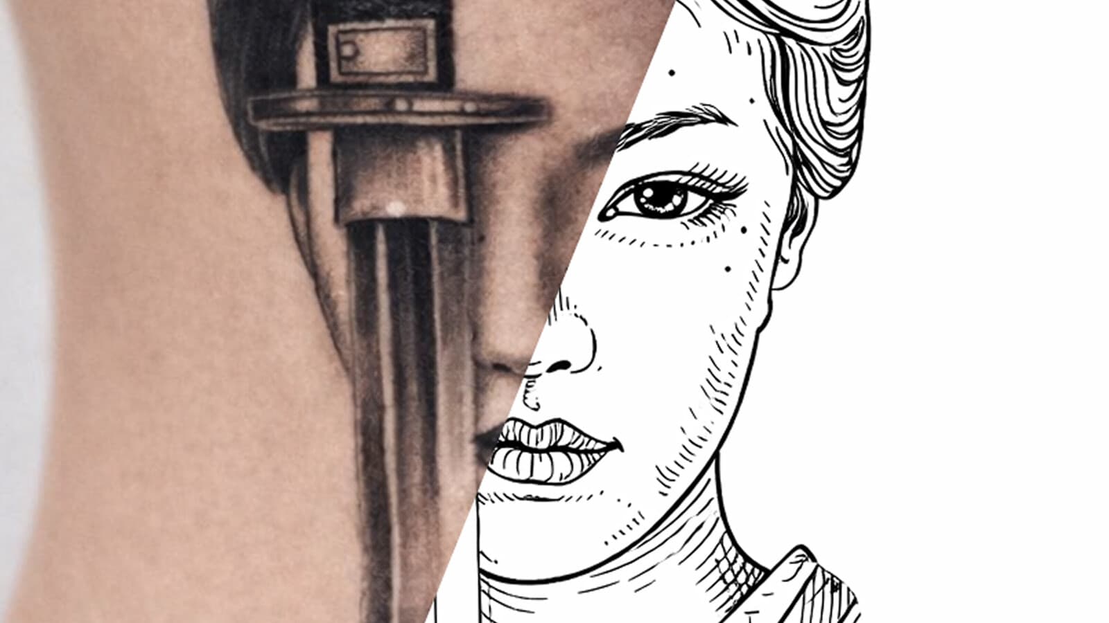
Loss-of-information triage
Keep the same small region in view and compare it across the workflow. The first checkpoint where a mark weakens, breaks, or disappears tells you which stage to inspect first. It does not prove one specific cause.
A
The loss exists before printing. Inspect the source and finished stencil file first.
Start upstreamB
Treat final physical size as part of the geometry. Fine marks may stop surviving the reduction.
Check final sizeC
The first visible loss happens during reproduction. Keep the file fixed and inspect the print stage.
Check print stageD
Use the paper stencil as the control. The first change appears downstream in the transfer stage.
Check transfer stageE
Compare the exact missing geometry at final size. A local reproduction limit is different from a globally faint stencil.
Check fine geometryFive-stage loss map
01
Is the useful information already weak, blurred, low-separation, or too dependent on similar tones?
02
Did conversion, gray edges, opacity, raster size, export, or resampling weaken marks that should carry structure?
03
Do marks that are clear while enlarged become too small or visually weak at the intended physical dimensions?
04
Does a clean digital file become faint, broken, or incomplete only on paper?
05
Does a strong complete paper stencil become weak or incomplete only after the paper-to-skin step?
Quick diagnostic map
Zoom can hide the real limit
A very fine mark can be present and obvious at 300-500% zoom while becoming marginal at the intended physical size. Judge the actual target size before assuming the printer removed information.
Viewed enlarged
All three marks can look obvious when the canvas is enlarged.
Judge at intended size
Conceptual only, not a universal line-width threshold. The point is that visible pixels at high zoom do not guarantee reliable physical reproduction at the chosen size.
Contrast cannot invent structure
If an eye contour, muzzle edge, lettering counter, or texture cue is absent in the source or file, a stronger global contrast move can harden what remains without recreating the missing shape.
Weak but present
The shape exists. Contrast or line-strength decisions may change how clearly it reads.
Information missing
Making remaining pixels darker cannot reconstruct a contour, landmark, or texture that is no longer represented.
If a tattoo stencil looks too light, do not make everything darker immediately. First find where the line first becomes weak, broken, or missing.
The fastest check is the same design through four stages:
If the mark is already weak in the file, stay with the file. If it disappears only when the design is reduced, inspect size and line geometry. If the file is clear but the paper is faint, inspect printing. If the paper is strong and the skin transfer is weak, inspect transfer.
That one comparison prevents a lot of unnecessary darkening, reprinting, and reworking.
Use these routes before changing anything:
Also describe the symptom precisely:
Those are not the same failure.
If the important shape is already hard to distinguish in the source or finished stencil, printing cannot restore it.
Look at the exact feature that matters:
A file can be high resolution and still be weak. More pixels do not help if the important edge is blurred, hidden in shadow, or never captured clearly.
The reverse is also true: a modest-resolution file can carry a strong simple silhouette perfectly well.
If the problem starts in a client photo, use the Reference Photo Quality Checker or the photo-to-stencil preparation guide before changing printer settings.
Contrast can make an existing shape easier to see. It cannot recreate a feature that was never clear in the source.
A blurry portrait does not regain the correct eyelid because the dark pixels become darker. A pet marking that has merged into shadow does not become known just because contrast is stronger.
Protect the few marks that actually carry recognition before worrying about secondary texture.
A good source can still become a weak stencil after conversion or export.
Check the actual file that will be printed, not only the original artwork or generation preview.
Look for:
A stencil does not need to be pure black and white. Lighter or selective guidance can be intentional. The question is whether the marks you actually need remain clear enough for the next stage.
Use the Tattoo Stencil Print Checker when you want to inspect the finished file at its intended physical width for fine geometry, weak regions, dense areas, and page fit.
One of the strongest clues is simple:
Does the line look fine when enlarged but disappear when the design is reduced?
As the stencil gets smaller:
Do not judge final-size readability from a 400% preview.
Set the real dimensions with the Tattoo Stencil Size & Print Calculator, then inspect the smallest important strokes and gaps at 1:1 scale.
If the information is right but the surviving marks are too fine, compare the choices in the Tattoo Stencil Line Weight Guide. If the stencil simply contains too much information for the chosen size, use the final-size detail diagnostic.
With lettering, check more than the outer stroke:
The lettering size and readability guide covers that problem in more depth.
When the exact finished file is clear at the intended size but the paper output becomes faint, broken, or incomplete, the first visible failure is now in the print path.
Keep the artwork fixed while you compare screen and paper.
Faint: the expected line is there but weak.
Missing: part of the line or mark does not appear at all.
Broken: a continuous digital line becomes intermittent on paper.
A whole sheet becoming faint is different from only tiny strokes disappearing. A repeated failure in one physical band of the printer is different again.
If the paper stencil is recognizable but generally weak, use the focused tattoo stencil printer faint-lines guide.
Use the Tattoo Stencil Printer Troubleshooter when the failure clearly appears between screen and paper. The Tattoo Stencil Printer Test Sheet can provide known, fixed geometry to compare without changing the client artwork.
When a loading method, paper preparation step, density setting, maintenance action, or feed behavior is specific to a printer or paper product, follow the current instructions for that exact system rather than applying one universal setting.
If the printed stencil is strong and complete but the transferred result becomes weak or incomplete, do not keep darkening the digital file or changing the printer first.
Compare the same area on paper and skin:
At that point use the Tattoo Stencil Transfer Troubleshooter, which keeps transfer-specific checks separate from file and printing issues.
This guide does not prescribe one universal skin-preparation method, product amount, contact time, or set time. Follow the current instructions for the transfer product and paper system you actually use.
This split is especially useful.
Check whether the weakness is global at the first failing stage:
Inspect those same coordinates through each stage.
Are the disappearing marks only:
Do not make the entire stencil heavier just to rescue a few fragile marks. That can close already-good gaps and flatten the visual hierarchy.
A pale but continuous line is different from a dotted or interrupted line.
For a broken line, check in order:
The first point where continuity changes tells you where to investigate next.
Choose one mark that matters and follow it through the workflow:
Do not switch to an easier region halfway through the test.
If the mark changes before paper, stay with file or size. If it changes on paper, stay with printing. If paper is good and skin changes, stay with transfer.
This is more useful than asking whether the final stencil is simply "dark enough."
Do not change physical size, line weight, paper, printer settings, and transfer method in one attempt.
If the result improves after five changes, you still do not know which change fixed it.
Keep the file and size fixed first. Compare screen with paper. If paper is the first mismatch, change one print-related variable according to the correct product instructions. If paper is clean, compare paper with transfer and change only the transfer variable you are testing.
The goal is practical: avoid solving a file problem with transfer changes, or a transfer problem by making the whole stencil darker.
Not every useful stencil needs maximum darkness everywhere.
Secondary texture can be lighter than the structural map. Fine guidance can carry less visual weight than the silhouette or major landmarks.
The real question is:
Can you still read the information you need at the size and stage where you need it?
If yes, a visually light stencil is not automatically a failure. If important placement, lettering, or recognition marks are disappearing, find the first stage where they stop being readable.
Weak client reference: use the Reference Photo Quality Checker or photo preparation guide.
Finished stencil file looks fragile: use the Print Checker at the intended physical width.
Looks fine large but loses detail when reduced: set the real size with Size & Print, then inspect line weight, gaps, and detail density.
Good file, faint or incomplete paper: use the Printer Troubleshooter, plus the Printer Test Sheet when a fixed comparison helps.
Good paper, weak skin transfer: use the Transfer Troubleshooter.
"Too light" describes what you see at the end. The first place an important mark becomes faint, broken, or missing tells you what to fix.
Related Guides
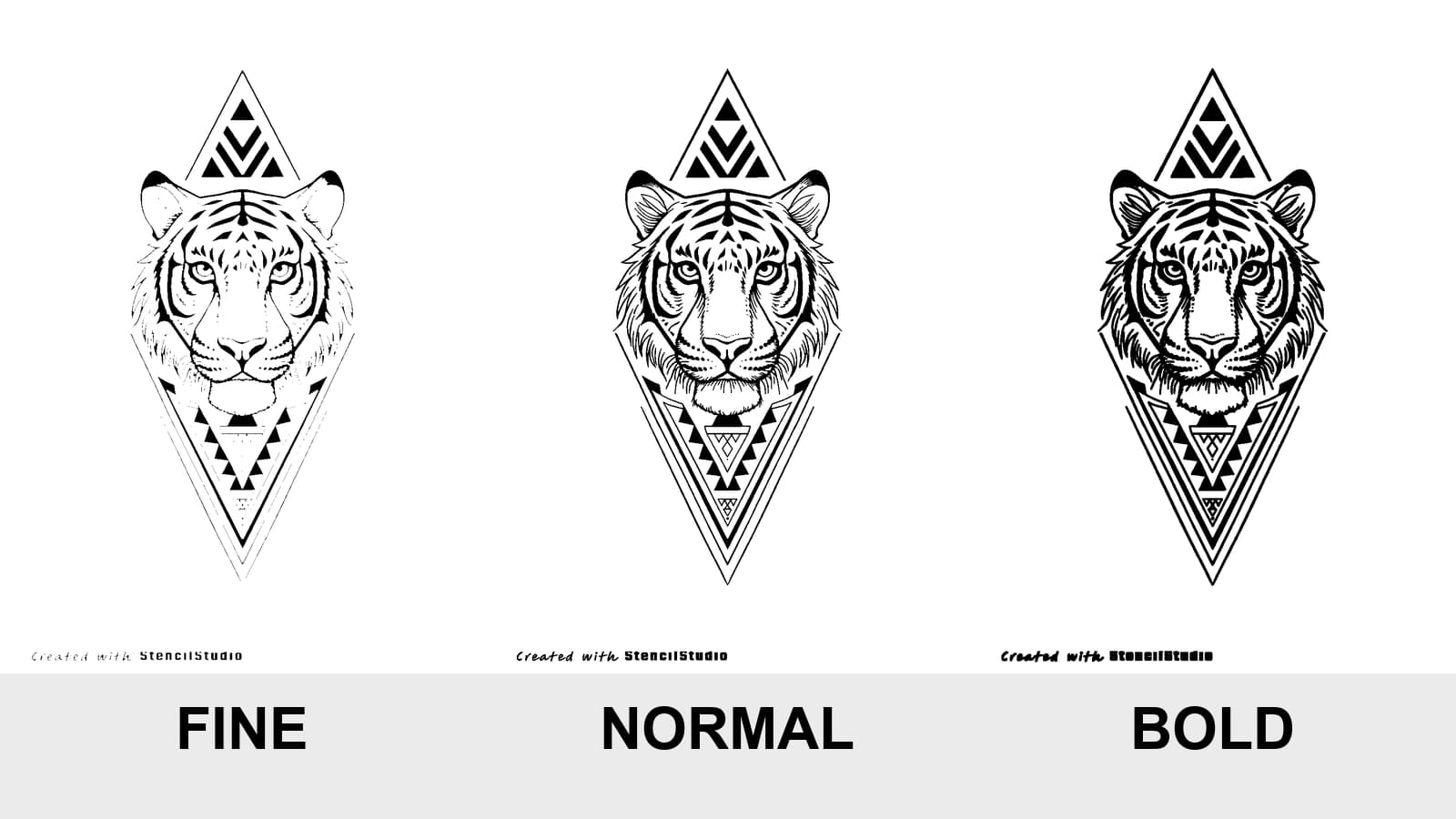
Compare Fine, Normal, and Bold on the same tattoo stencil, see where lines disappear or merge, and test the result at the size you will actually print.
tattoo stencil line weight · fine normal bold stencil
Read guideSize tattoo lettering by the geometry that must stay open: counters, joins, spacing, and fine strokes. Compare at real width and know when to print a test.
tattoo lettering size · small tattoo lettering
Read guide
Use a tattoo thermal stencil printer with a repeatable file-to-paper workflow: control size and mirror, load transfer paper correctly, test output, and diagnose blank, faint, blurry, merged, skewed, or missing lines.
tattoo thermal stencil printer · tattoo stencil printer workflow
Read guideAuthor
Founder and product builder at StencilStudio
Andrea builds StencilStudio and tests how the tools fit into real stencil prep, using real references and outputs to document what works, what changes, and where artist judgment still matters.
In the App
Use the Print Checker when a finished stencil may contain weak, fine, threshold-sensitive, or final-size detail before you change printer or transfer variables.