01Counter
a e o
Is the smallest opening still clearly open?


Lettering Prep
Size tattoo lettering by the geometry that must stay open: counters, joins, spacing, and fine strokes. Compare at real width and know when to print a test.
tattoo lettering size · small tattoo lettering · tattoo lettering readability · tattoo lettering spacing
Real-size decision check
Compare the exact wording at one physical target width, then inspect these four points before reducing it further.
Is the smallest opening still clearly open?
Can adjacent strokes still be separated at a glance?
Does the finest required mark still reproduce?
Do letters and words still have distinct gaps?
Screen zoom helps you inspect structure, but it does not prove physical size. When the decision is close, export the finalist at 1:1 and repeat the same four checks on plain paper.
Compare lettering at one widthThere is no useful universal minimum letter height for tattoo lettering.
A compact Roman capital, a dense Blackletter lowercase word, and a swashed connected script can share the same measured height while carrying completely different counters, joins, stroke contrast, and spacing. A single number cannot tell you whether all three are equally readable or equally workable as a stencil.
The practical question is narrower:
At the final physical size for this exact wording, which parts of the letterforms are becoming too cramped, too fine, or too dependent on perfect transfer?
Answer that before transfer. Do not try to answer it from a large browser preview.
Font size is a weak production measurement because typefaces use their internal boxes differently. Two fonts set to the same nominal point size can produce very different visible letter heights and word widths.
For tattoo prep, the physical size of the finished lettering is more useful. Start with the space the placement actually gives you, then compare the exact text inside that boundary.
If the word needs to fit inside 80 mm, compare candidates at 80 mm. Do not compare one font at 48 px and another at 48 px and assume the visual difference tells you how they will behave on the body.
The Tattoo Lettering Stencil Maker is built around this comparison: type the real name, date, numeral, or phrase, set a target physical width, and compare candidates at that same width before you tune the rest of the layout.
If the source is an existing signature, note, or other real handwriting whose individual character must survive, that is a different starting point from font selection. Use the real-handwriting preparation guide to preserve the writer-specific shapes, joins, spacing, baseline, and uncertain marks before you make final-size readability decisions.
This also exposes an important tradeoff. A wider font may need to shrink more to fit the placement. A condensed font may fit easily but carry denser counters. A delicate script may look open overall while hiding one hairline or tight join that becomes the real limiting feature.
Judge the smallest important geometry, not the average size of the word.
When you reduce lettering, do not stare at the whole word and ask whether you can still recognize it. Recognition can remain surprisingly good after individual letterforms have already lost useful separation.
Inspect these four areas separately.
Counters are the enclosed or partly enclosed spaces inside letterforms: the interior of a, e, o, b, d, p, R, and many Blackletter forms.
They are often the first useful diagnostic because shrinking a word reduces both the black strokes and the white openings between them. A letter can still look like an o on a bright zoomed screen while the actual opening has become very small in the final print.
Check the smallest counter in the actual wording. Do not test a generic alphabet if the client is getting Forever or MOM 1997. The exact sequence matters.
Dense Blackletter deserves extra attention here. A heavy face can have strong outer strokes and still become difficult because several small internal openings are competing for limited space.
Connected scripts create a second failure point: where one letter hands off to the next.
Look for:
Do not solve every tight join by adding global letter spacing. Connected script can break visually if you separate letters that were designed to connect. Sometimes the better fix is a different font, a different capitalization, a manually adjusted pair, or more physical width.
High-contrast scripts and serif faces can contain strokes that are much finer than the main body of the letter.
That difference matters more than the advertised font category. A word can look visually bold because its main strokes are heavy while still depending on hairline connectors or small serif terminals.
At the target size, find the finest stroke that still carries information. Ask whether it remains visible and distinct in the exported stencil and in the print path you actually use.
Do not confuse this with choosing the final tattoo needle or final ink width. The stencil is a guide. If the problem is the mass of the stencil lines themselves rather than the letter design, use the tattoo stencil line-weight guide as the separate decision owner.
Spacing does more than make typography look polished. At small physical sizes it protects separation.
Check the narrowest gap between neighboring forms, not just the average tracking value. Problem pairs are often local: a swash beside a capital, two rounded letters, repeated verticals, or punctuation tucked against a final stroke.
For a phrase, check word spaces independently from letter spacing. A phrase can remain technically readable while two words start to look like one unit.
Use spacing to remove avoidable crowding, but do not use huge tracking to rescue a font that is structurally too intricate for the available width. That creates a different problem: the phrase gets longer without making its smallest internal geometry safer.
The smallest workable version of MOM is not evidence for the smallest workable version of Amor Fati, and neither predicts a long memorial sentence.
Build the test around the final copy:
This sequence is faster than arguing about a universal minimum because it tests the actual design you are about to use.
A useful sizing guide should not pretend every font family has the same weak point.
Fine script often looks spacious because the overall word has a lot of white around it. The risky parts can be local: a narrow loop, a thin connector, a small lowercase counter, or a swash that returns close to another stroke.
In the tool, a face such as Sacramento is deliberately quieter and more monoline than an ornamental script such as Great Vibes. That does not make either one universally "better for small tattoos." It gives you different geometry to inspect at the same final width.
Blackletter can carry strong, confident outer mass while packing a lot of structure into lowercase letters.
Inspect counters and repeated verticals first. A readable Gothic face such as Pirata One can behave very differently from a denser historic Fraktur direction such as UnifrakturCook even when both are visually categorized as Blackletter or Old English.
Do not choose by category label. Choose by the exact word at size.
Roman capitals can be comparatively self-contained, which is useful for dates, initials, and short memorial wording. But high-contrast serif construction can still contain fine terminals or narrow internal spaces.
For something like MCMXCIV, check repeated verticals, diagonal intersections, and the spacing around I before assuming that all-caps automatically solves readability.
These faces can be robust in their main strokes but spend a lot of width on decoration.
Watch terminals, inline details, notches, and adjacent swashes. If decoration forces the core letters to shrink significantly just to fit the placement, a simpler face at the same width may preserve more useful letterform area.
Zoom is useful for inspection. It is not proof of print scale.
A browser can make a 35 mm word fill most of a laptop screen. A phone can show the same file at a completely different apparent size. Even 100% zoom is not a reliable statement that the pixels on screen equal the physical dimensions of the stencil.
Use the screen to compare structure. Use a true-size output to verify physical size.
For a near-limit lettering design:
Fit to Page that rescale the document.If the plain-paper print already makes an important opening ambiguous, transfer paper will not make the underlying design geometry more generous.
The same vector lettering can reproduce differently through different printers, paper paths, density settings, and transfer technique. That is why this guide does not give a universal millimeter threshold and does not predict how every tattoo will age.
Separate two questions:
Is the lettering geometry too compressed?
That is a design problem. Increase physical size, open spacing where appropriate, simplify ornament, change case, shorten the copy, or choose a face with more usable internal space.
Is the design geometry clear, but the physical stencil is reproducing weakly?
That is a print-path problem. Test the printer and stencil line behavior instead of redesigning the typography blindly. The Tattoo Stencil Printer Test Sheet gives you known lines, gaps, and counters to establish a baseline for your own hardware.
Keeping these questions separate prevents a common waste loop: making the lettering larger when the printer is the issue, or pushing printer density harder when the letterforms are simply too crowded.
Making the lettering larger is the cleanest fix when the placement has room and the critical geometry improves immediately.
But size is not the only lever.
Change the lettering design when:
For long copy, splitting the phrase into intentional lines can be better than compressing one horizontal run. For a short word, a different font direction can recover more usable negative space without changing the placement size.
The goal is not "make it as small as possible." The goal is to use the available placement efficiently while keeping the stencil legible enough for the artist to work from.
You do not need a physical proof for every rough font comparison. You do need one when the decision depends on details that are close to the limit of your screen judgment or print path.
Print the actual-size test when:
Plain paper is enough for this decision. You are checking scale and geometry before you spend transfer material.
Before the final transfer, check the design in this order:
If one item fails, solve that specific failure. Do not automatically enlarge everything or make every stroke bolder.
There is no useful universal minimum that applies to every word, font, placement, stencil printer, and tattooing approach. Set the exact wording at its intended physical size, then inspect counters, joins, fine strokes, and spacing. If critical geometry is already cramped in the 1:1 proof, size up or simplify the lettering direction.
Use the final physical dimensions of the rendered lettering. Nominal font size is not comparable across typefaces because their internal metrics and visible proportions differ. Comparing candidates at the same physical width gives you a much more useful production test.
Use the screen for relative comparison and close inspection, not as proof of physical scale. Browser zoom and device size can make the same design appear much larger or smaller than the final stencil. Print at 1:1 when the decision depends on small openings or fine strokes.
Fix unnecessary local crowding first when spacing is genuinely the problem. If the smallest counters, joins, or strokes remain cramped after reasonable spacing adjustments, more tracking will not fix the letterform geometry. Increase the physical size, simplify the style, change case, or choose a more suitable lettering direction.
Related Guides
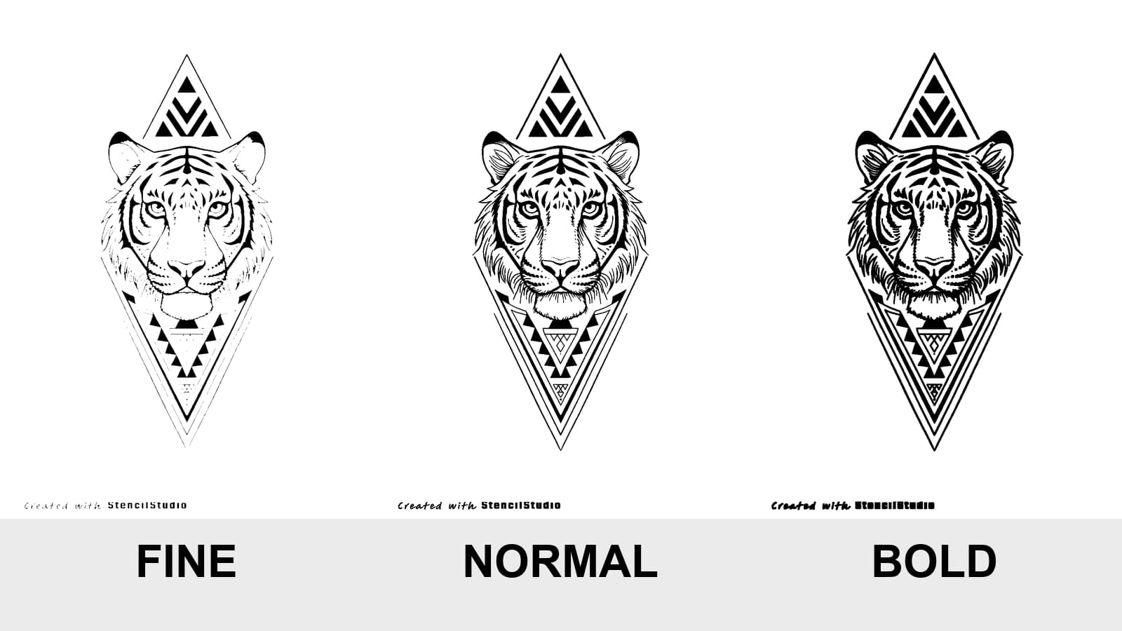
Compare Fine, Normal, and Bold on the same tattoo stencil, see where lines disappear or merge, and test the result at the size you will actually print.
tattoo stencil line weight · fine normal bold stencil
Read guide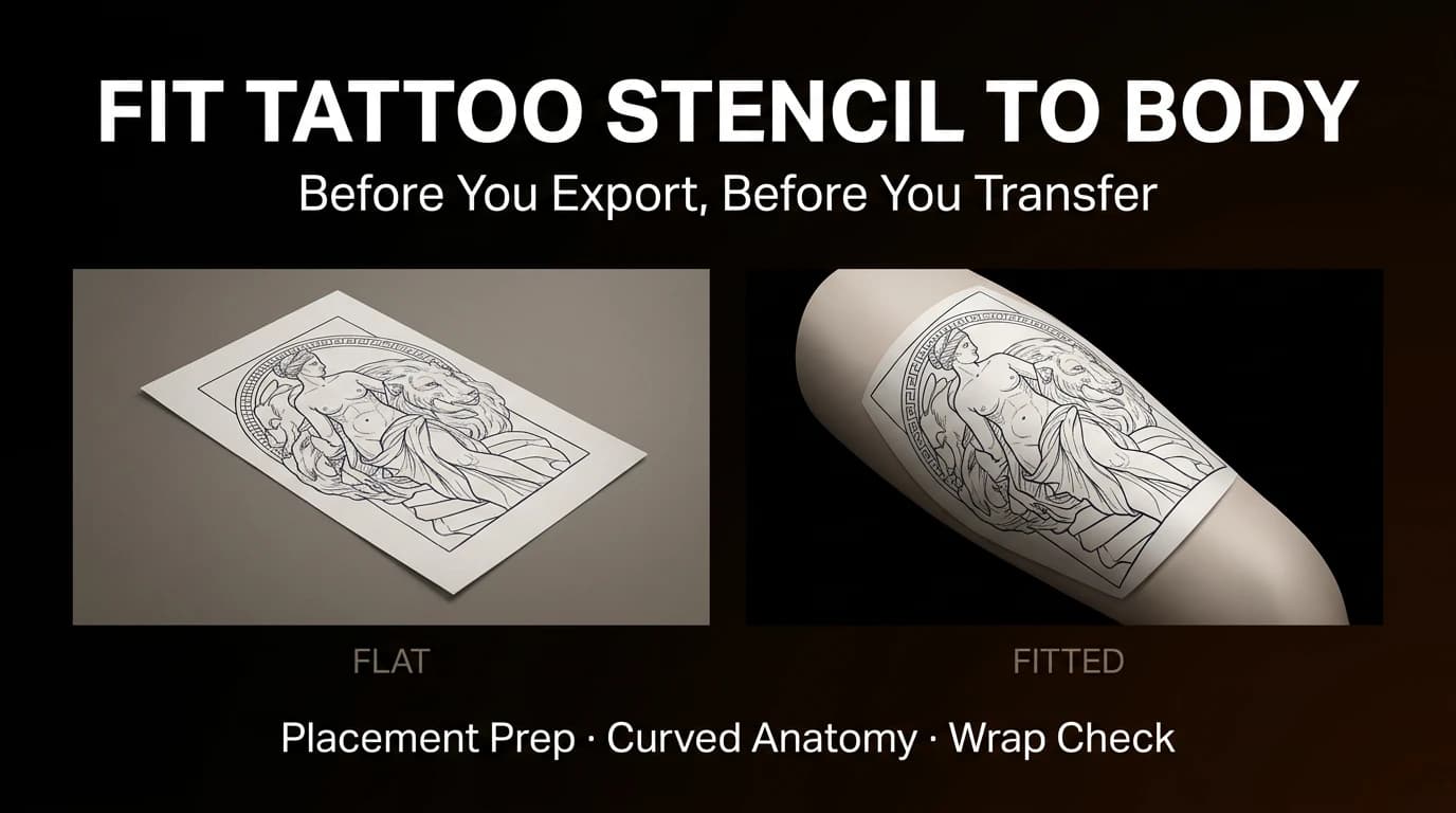
Review focal point, wrap, compression, negative space, and body line before exporting a tattoo stencil for a curved placement.
fit tattoo stencil to body · tattoo placement prep
Read guidePrint a tattoo stencil from iPhone without silent resizing: prepare a 1:1 PDF, use AirPrint or your printer app, and verify the 50 mm scale check.
print tattoo stencil from iPhone · AirPrint tattoo stencil
Read guideAuthor
Founder and product builder at StencilStudio
Andrea builds StencilStudio and tests how the tools fit into real stencil prep, using real references and outputs to document what works, what changes, and where artist judgment still matters.
In the App
Compare tattoo lettering styles at the same physical width, adjust spacing, then export a true-size stencil when the geometry still reads.