

Troubleshooting
Tattoo Stencil Too Detailed for the Final Size
Tell whether a tattoo stencil has too much information for its intended physical size by checking line separation, gaps, landmarks, and texture before printing.
tattoo stencil too detailed · final size readability · tattoo stencil crowding · stencil detail
- August 23, 2026
- 14 min
A stencil can look controlled while it fills a tablet screen and become unreadable when the same design is reduced to the tattoo's intended physical size.
That is what too detailed for the final size means: the design contains information that no longer reads as separate information once the available physical area is fixed.
It is not simply a high line count. One design may contain many marks with enough space between them. Another may contain only a few marks, but place them so close around an eye, letter counter, petal overlap, or ornamental channel that they stop reading independently.
Before changing anything, make one split:
- The digital stencil is already crowded at the intended physical size: diagnose the design here.
- The digital stencil is clear at the intended size, but the paper print loses or merges detail: the first failure is in the physical print path, not this design-density problem.
That distinction prevents a common waste of time: simplifying good artwork to compensate for a printer-stage failure.
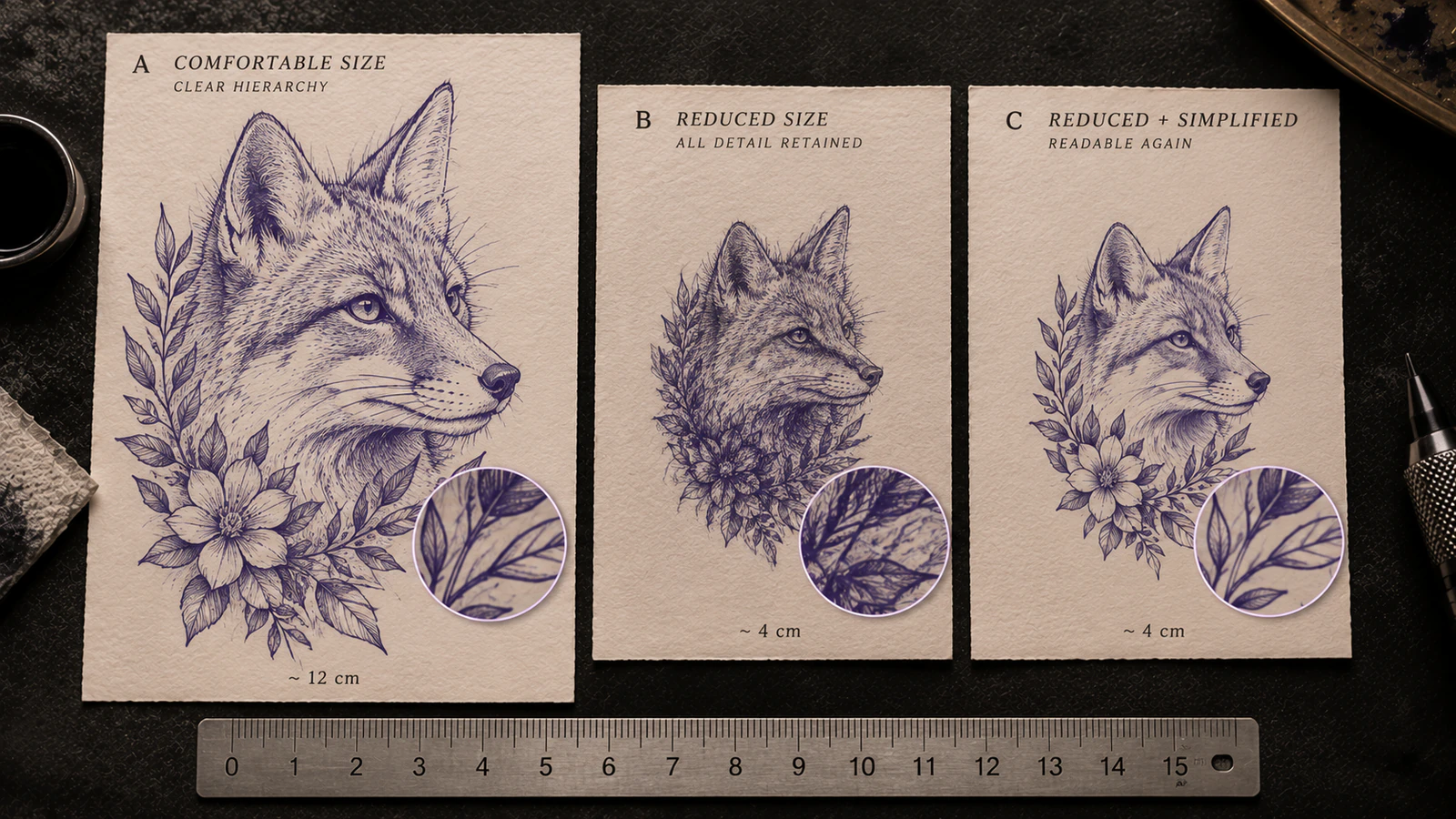
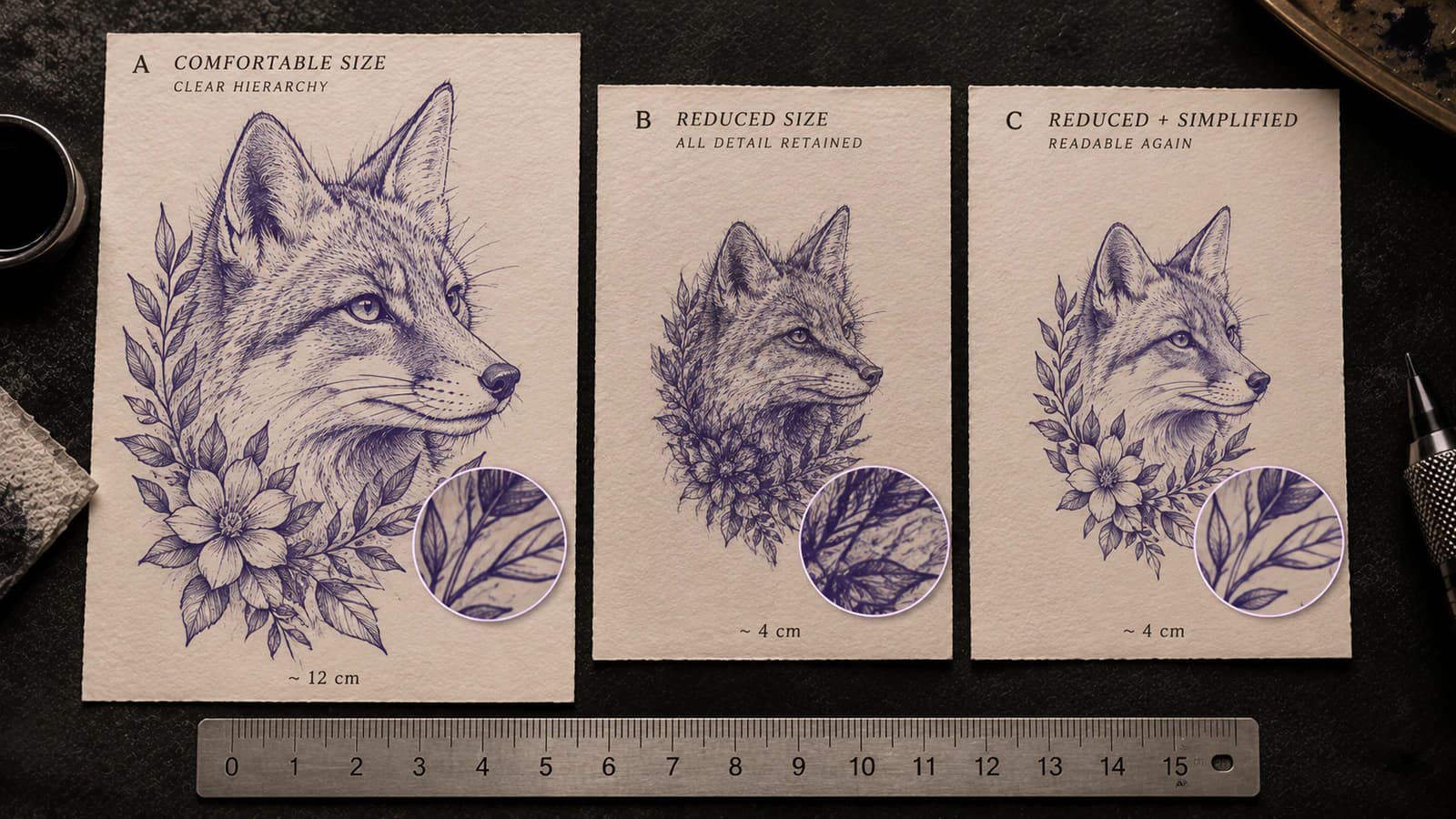
The comparison is conceptual, not a minimum-size rule. The useful question is what fails first in your actual design when it reaches its intended physical dimensions.
What "too detailed" actually describes
Detail is not one variable. Readability at final size depends on the relationship between marks and the space around them.
Inspect combinations such as:
- distance between neighboring lines;
- width of important negative spaces;
- several short marks concentrated in one small area;
- nested contours that need to remain distinguishable;
- repeated texture such as fur, hair, scales, wrinkles, petals, or fabric grain;
- tiny isolated marks that carry little visual weight on their own;
- parallel lines that begin to read as one band;
- several shading boundaries competing with a primary contour;
- internal shapes whose identity depends on a small opening;
- facial or object landmarks surrounded by secondary information of equal strength.
The same drawing can therefore be comfortable at a larger size and overloaded at a smaller one without any line being "wrong" in isolation. Reduction changes the physical distance available between neighboring pieces of information.
A useful test is not "How many lines are there?" It is: Can the eye still tell what each important mark is doing at the size the stencil will actually be used?
Judge the stencil at physical final size, not editing zoom
Screen zoom is an editing aid. It is not a physical-size guarantee.
At 300% zoom, a tiny gap can occupy a large part of the screen. A short crease can look as important as the outer contour because the interface has enlarged both for inspection. That tells you the pixels exist. It does not tell you how much physical room those marks will have on paper or on the intended placement.
Keep three ideas separate:
Screen zoom changes how large the file appears on your display.
Pixel dimensions describe how much raster data the file contains.
Physical size describes the width and height at which the stencil will actually be printed or used.
Adobe's current Photoshop documentation makes the same underlying distinction: image dimensions describe pixel count, while print resolution controls how densely those pixels are packed into physical output. A high-resolution source can give you more data to work with, but it does not create more physical space between two features once the final width is fixed.
Use the Tattoo Stencil Size & Print Calculator when you need to set or verify the actual width and height. If your software cannot show physical size reliably on screen, an actual-size plain-paper print is often the cleaner reference.
Do not judge the design only from a thumbnail either. The goal is not to make the stencil readable at every arbitrary screen size. The goal is to test the intended physical output.
Run the Final Size Readability Check
Use one fixed version of the design and one intended physical size. Do not change size, line weight, contrast, and detail level at the same time.
1. Set the intended width or height
Start with the size the placement decision actually requires. Do not leave the design at an undefined canvas size and judge it by how large the app happens to display it.
If the intended dimensions are still unknown, solve that first. This check tells you what happens at a chosen size; it does not decide what tattoo size the client or artist should choose.
2. Mark the information that cannot be casually lost
Before looking for tiny details, identify the few relationships that make the design read correctly.
Depending on the subject, these may include:
- silhouette and outer proportion;
- major overlaps;
- eye, nose, mouth, muzzle, ear, or jaw relationships;
- the character skeleton of lettering;
- a distinctive petal, leaf, wing, symbol, or object shape;
- the major rhythm in ornamental or geometric work;
- one hard boundary that defines a change of form.
These are your identity-critical or construction-critical landmarks. They deserve more protection than texture that simply repeats information already visible elsewhere.
3. Inspect the smallest important cluster
Do not begin with the largest contour. Find the area where several important things occupy the least room.
Examples include an eye with eyelid and crease marks, a letter with a small counter, a flower center with repeated petals, a knot in ornament, or a face surrounded by hair and shadow boundaries.
If that cluster survives, move outward. If it fails, the whole design does not need another global setting yet. You have found the first local constraint.
4. Check line separation
Ask whether neighboring marks still read as separate marks.
A failure can look like:
- two parallel lines becoming one visual band;
- several short texture strokes becoming a dark patch;
- a small contour sitting so close to a larger contour that its purpose becomes ambiguous;
- repeated interior marks losing their individual rhythm.
This is an information-density failure even when every individual line is thin.
5. Check negative spaces
Now inspect the white or open spaces that carry structure.
If an enclosed opening, counter, channel, or gap is the main thing that is failing, you have identified a negative-space-specific problem rather than generic excess detail. Use Tattoo Stencil Negative Space Too Tight at Final Size to follow that gap itself, rank the information it carries, and decide whether local spacing, neighboring information, line mass, design size, paper output, or transfer is the first relationship that changed.
For lettering specifically, How Small Can Tattoo Lettering Be? goes deeper into counters, joins, repeated verticals, and word-level readability.
6. Check visual hierarchy
Look at the design without trying to admire every mark.
What does your eye see first?
If eyelash texture competes with the eye shape, vein marks compete with the leaf silhouette, or tiny armor scratches compete with the figure's main form, the problem is not only that the marks are close. Their priority has flattened.
The stencil may still contain all the right information, but too much of it is asking for equal attention inside too little space.
7. Remove or combine one low-priority information family
Do not erase random lines until the design looks emptier.
Choose one category that repeats information already communicated by stronger structure. For example:
- reduce four fur ticks to two directional cues;
- remove a small crease that sits beside an already clear eyelid;
- combine several near-identical texture marks into one boundary;
- keep a petal overlap but reduce interior vein marks;
- preserve a garment fold that changes form and remove scratches that only add surface texture.
Then re-check the same area at the same physical size.
8. Classify what failed
The classification matters because the next edit should match the failure.
A. Readable: primary structure, important gaps, and useful secondary cues stay distinct. Stop editing for density.
B. Tertiary detail fails first: recognition and construction survive, but texture becomes noisy or insignificant. Simplify texture selectively before sacrificing landmarks.
C. Neighboring marks merge: several separate lines or dots begin functioning as one band or mass. Fewer marks may solve this more cleanly than globally thinning every line.
D. Negative spaces collapse: the surrounding contour still works, but a specific opening, counter, or channel becomes fragile. Treat the space as the constrained feature.
E. Identity-critical landmarks degrade: the design loses a relationship that makes the subject specific or the construction understandable. At this point, removing more structure may be the wrong compromise. Increase size, change crop, or restructure the design around those landmarks.
F. Digital file passes, physical paper fails: stop diagnosing design density. If the target-size digital file remains clear and only the print loses, merges, or drops information, move to print-stage evidence.
That last class is especially important. Once the design has been shown to pass digitally at the intended size, stop simplifying it and investigate the print path instead.
Preserve hierarchy, not every mark
Selective simplification works only when you know what each mark contributes.
A useful working hierarchy is:
- Silhouette and global proportion. Can the subject or composition still be read as the intended thing?
- Identity-critical or construction-critical landmarks. Which relationships make this face, pet, word, symbol, ornament, or object specific?
- Secondary structure. Which overlaps, plane changes, folds, or internal contours help reconstruct the form?
- Tertiary texture. Which repeated marks add surface character without changing recognition or construction?
This is not a style prescription. A texture-heavy piece may intentionally promote some texture into primary information. A minimal design may have almost no tertiary layer at all.
The point is to assign priority for this design at this size.
A quick editing question helps: if this mark disappeared, what decision would become harder?
- If recognition changes, it is probably high priority.
- If construction becomes ambiguous, it is probably high priority.
- If an important separation disappears, protect the space around it.
- If nothing meaningful changes because three nearby marks already communicate the same cue, it is a stronger simplification candidate.
This is also why simply switching to a lower detail mode is not always enough. The Tattoo Stencil Detail Levels guide explains Simple, Standard, and Detailed as broad information choices. This final-size check starts after you have a candidate design and asks whether that specific information map survives its intended physical size.
Three worked examples
Portrait: texture competes with identity
Imagine a portrait stencil that is clear while enlarged. Around one eye it contains the eyelid edge, iris edge, a small skin crease, highlight boundary, several lashes, and short eyebrow texture.
At a larger physical size, those can remain distinguishable.
After reduction, the eyelid, iris, lashes, and crease begin to occupy nearly the same visual cluster. The eye still exists, but its important relationships are harder to read because lower-priority texture now competes with the landmark itself.
The first edit should not be "make every line thinner."
Protect the eye position, eyelid shape, iris relationship, and any crease that genuinely defines form. Reduce repeated lash or skin texture that does not change recognition. Re-check the eye at final size before touching the rest of the face.
For a portrait, losing a texture mark is not equivalent to changing eye spacing, nostril shape, mouth angle, or jaw relationship. Treat those information families differently.
Lettering: the word survives but an internal opening does not
A script word can remain recognizable even while one small counter or join becomes cramped.
That is a useful warning because whole-word recognition can hide a local geometry failure.
If the outer character shape remains clear but one counter is closing, do not classify the entire design as "too detailed" and start deleting unrelated flourishes. The constrained feature is the opening itself.
Options may include giving that letter more room, changing the local construction, reducing a nearby flourish, or increasing the final size. The correct choice depends on the lettering, not on a universal minimum gap.
Illustrative texture: several lines become one band
Consider an illustrative animal, anime, botanical, or ornamental design with a set of parallel texture lines inside a larger shape.
At working size, each line clearly suggests direction or surface.
At final size, the lines remain technically present but your eye reads them as one dark band. The primary contour still works. The problem is the number of similar marks occupying the same local area.
Making all of them thinner may reopen some space, but it may also weaken the useful contour elsewhere. A cleaner edit can be to keep fewer directional marks while preserving their rhythm.
That is the difference between reducing line mass and reducing information density.
"Too detailed" is not the same as "too dark"
These symptoms can overlap visually, but they are not the same problem.
A stencil can have correct darkness and reasonable line thickness yet still contain too many nearby marks for the intended size.
A sparse stencil can also be too dark if the few surviving lines reproduce with excessive mass.
Use this split:
- Many reasonable marks, too little space between them: information-density problem. Stay here.
- The right marks are present, but individual strokes need more or less mass: use the Tattoo Stencil Line Weight guide.
- The whole stencil reads excessively heavy and you do not yet know whether the change starts in the file, print, transfer, or final size: use the tattoo stencil too-dark diagnostic.
Do not use a global darkness adjustment as a substitute for deciding which information deserves to remain.
"Too detailed" is not the same as missing detail in print
This is the most important workflow boundary on the page.
Suppose a whisker, tiny contour, or ornamental mark is perfectly clear in the digital stencil at the intended physical size.
You print it. The strong contour survives, but that specific fine information disappears or merges on paper.
That is no longer evidence that the design was too detailed for its size. It is evidence that the physical output changed relative to a target-size digital baseline.
Keep the artwork fixed and use Tattoo Stencil Print Missing Details to follow that same feature through the finished stencil, final-size digital view, exported document, print preview, and paper. The first checkpoint where the feature becomes absent or broken determines whether to stay upstream or investigate physical reproduction.
The Tattoo Stencil Print Checker can inspect the finished file for final dimensions, source sampling, fine geometry, threshold-sensitive regions, and dense areas before you blame the printer. It deliberately does not promise that a particular printer will reproduce every feature.
If the file passes your visual final-size check and the paper still changes, the Tattoo Stencil Printer Troubleshooter separates file, layout, paper/feed, printer, and app layers. Use the missing-detail guide first to establish where the physical mismatch begins.
Do not redraw a client stencil until you know which side of that digital-to-paper boundary actually failed.
Simply scaling a finished design down may not be enough
Scaling is geometric. Readability is editorial.
If every contour, texture mark, gap, accent, and secondary boundary is reduced together, their relationships become physically tighter together. The smaller version may therefore need a different information map rather than a smaller copy of the large one.
Useful restructuring can include:
- removing tertiary marks that repeat a stronger cue;
- combining redundant boundaries;
- preserving fewer but clearer texture directions;
- protecting recognition landmarks and opening space around them;
- changing the crop so the important subject occupies more of the available area;
- reducing background or framing information before sacrificing the focal subject;
- separating construction guidance from texture you can reference elsewhere during the session.
That last option is often overlooked: the skin stencil does not need to carry every piece of reference information you have available. A cleaner working stencil and a richer visual reference can serve different jobs.
The design may still legitimately need to be larger. The point is that "make it bigger" is not the only possible operation when some information is low priority.
There are two broad responses:
Increase physical size when the current information is all important and needs more room.
Reduce or restructure information when the intended size is fixed and some marks can be represented more selectively without damaging recognition or construction.
Neither response is universally superior.
Use a 1:1 check before approving the reduction
Once the edit looks good, return to the same physical dimensions and repeat the check.
Do not approve it because the simplified version looks cleaner at 250% zoom.
For a dependable workflow:
- set the intended dimensions;
- view or print the design at 1:1 scale;
- inspect the smallest identity-critical cluster;
- inspect the narrowest important negative space;
- inspect repeated texture and parallel marks;
- compare the revised version with the previous version at the same size;
- confirm that simplification improved separation without deleting a relationship you actually need.
If you print a PDF for this check, make sure the print path is not silently scaling it. Adobe Acrobat, for example, distinguishes Actual size, which prints without scaling, from Fit, which reduces or enlarges a page to match the printable area. The Size & Print Calculator provides a 1:1 PDF workflow and a physical calibration check so the dimensions can be measured rather than assumed.
The final test is simple: at the size you actually intend to use, can you still tell what the important marks are doing and why they are there?
If yes, stop simplifying. If no, classify the first failure and edit that constraint instead of thinning, darkening, or deleting the whole stencil at once.
Related Guides
Keep reading from here
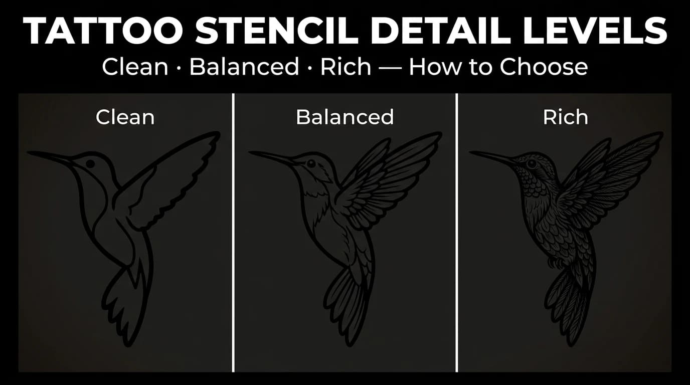
Tattoo Stencil Detail Levels: Simple, Standard, and Detailed
Compare Simple, Standard, and Detailed tattoo stencil modes and choose the amount of structural guidance that suits the size, subject, and placement.
tattoo stencil detail levels · tattoo stencil readability
Read guide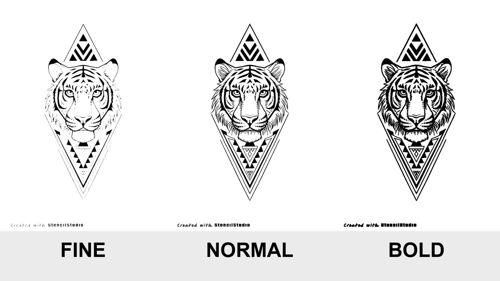
Tattoo Stencil Line Weight: Fine vs Normal vs Bold
Compare Fine, Normal, and Bold on the same tattoo stencil, see where lines disappear or merge, and test the result at the size you will actually print.
tattoo stencil line weight · fine normal bold stencil
Read guide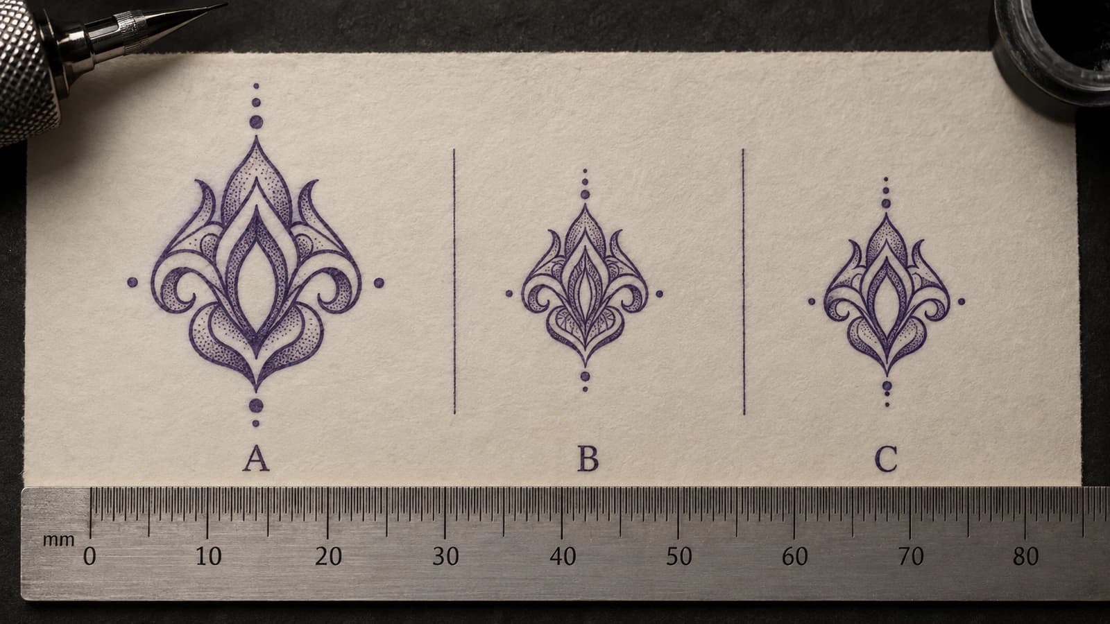
Tattoo Stencil Negative Space Too Tight at Final Size
Diagnose tattoo stencil gaps, counters, and openings that become too tight at intended physical size, then decide what geometry to protect or change.
tattoo stencil negative space · tattoo stencil gaps
Read guideAuthor
Andrea Mezzadra
Founder and product builder at StencilStudio
Andrea builds StencilStudio and tests how the tools fit into real stencil prep, using real references and outputs to document what works, what changes, and where artist judgment still matters.
In the App
Check the finished stencil at the size you intend to use.
Set the physical width, inspect fine and crowded regions, and separate file-side risk from printer behavior before changing the artwork again.