Fine
Reduces line mass. Useful when narrow spaces are closing, but weak marks may disappear.
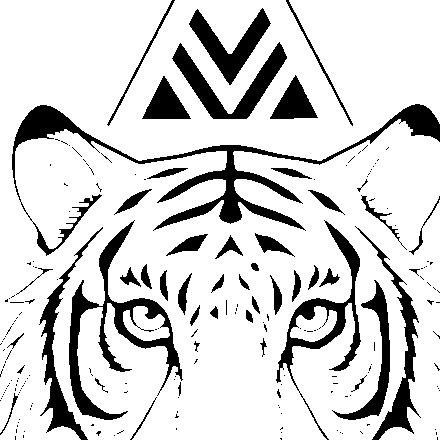
Watch the shortest feather or fur breaks and the narrow facial gaps.


Detail Control
Compare Fine, Normal, and Bold on the same tattoo stencil, see where lines disappear or merge, and test the result at the size you will actually print.
tattoo stencil line weight · fine normal bold stencil · tattoo stencil readability
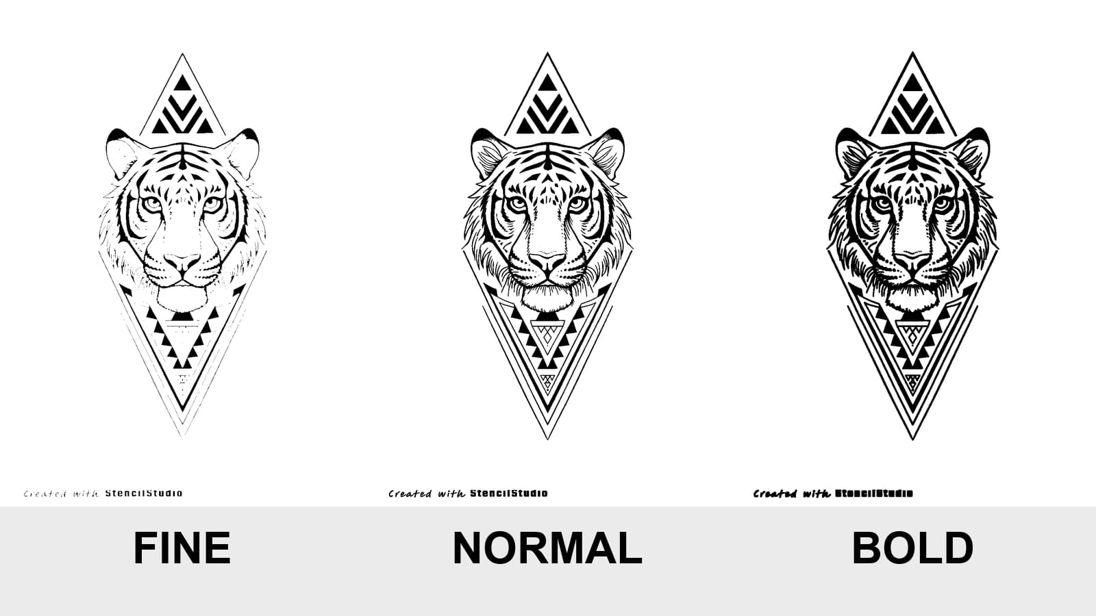
Controlled comparison
Fine, Normal, and Bold use the same source and crop. Inspect what disappears, what stays separate, and what begins to merge.
This screen comparison is relative, not physically true size. Use the printable A4 sheet to judge the print path.
These are controlled editorial variants made from the same normalized stencil, crop, and canvas. They show relative line-mass trade-offs, not exact output from every model, printer, or paper path.
Reduces line mass. Useful when narrow spaces are closing, but weak marks may disappear.
Watch the shortest feather or fur breaks and the narrow facial gaps.
Keeps the baseline line mass. Start here before solving a specific readability problem.
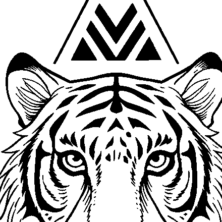
Watch the shortest feather or fur breaks and the narrow facial gaps.
Adds line mass. Useful when structure prints weakly, but close lines and dots may merge.

Watch the shortest feather or fur breaks and the narrow facial gaps.
All three versions in the comparison above contain the same drawing. Nothing has been added, removed, or restyled. Only the amount of black carried by the lines changes.
That single change can rescue a weak print. It can also close the gap between two whiskers and turn them into one.
The useful question is not “Which preset is best?” It is:
What problem does this stencil have at the size I am going to print it?
Start from Normal. Move to Fine or Bold only when the comparison gives you a specific reason.
These controls solve different problems.
Detail level decides which contours, landmarks, and internal information remain in the stencil. The detail-level guide covers the three available stencil modes.
Line weight changes the visual mass of the lines that already survived.
A Detailed stencil can still use Fine line weight. A Simple stencil can still use Bold line weight. Increasing Bold does not restore a missing landmark, and choosing Fine does not create more detail.
This distinction matters because the wrong fix can make the draft worse:
If the individual strokes already have reasonable weight but the design still contains too many nearby marks for its intended physical size, use Tattoo Stencil Too Detailed for the Final Size. That diagnostic treats information density as the variable instead of changing the mass of every surviving line.
Normal is the baseline. That is different from calling it a generic middle option.
Use it to inspect the stencil before solving anything:
When the answers are good, stop. A preset change without a visible problem is just movement.
Fine reduces line mass. Its first benefit is usually separation.
It can help when:
Fine also has a failure mode: weak source marks can fade or disappear. That is not extra simplification by design. It is information falling below the useful output.
Check the shortest and lightest marks first. They usually reveal the limit before the main contour does.
Bold adds line mass.
It can help when:
Bold does not only strengthen lines. It expands them toward the space around them.
The first places to inspect are therefore:
A stronger silhouette is useful only while the internal map remains readable.
Artists naturally look at the black lines. Line-weight problems often become visible earlier in the white space between them.
Inspect:
If the negative space collapses, Bold has passed the useful point for that area.
If the line itself disappears, Fine has passed the useful point.
Normal is correct when both survive.
If the strokes themselves are already a reasonable weight and one particular counter, opening, channel, or separation is still the constrained feature, use Tattoo Stencil Negative Space Too Tight at Final Size. It follows the gap itself and compares local spacing, nearby information, scale, and paper reproduction instead of treating thinner lines as the automatic fix.
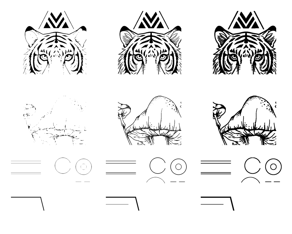
Columns from left to right: Fine, Normal, Bold. Rows from top to bottom: organic detail, ornament, diagnostic strip. The useful threshold is where the line remains present and the surrounding space remains open.
A stencil that looks clean while zoomed in can become crowded when printed smaller. A weak line can also look acceptable on a bright screen and reproduce poorly through a real printer and paper path.
If marks are becoming faint, broken, or absent and you are not yet sure whether the loss starts in the file, final size, paper, or transfer, use the tattoo stencil too-light diagnostic to find the first failing stage before changing line weight.
If the geometry is still recognizable on paper but the physical marks are specifically pale or intermittently faint, use the focused tattoo stencil printer faint-lines guide. It separates visual strength from line geometry and compares the client output with a known printer Test Sheet before a global line-weight change.
If the intended digital line weight is acceptable at final size but the paper makes those marks wider, narrows an open gap, or closes it, use Tattoo Stencil Printer Filling In Gaps?. That comparison starts from a digital pass and asks whether physical reproduction added mark mass.
Do not choose a preset from a zoomed preview alone.
Set the intended physical dimensions with the Tattoo Stencil Size & Print Calculator, then compare on plain paper.
If you already have the finished raster, run it through the Tattoo Stencil Print Checker at that intended width before changing the preset again. It can expose source-sampling, very-fine-geometry, and threshold-sensitive regions that may contribute to disappearing detail; it does not simulate your specific printer.
Use the same:
Change one variable at a time.
Download the printable A4 Fine, Normal, and Bold comparison sheet. Print it without Fit to Page and measure the 50 mm line before judging the examples.
Start with the shortest texture marks and the gaps around them.
Fine may preserve separation but lose weak fragments. Bold may reinforce the main face structure while joining nearby whiskers or fur breaks. Normal is correct when the face remains organized without turning texture into a continuous mass.
Inspect repeated channels rather than the largest outer contour.
Bold can make the outer structure more confident while closing small petal separations or parallel ornamental paths. Fine can reopen those spaces, but may weaken short internal joins.
Watch counters, joins, serifs, and small openings.
The word may remain recognizable even after an internal opening has closed. That does not mean the stencil stayed precise. Judge the negative spaces before judging the word as a whole.
A global weight change affects dots as well as lines.
Bold can turn nearby dots into a cluster. Fine can weaken isolated points or short broken guides. If the stencil depends heavily on tonal guidance, line weight alone may be the wrong control; the structure of the shading map may need revision.
Line weight changes the mass of the guidance marks. It does not decide which tonal landmarks belong in the stencil. Use the tattoo stencil shading guide when the problem is the map itself.
Simple shapes often tolerate more line mass because fewer internal gaps are at risk.
That still does not make Bold automatic. Inspect small cut-ins, enclosed spaces, and any narrow separation that carries the symbol's identity.
Stencil line weight controls the printed guide.
It does not prescribe:
A tattoo with varied final line hierarchy can begin from a restrained stencil. A bold final tattoo does not require every stencil mark to be equally heavy.
Use the stencil preset to preserve a readable map. Make tattooing decisions separately.
Use this order:
The goal is not the thinnest or darkest stencil.
The goal is a stencil that stays readable without erasing its own separations.
Normal is the best starting point because it gives you a baseline before you solve a specific problem. Keep it when the important lines are visible and the important spaces remain open.
No. Detail level controls which information remains. Fine line weight reduces the visual mass of the lines that are already present. It can preserve narrow gaps, but it can also make weak marks disappear.
Not universally. Bold can strengthen weak structure, but it can also merge close lines, close counters, and cluster dots. Compare it at the intended print size rather than treating it as an upgrade.
Adding line mass expands black pixels toward nearby marks. When the remaining gap is too narrow, separate elements begin to touch and read as one shape.
You can compare the presets relatively, but the screen is not proof of physical print size or printer behavior. Print at the intended dimensions and verify the calibration line.
Not necessarily. The stencil is a placement and structure guide. Final tattoo line width and technique remain separate artist decisions.
Related Guides
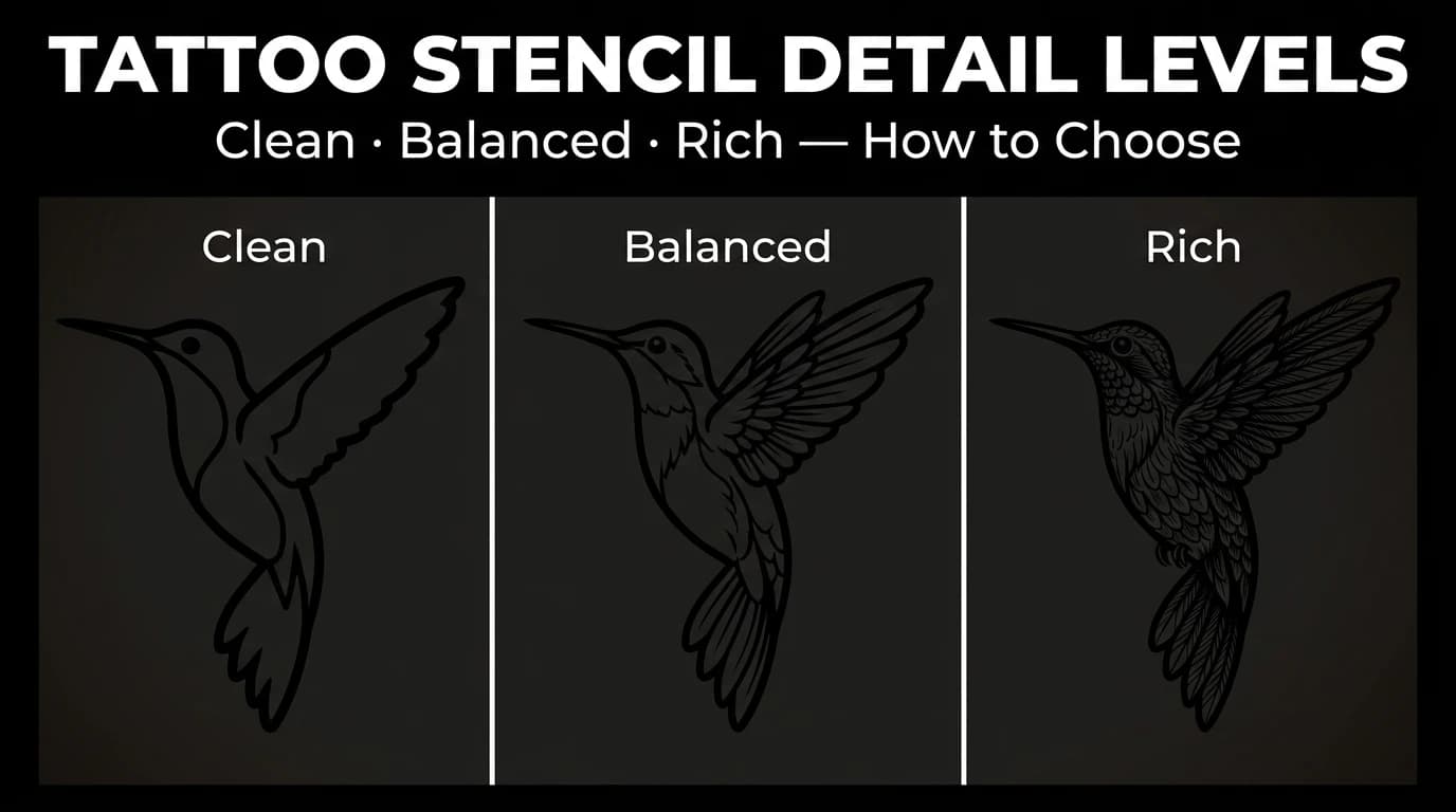
Compare Simple, Standard, and Detailed tattoo stencil modes and choose the amount of structural guidance that suits the size, subject, and placement.
tattoo stencil detail levels · tattoo stencil readability
Read guide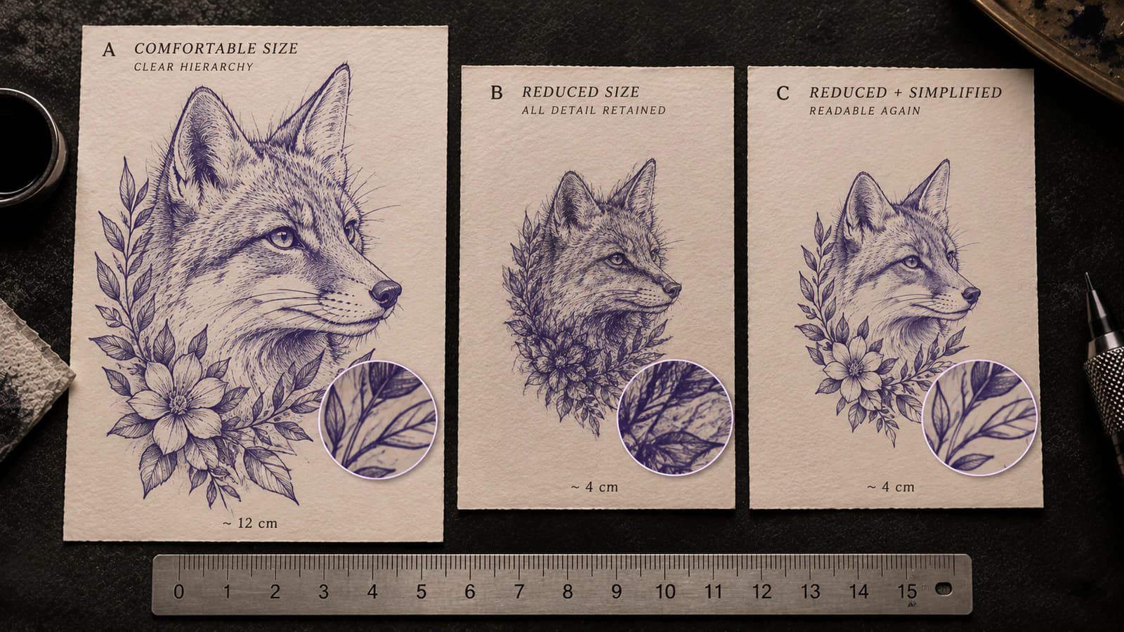
Tell whether a tattoo stencil has too much information for its intended physical size by checking line separation, gaps, landmarks, and texture before printing.
tattoo stencil too detailed · final size readability
Read guide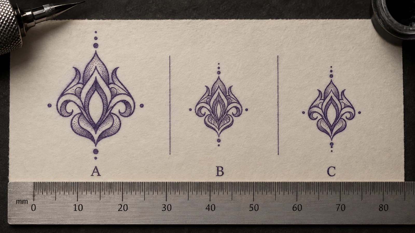
Diagnose tattoo stencil gaps, counters, and openings that become too tight at intended physical size, then decide what geometry to protect or change.
tattoo stencil negative space · tattoo stencil gaps
Read guideAuthor
Founder and product builder at StencilStudio
Andrea builds StencilStudio and tests how the tools fit into real stencil prep, using real references and outputs to document what works, what changes, and where artist judgment still matters.
In the App
Use StencilStudio to build a clean stencil, then check the same draft at the dimensions you will actually print.