

Troubleshooting
Tattoo Stencil Printer Filling In Gaps? Compare File vs Paper
If clean digital stencil gaps close on paper, compare the same final-size geometry through preview, scale, and a known control to find where extra mark mass appears.
tattoo stencil printer fills gaps · tattoo stencil printer lines too thick · blotchy tattoo stencil print · stencil printer gaps closing
- August 23, 2026
- 14 min
The digital stencil has a clean opening. The printed stencil does not.
Maybe the counter inside a letter fills in. Two portrait lines that were clearly separate become one dark patch. A filigree channel pinches closed. Parallel geometry prints as a heavy band even though the final file still shows white space.
That is not just a question of whether the stencil "looks dark." The useful question is relational:
Did the mark gain mass between the final-size digital file and the physical paper?
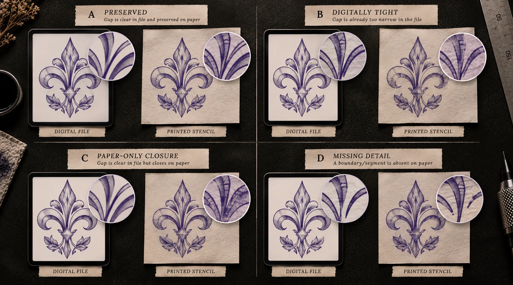
This guide starts only when the exact digital geometry passes and the paper geometry fails. If the gap is already too tight in the final digital stencil at the intended physical size, fix the design-side spacing instead. If it is open digitally and paper closes it, keep the file as your baseline and diagnose the print path.
Start with one gap or counter
Do not diagnose the whole sheet as "too bold."
Choose one small region whose intended geometry is easy to identify. Good candidates include:
- the counter inside a letter or number;
- the opening inside a small symbol;
- the channel between two ornamental curves;
- the separation between an eyelid cue and a nearby contour;
- a narrow floral overlap;
- two parallel geometric lines;
- one deliberate skin break inside dense texture.
Now trace that exact region through the workflow.
FINAL DIGITAL FILE -> INTENDED PHYSICAL SIZE -> PRINT PREVIEW -> PHYSICAL PAPER
The same gap matters at every step. Comparing a clean digital eye with a different muddy area on paper tells you almost nothing.
The gate: digital final size must pass first
Before calling this a printer reproduction problem, establish three facts.
1. The exact final file contains the opening
Open the file actually being printed, not an earlier design-app canvas or generation preview.
The two surrounding marks should be visibly separate and the counter or channel should actually exist. If cleanup, thresholding, export, or another upstream step already filled the area, paper is not the first mismatch.
2. The opening still works at intended physical size
A gap that looks generous at 600% zoom can be fragile at the dimensions you will actually print.
Set or verify the physical dimensions first. The Tattoo Stencil Size & Print Calculator can establish the target dimensions and create true-size output. If the printed stencil is globally smaller than intended, solve the wrong-size print problem before judging gap survival.
If the gap is already structurally tight in the final-size digital version, use the negative-space diagnostic. The physical printer cannot be the first cause of a separation that was already failing before paper.
For file-side evidence about fine, dense, or threshold-sensitive geometry at the intended width, use the Tattoo Stencil Print Checker. It can inspect the finished file, but it does not predict how a specific printer and paper combination will reproduce it.
3. The paper changes that same geometry
Now compare the sheet.
The key evidence is not that the paper looks darker. It is that the relationship changed:
- a line became physically wider;
- the open interval became physically narrower;
- two marks began touching;
- an enclosed counter became smaller or solid;
- several nearby marks fused into one local mass;
- a dark filled region expanded into nearby structure.
If those changes are absent and the print is merely darker in tone while the intended separations remain intact, this is weaker evidence for a geometry-growth problem.
Think in mass delta, not absolute line thickness
A bold intended contour printing bold is not a failure.
A normal intended contour becoming materially heavier on paper is.
That is why "Are these lines thick?" is the wrong first question. It depends on the intended line treatment. The more useful question is:
How much mark mass changed between the approved digital baseline and the paper?
Call that the mass delta.
You do not need a universal millimetre threshold to use the idea. Compare the same region before and after printing.
Line thickening
The line stays separate from its neighbors but becomes visibly wider or heavier.
This is the mildest geometry change. It matters most where the extra width threatens a nearby opening.
Gap shrinkage
Both marks still exist as separate marks, but the white interval between them is materially smaller on paper.
This can be more important than a general darkness change because the negative space may carry structure.
Gap closure
The open interval disappears and two neighboring marks touch.
This is a strong signal when the same gap was comfortably open in the exact final-size file.
Counter fill
An enclosed opening becomes partly or fully solid. Lettering, symbols, eyes, ornamental loops, and small internal shapes make this easy to see.
Local blob
Several nearby marks survive but fuse into one dark mass. The information did not necessarily disappear; its separations were consumed.
Solid-fill expansion
A deliberately heavy region reproduces beyond the boundary expected from the file and contaminates nearby fine structure.
Treat this cautiously. Some printer models explicitly limit or warn about dense or large dark patterns, but that is device-specific behavior, not a universal thermal-printer law.
Use the gap-survival matrix
The same paper symptom can come from different stages. Classify the pair before changing anything.
| Final digital geometry | Physical paper | Interpretation | Next move | |---|---|---|---| | Open | Open | Reproduction preserved the separation | No gap-growth diagnosis needed | | Tight | Tight | The constraint already exists digitally | Fix final-size spacing, line mass, or information density | | Open | Narrower | Paper added mark mass | Keep the file fixed and investigate the output path | | Open | Closed | Strong paper-only geometry-growth signal | Run a known-gap control and one-variable test | | Present | Missing | Information was lost rather than overbuilt | Use the missing-detail diagnostic | | Continuous | Broken | One intended path lost continuity | Use the broken-line diagnostic | | Present but pale | Present but pale | Strength is the main problem | Use the faint-lines diagnostic |
The matrix prevents one dark patch from being treated as proof that the printer is "too hot," "bad," or defective.
Use print preview as a checkpoint, not a guarantee
Print preview can locate the transition.
Preview is already heavier or filled
The physical printer is not necessarily the first cause.
Inspect the exact document being sent, visible scaling, rasterization, import/export behavior, and any conversion that occurred between the final stencil and the print job.
A preview cannot explain every transformation inside a print stack, but if the gap is already gone there, paper is not the first place it disappeared.
Preview is clean, paper is heavier
The physical handoff becomes more relevant.
Keep the file, physical size, and test gap unchanged. Do not redraw the artwork yet. Move to a known control so you can ask whether the same physical path also closes fixed clean geometry.
Verify physical scale before judging geometry
A smaller-than-intended print is a confounder.
If the whole stencil was silently reduced, neighboring lines are physically closer together even if the printer reproduced their relative geometry perfectly. Counters become smaller. Gaps become narrower. A formerly comfortable opening can become fragile without any line actually expanding.
Measure first.
When using the Printer Test Sheet, measure its 50 mm scale check before interpreting the gap patterns. When using a client stencil, verify one known physical dimension from the approved print master.
If scale is wrong, correct scale first and re-run the same comparison. Do not compensate by thinning the artwork.
Run a known-gap control
A client stencil alone cannot tell you whether the effect follows the client geometry or the broader physical output path.
The Tattoo Stencil Printer Test Sheet already contains fixed negative-space gaps, small counters, printed stroke patterns, long lines, and a dark-mass stress area. Use those controls instead of inventing a second diagnostic file.
Compare one client gap with one similar known control under the same printer, paper, app, scale, and supported settings.
Client gap closes, comparable control stays open
The physical path can preserve at least some known open geometry.
Re-check the client-specific path:
- exact final file;
- final physical size;
- document/import transformation;
- whether the client gap was actually comfortable or only barely open;
- local dense or anti-aliased geometry around that feature.
This does not prove the client file is wrong. It tells you not to blame the complete printer path yet.
Client gap closes, comparable control also closes
Now independent geometry shows the same class of mass gain.
That moves paper, supported print-intensity controls, printer/app behavior, and model-specific maintenance higher in the investigation. Use the Printer Troubleshooter to choose the next layer without naming a hardware component from appearance alone.
Read repeatability before changing settings
Print one controlled repeat only when it will answer a specific question.
Classify what the geometry growth follows.
Feature-locked
The same client feature closes every time, while comparable control geometry remains open.
Inspect that feature's final-size and document representation first.
Line-class locked
Many similar close-spaced structures or medium/heavy lines gain mass across the page.
The effect is broader than one client feature. A supported print-intensity or media comparison may now be useful, but change one variable only.
Location-locked
Unrelated geometry gains mass when it passes through one physical page region.
That is strong location evidence for the physical path, but it is not permission to diagnose a printhead, roller, sensor, pressure system, or another component remotely. Use the exact manufacturer's troubleshooting path.
Global
Nearly every line reproduces heavier than the digital baseline and gaps shrink across unrelated structures.
Confirm scale and preview once more, then test one supported printer/paper variable against the same known geometry.
Intermittent
The affected locations move between repeats without a stable feature or page pattern.
Do not keep editing the file to chase a moving symptom. Keep the control stable and broaden the printer/paper/app investigation.
What current manufacturer guidance actually supports
Tattoo-printer guidance does recognize a filled-output morphology as different from faint or broken output.
Phomemo's current tattoo stencil printer guide lists "blotchy / filled" lines separately from too light and broken/dotted lines. Its suggested checks include reducing a supported darkness control, using a binary rather than gray input, and checking paper condition. Phomemo's M08F support also exposes print-density adjustment in its app while keeping image quality and model-specific cleaning in the troubleshooting path.
That evidence supports two principles, not one universal recipe:
- a printer/output path can add too much mark mass;
- the exact control and maintenance procedure depends on the device and media.
See the current Phomemo tattoo printer troubleshooting guide and the M08F support page for model/vendor-specific examples.
Do not translate those examples into a universal darkness number, heat level, line width, cleaning solvent, or paper rule for every tattoo stencil printer.
If the printer exposes density or darkness, test it as one variable
Some current tattoo stencil printers and companion apps expose a density, darkness, or intensity control. Others expose different modes or no equivalent user control.
If your exact printer supports one, use a controlled comparison:
- keep the exact file fixed;
- keep the physical size fixed;
- keep the paper and loading method fixed;
- choose one known gap and one known control gap;
- change only the supported intensity setting by one deliberate step;
- compare the same geometry again.
Do not jump from minimum to maximum and do not change the artwork at the same time.
If a lower supported intensity reopens the known control without making necessary lines unusably weak, you have learned something about that setup. If the gap remains closed, continue the evidence chain instead of assuming the setting is the cause.
Paper and layer setup can change the physical result
Do not reduce this to "buy better paper."
Verify:
- the transfer paper is compatible with the exact printer or copier workflow;
- the sheet is prepared and loaded exactly as that printer/paper combination requires;
- required protective or interleaving layers are handled according to product instructions;
- the sheet is flat, undamaged, and stored in a condition consistent with the manufacturer's guidance;
- a known-working material is compared only if you already have one available.
The tattoo stencil paper guide covers compatibility and repeatable paper comparison in more depth.
If the sheet exits physically creased, folded, buckled, wrinkled, or indented, stop treating the print as a clean geometry-growth experiment. Diagnose the paper deformation first.
Do not globally thin the stencil first
If the digital final-size stencil is correct and the paper thickens it, globally thinning the source can hide the output problem rather than solve it.
It can also create new failures:
- primary contours become weaker than intended;
- fine or isolated marks become fragile;
- hierarchy between structural and secondary lines flattens;
- another printer or paper path now reproduces the file too lightly;
- the client file becomes a compensation profile for one unstable setup.
The line-weight guide is for choosing the intended mass of surviving stencil lines. This diagnostic starts when that intended mass changes during physical reproduction.
Fix the first mismatch first.
When selective artwork adaptation is reasonable
A stable physical system can still reproduce extremely fine local geometry differently from a backlit screen.
Selective adaptation becomes reasonable only after you have established that:
- the final physical size is correct;
- the exact digital gap is genuinely open;
- the print path is stable and repeatable;
- supported printer and media checks are complete;
- the remaining issue is limited to a specific fragile detail rather than a broad malfunctioning output pattern.
Then adapt the smallest useful region rather than the entire stencil.
Protect high-information openings first:
- identity-critical facial or subject separations;
- lettering counters and apertures;
- structural overlap channels;
- major ornamental openings;
- deliberate light reserves;
- tertiary texture gaps.
This is not permission to design around a printer that is unpredictably filling independent known controls. Stabilize the output path first.
Lettering example: a counter fills in
Suppose a small letter has a clearly open counter in the exact final file.
On paper, the counter becomes solid.
Check in this order:
- Is the word printed at the intended physical width?
- Is the counter comfortably open in the final-size digital file?
- Does print preview preserve it?
- Does a similar counter on the Printer Test Sheet also fill?
- Are neighboring letters and medium lines also heavier than the digital baseline?
If the counter is already tiny digitally, the problem is upstream: final-size lettering or negative-space geometry. If the digital counter is open and independent paper controls also fill, physical reproduction deserves the next test.
Portrait example: marks merge rather than disappear
A portrait stencil contains a lower-eyelid cue and an iris edge. Both are clearly separate in the final-size file.
On paper, both marks are still present, but they fuse into one local dark mass.
That is different from missing detail. Nothing had to vanish. Separation was lost because the printed marks gained mass.
Track the same eye region and compare a control gap before simplifying portrait structure.
Ornamental example: a channel pinches closed
Two filigree curves leave a clear open channel in the final-size file.
The paper version narrows that channel until one section touches.
If the digital channel was already near-closed, use the final-size negative-space guide. If the digital channel was comfortable and paper consumed it, stay with print-path diagnosis.
Do not thin every ornament stroke just because one physical run closed one channel.
Geometric example: parallel lines expose the delta
Parallel geometry is one of the cleanest controls because the intended relationship is obvious.
Digital: separate lines with repeated open intervals.
Paper: intervals narrow consistently, several lines touch, or one region becomes a solid band.
Now ask whether the pattern is feature-locked, line-class locked, location-locked, or global. A simple repeated geometry can reveal more than a visually complex client stencil.
Keep nearby problems separate
The stencil is already too dark digitally
If the finished stencil itself reads as a dense dark block, use Why Is My Tattoo Stencil Too Dark? to find the first stage where the heaviness appears. This guide is narrower: it requires a clean digital baseline before paper gains mass.
The gap is already too tight digitally
If one important counter, channel, or opening is structurally fragile at intended size before printing, use Tattoo Stencil Negative Space Too Tight. The constrained object is the gap itself, not a reproduction change.
The paper output is faint
Faint output loses mark strength. This problem gains mark mass. They can sit on opposite sides of the same supported intensity adjustment, which is exactly why a universal "make it darker" rule is poor troubleshooting.
Use the printer faint-lines guide when the geometry remains present but weak.
A line becomes broken
A broken line loses continuity along one intended path. A filled print may keep continuity while making the path wider and consuming nearby white space.
Use the broken-line continuity guide when empty intervals appear inside a line that should remain continuous.
A feature disappears
If a specific eyelid, serif, dot, contour, or other intended feature is absent while stronger structure survives, use the missing-detail print guide.
If the feature is present but merged into its neighbors, stay here. Presence survived; separation did not.
The intended line weight is simply too heavy
Choosing Fine, Normal, or Bold is a design-side line-mass decision. A correctly intended bold contour is not a printer defect.
Use the line-weight guide when the question is how much mass the digital stencil should carry. Stay here only when paper changes that intended geometry.
The controlled next move
When a clean final-size digital gap closes on paper, use this order:
- choose one important gap or counter;
- confirm it exists in the exact final file;
- confirm it remains clearly open at intended physical size;
- verify the print is actually the intended physical size;
- check whether preview still preserves the gap;
- compare that gap with known control geometry on the same paper path;
- classify the growth as feature-locked, line-class locked, location-locked, global, or intermittent;
- change one supported output variable;
- repeat the same gap comparison;
- use manufacturer support when the evidence becomes model-specific.
Do not redraw the whole stencil merely because the paper looks heavy.
The memorable rule is simpler:
If the gap was already closed digitally, fix the design. If it was open digitally and paper closed it, diagnose the print path.
Related Guides
Keep reading from here
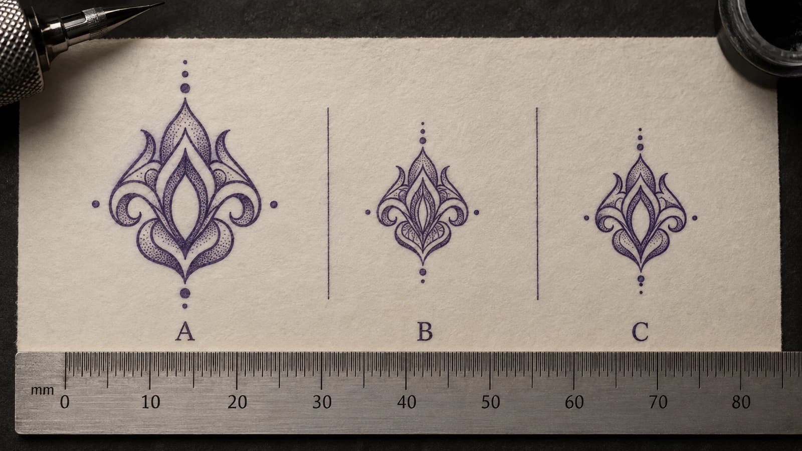
Tattoo Stencil Negative Space Too Tight at Final Size
Diagnose tattoo stencil gaps, counters, and openings that become too tight at intended physical size, then decide what geometry to protect or change.
tattoo stencil negative space · tattoo stencil gaps
Read guide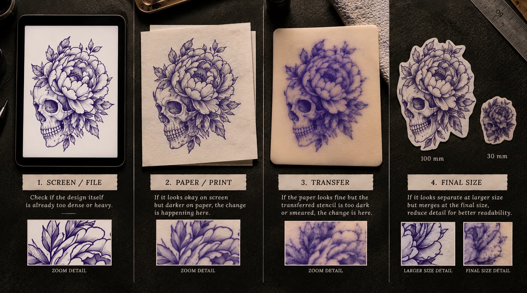
Why Is My Tattoo Stencil Too Dark?
Find where a tattoo stencil first becomes too dark: source, stencil file, print, transfer, or final size, then move to the right next check.
tattoo stencil too dark · dark tattoo stencil
Read guide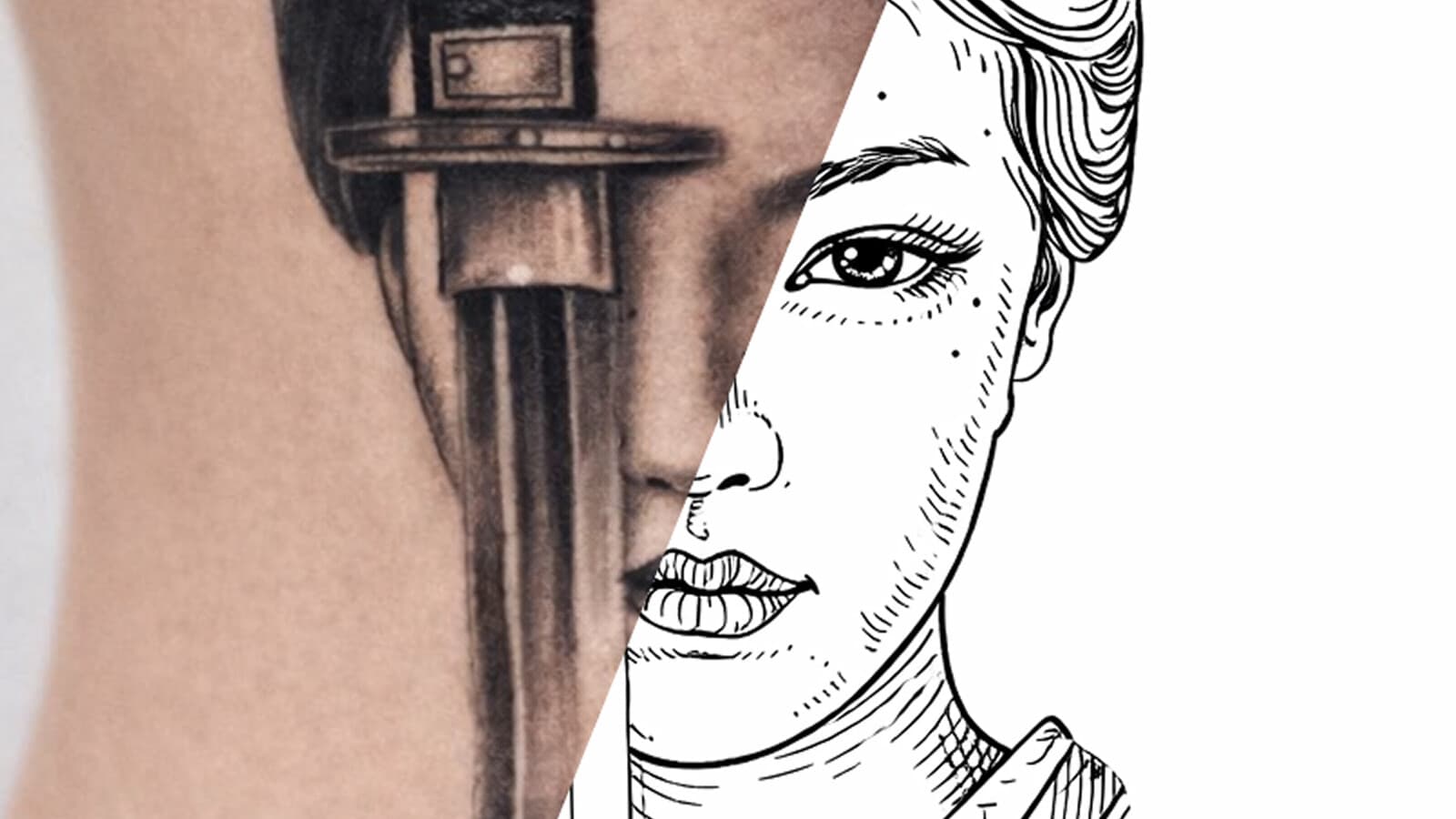
Why Is My Tattoo Stencil Printer Printing Faint Lines?
Diagnose faint tattoo stencil printer output when the stencil is visible on paper but weak. Compare file, final size, preview, paper, and a known test sheet.
tattoo stencil printer faint lines · tattoo stencil printer printing faint
Read guideAuthor
Andrea Mezzadra
Founder and product builder at StencilStudio
Andrea builds StencilStudio and tests how the tools fit into real stencil prep, using real references and outputs to document what works, what changes, and where artist judgment still matters.
In the App
Test the same gap with known printer geometry
Use the Printer Test Sheet to compare fixed gaps, counters, line weights, and dark-mass patterns through the same paper and printer path.