01
Source / design
Is the reference or drawing already dominated by dense dark structure?


Troubleshooting
Find where a tattoo stencil first becomes too dark: source, stencil file, print, transfer, or final size, then move to the right next check.
tattoo stencil too dark · dark tattoo stencil · heavy tattoo stencil · stencil troubleshooting
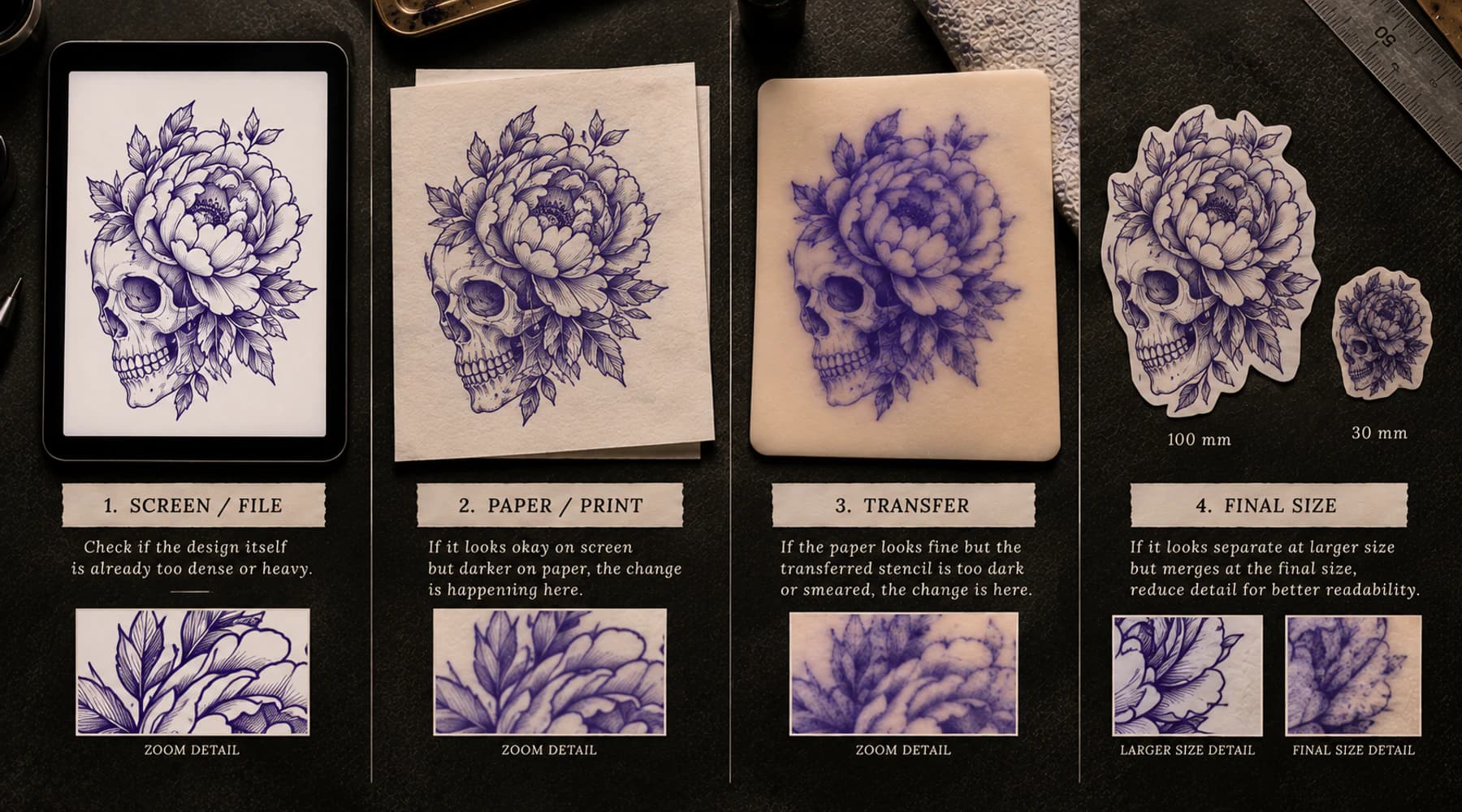
First boundary check
Compare the same stencil at each checkpoint before changing anything. The first checkpoint that becomes visibly heavier is the first stage to inspect, not proof of a single cause.
Screen
Start with source, stencil-file geometry, line weight, density, and negative space.
Inspect file/designPaper
Keep the file fixed. The print path is the first stage that visibly changed the result.
Inspect print stageSkin
Use the paper stencil as the control and stay inside the transfer stage first.
Inspect transfer stageFinal size
Treat physical size as part of the geometry. Gaps can become the limiting feature.
Inspect scale + gapsFive-stage model
01
Is the reference or drawing already dominated by dense dark structure?
02
Did conversion, line weight, thresholding, or resize turn separate marks into a heavy map?
03
Does a clean digital file gain line mass or lose open gaps only on paper?
04
Does a clean paper stencil become thicker, doubled, smeared, or more saturated after contact?
05
Do marks that separate while enlarged visually merge at the intended physical dimensions?
Quick diagnostic map
Dark can mean two different geometries
One thick line and many tightly packed thin lines can both look heavy, but they need different upstream decisions.
Heavy line weight
Few marks, but each mark carries more width.
High mark density
Thin marks can still form a dark zone when too many occupy the same area.
Why final size changes the read
This conceptual diagram shows visual crowding, not a printer simulation. Judge the real file at the intended physical size.
Viewed large
The negative spaces are easy to read.
Same structure compressed
The marks did not get darker; the gaps became less dominant.
A stencil that looks "too dark" does not tell you what caused it.
The useful question is where it first became too dark.
Compare the same stencil at four checkpoints: screen, paper, skin, and intended physical size. If it is already dense on screen, stay upstream. If it changes only on paper, inspect the print path. If the paper is clean and the skin transfer becomes heavy, stay in the transfer stage. If it reads well enlarged but collapses when reduced, treat final size as part of the geometry.
Do not begin by lowering contrast or changing several settings. That can hide the stage that actually changed the result.
Use the first visible mismatch as a routing clue, not as proof of one cause.
This separation matters because the same dark-looking patch can come from different mechanics. Thick individual lines, many thin lines packed together, dense shading marks, a paper output that gains mass, a transfer that spreads or doubles, and a design reduced until its gaps nearly disappear can all look "too black" at a glance.
The fix should follow the stage.
Start by separating line weight from mark density.
Line weight is the width of an individual line. A stencil can look heavy because a few lines are simply too wide for the spaces around them.
Density is how much marked information occupies an area. A stencil can use very thin lines and still become a dark field when many of them sit close together.
That distinction changes what you inspect next.
If single contours are visibly too broad, compare the line treatment. The tattoo stencil line-weight guide shows how Fine, Normal, and Bold affect the same surviving geometry and why the first failure often appears in the white space between marks.
If individual lines are reasonable but entire zones look crowded, inspect the map itself:
When the problem comes from tonal guidance, do not solve it by thinning every contour. The tattoo stencil shading guide separates hard edges, dark-core landmarks, contact shadows, fade direction, and light reserves so the stencil can preserve tonal decisions without tracing every value change.
The source or drawing can be visually dense while the stencil file is still selective. The opposite can also happen: a reasonable source can become an overloaded stencil after conversion.
At the source/design stage, inspect whether the reference gives clear separation between important structures. Deep shadow regions, dense texture, and high local contrast can make it easy to preserve too much information during stencil preparation.
At the stencil-file stage, inspect what the conversion actually produced. Common file-side mechanisms include:
The goal is not to "make it lighter" globally. Preserve the silhouette, recognition landmarks, useful overlaps, hard value boundaries, and directional cues that carry the design. Simplify only where marks compete without adding a distinct job.
If you want file-side evidence at the intended physical width, use the Tattoo Stencil Print Checker. It can inspect fine geometry, dense regions, threshold sensitivity, source sampling, and page fit. It does not simulate your exact printer or predict the skin transfer.
If the finished digital file looks clean but the paper output becomes visibly heavier, the print stage is the first place to inspect.
Keep the file fixed while you compare.
Look for changes such as:
Do not immediately edit the artwork to compensate. First ask whether the paper output is reproducing the file faithfully.
If the exact final-size digital gap is clearly open but paper makes the marks wider, narrows that gap, fills a counter, or closes the separation, use Tattoo Stencil Printer Filling In Gaps?. That focused comparison follows the same region through final file, physical size, print preview, known control geometry, and paper before changing the artwork.
The Tattoo Stencil Printer Troubleshooter handles the broader symptom-first print diagnosis. It separates the finished file, size/layout, paper/feed path, and printer/app layers without pretending that one universal device setting exists.
A fixed control helps here. The Tattoo Stencil Printer Test Sheet gives the printer known line, gap, counter, scale, and dark-mass geometry. If the same controlled geometry also gains excessive mass, keep investigating the physical print path rather than repeatedly simplifying the client stencil.
If the control is clean but only the client file looks heavy, move upstream again and inspect the file at final size.
Printer darkness, density, heat behavior, media handling, companion apps, maintenance, and other controls vary by device. Use the current instructions for the exact printer and paper when a check becomes model-specific. Avoid borrowing a universal temperature, voltage, speed, or density recipe from another setup.
The operational thermal stencil printer guide covers the full file-to-paper workflow. This page only decides when the print stage should become your first investigation.
A clean paper stencil is the boundary control between printing and transfer.
If the paper itself has the expected line width and separation, but the result on skin becomes noticeably heavier, doubled, smeared, or more saturated, do not keep changing the printer first. The first visible change happened downstream.
Compare the same small region on paper and on skin. That can separate a source-density problem from a transfer-stage change much faster than judging the whole design at once.
Possible transfer-stage appearances include:
These observations do not identify one universal cause. They tell you where to continue the diagnosis.
Use the Tattoo Stencil Transfer Troubleshooter to separate the paper stencil, placement, product/surface, contact/movement, and set/handling stages. It deliberately avoids universal product timing or clinical guidance.
For the normal paper-to-skin sequence, use the stencil application guide and the instructions for the exact transfer product. This troubleshooting page stays at the workflow boundary and does not prescribe skin treatment, medical care, or one product for every studio.
A design can look clean at 300 percent zoom and still become visually dense at the size you actually intend to use.
Shrinking the design reduces the physical distance between neighboring marks. The black lines do not need to become darker for the area to read darker. The negative space becomes smaller relative to the linework, so separate marks begin to function like one visual mass.
This is why final size must be checked before you blame contrast or the printer.
Watch the narrowest important spaces first:
Set the intended physical dimensions with the Tattoo Stencil Size & Print Calculator. Then inspect the same file at that size instead of judging an enlarged screen preview.
If the final width is already known, the Print Checker can help identify regions where fine or dense geometry becomes sensitive at physical output size.
Do not use size reduction as a silent global operation. If a smaller version is required, protect the important negative spaces and structural landmarks first. Removing low-priority texture can be safer than thinning every line indiscriminately.
Absolute black coverage is not a quality score.
A stencil can contain intentional black masses and still be clear. A sparse stencil can also be hard to use if the remaining marks do not separate the right structures.
If the actual symptom is the opposite, marks becoming faint, broken, or absent, use the tattoo stencil too-light diagnostic. It follows information loss across source/file, final size, paper, and transfer rather than excess line mass and collapsing negative space.
Before changing the artwork, check whether the impression is being distorted by viewing conditions:
The practical question is whether the map remains readable for its intended job: important marks stay distinct, important negative spaces stay open, and the paper or transfer still matches the decisions in the file.
Do not remove intentional style simply to reduce the amount of black.
A dark stencil is easy to over-correct because several variables can affect the same appearance.
If you change the file, physical scale, printer setting, paper, and transfer method at the same time, a better result tells you very little about which change mattered.
Use a controlled sequence instead:
This is not an industrial protocol. It is simply a way to avoid solving a print problem with an artwork edit or solving a file-density problem with a printer adjustment.
Dark on screen: inspect line weight, shading-map density, or run the finished file through the Print Checker.
Dark only on paper: use Tattoo Stencil Printer Filling In Gaps? when clean final-size geometry gains mass, and use the broader Printer Troubleshooter for other print-path symptoms.
Heavy only after transfer: use the Transfer Troubleshooter.
Dense only at final size: set the real dimensions with the Size & Print Calculator, then re-check the narrowest important gaps.
The phrase "too dark" is the symptom. The first stage where the stencil stops matching the previous checkpoint is the useful starting point.
Related Guides
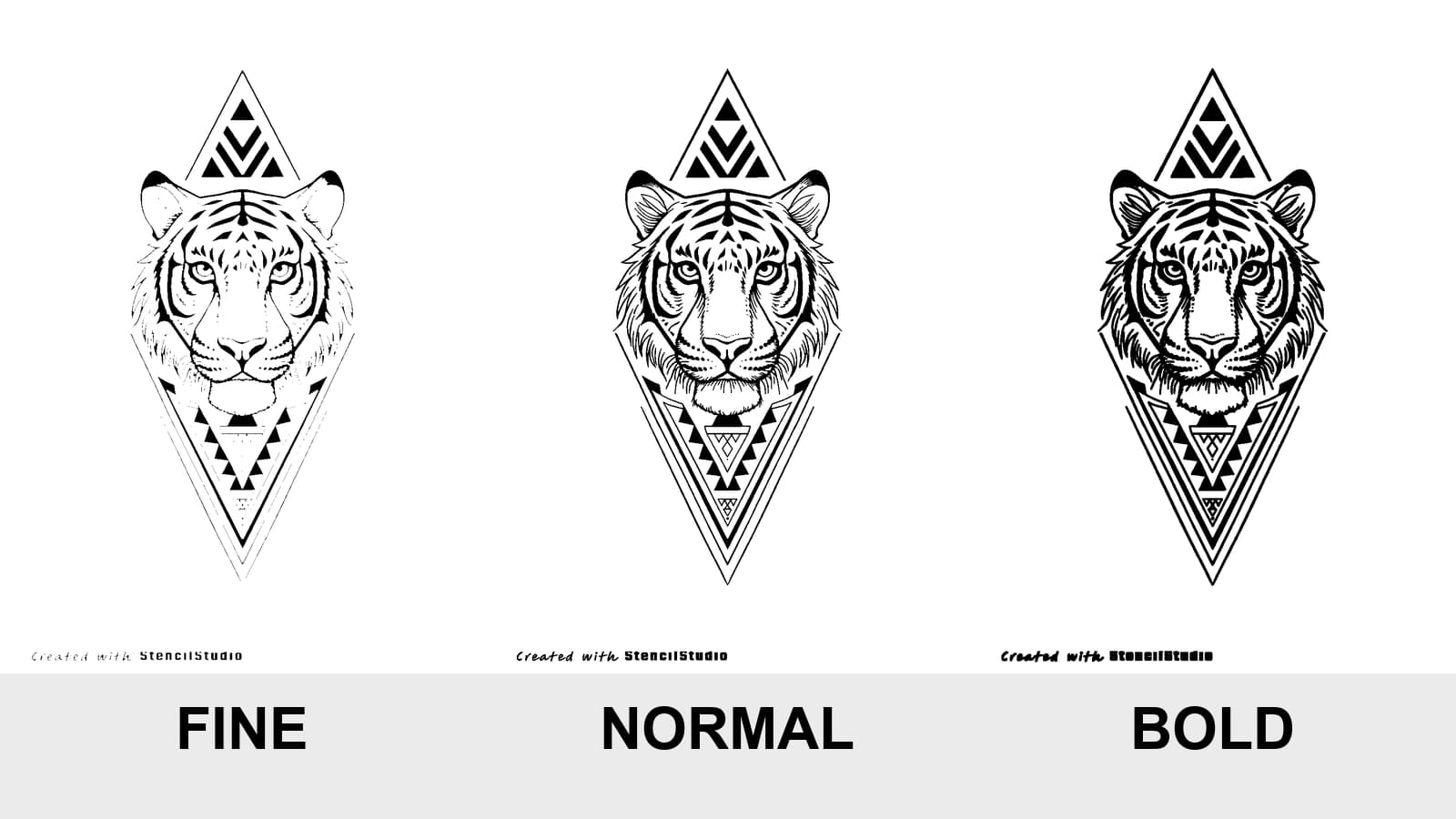
Compare Fine, Normal, and Bold on the same tattoo stencil, see where lines disappear or merge, and test the result at the size you will actually print.
tattoo stencil line weight · fine normal bold stencil
Read guide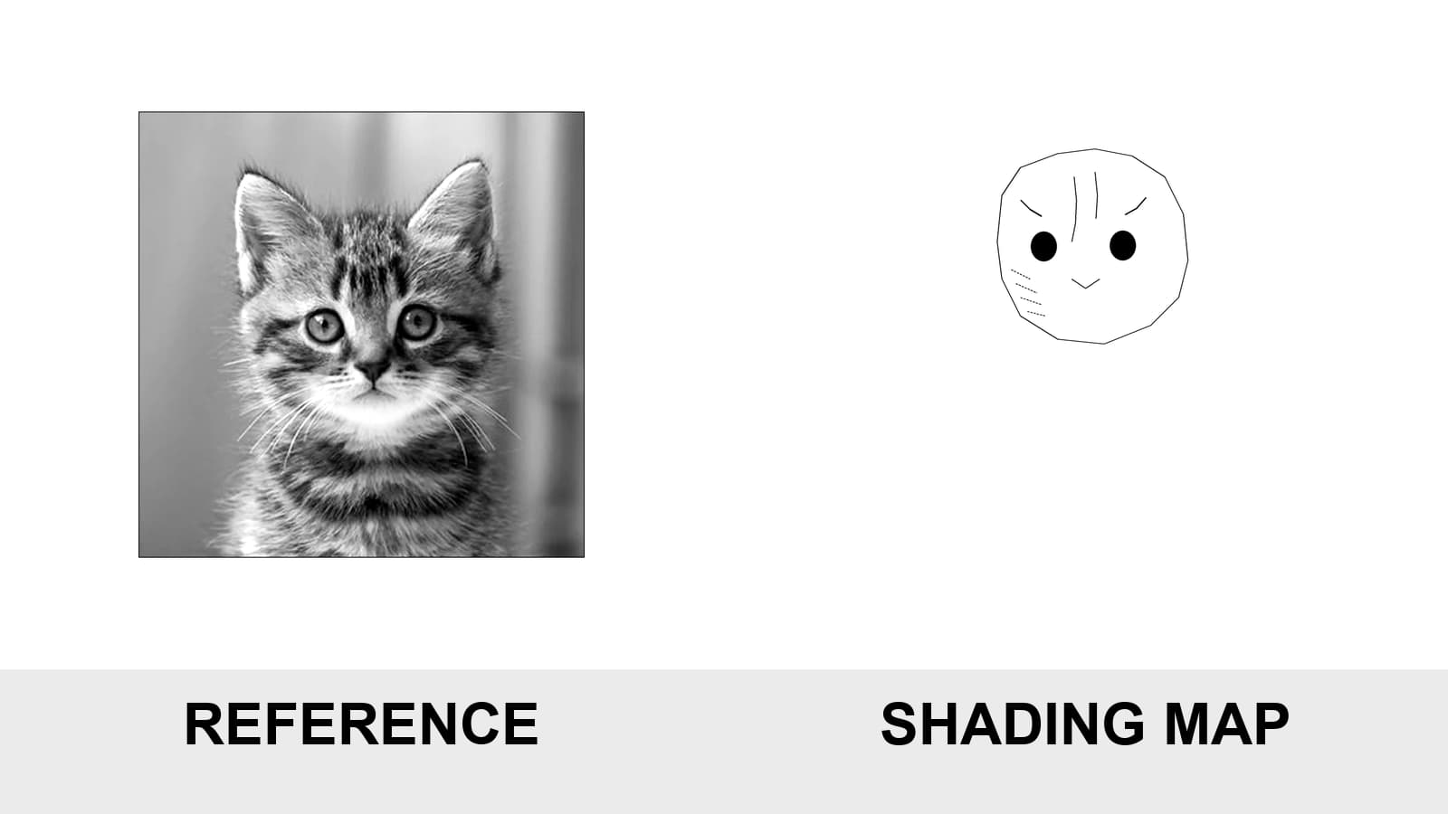
Learn which shadow landmarks belong in a tattoo stencil, how to map hard edges and soft fades, and how to avoid transfers that are either empty or overloaded.
tattoo stencil shading · shading map stencil
Read guide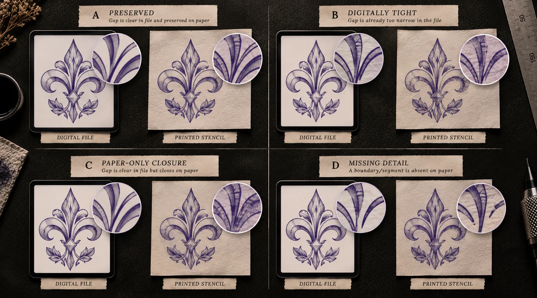
If clean digital stencil gaps close on paper, compare the same final-size geometry through preview, scale, and a known control to find where extra mark mass appears.
tattoo stencil printer fills gaps · tattoo stencil printer lines too thick
Read guideAuthor
Founder and product builder at StencilStudio
Andrea builds StencilStudio and tests how the tools fit into real stencil prep, using real references and outputs to document what works, what changes, and where artist judgment still matters.
In the App
Use the Print Checker when the file itself may be crowded, heavy, or sensitive to final-size output before you change printer or transfer variables.