

Troubleshooting
Tattoo Stencil Negative Space Too Tight at Final Size
Diagnose tattoo stencil gaps, counters, and openings that become too tight at intended physical size, then decide what geometry to protect or change.
tattoo stencil negative space · tattoo stencil gaps · final size readability · tattoo stencil spacing
- August 23, 2026
- 14 min
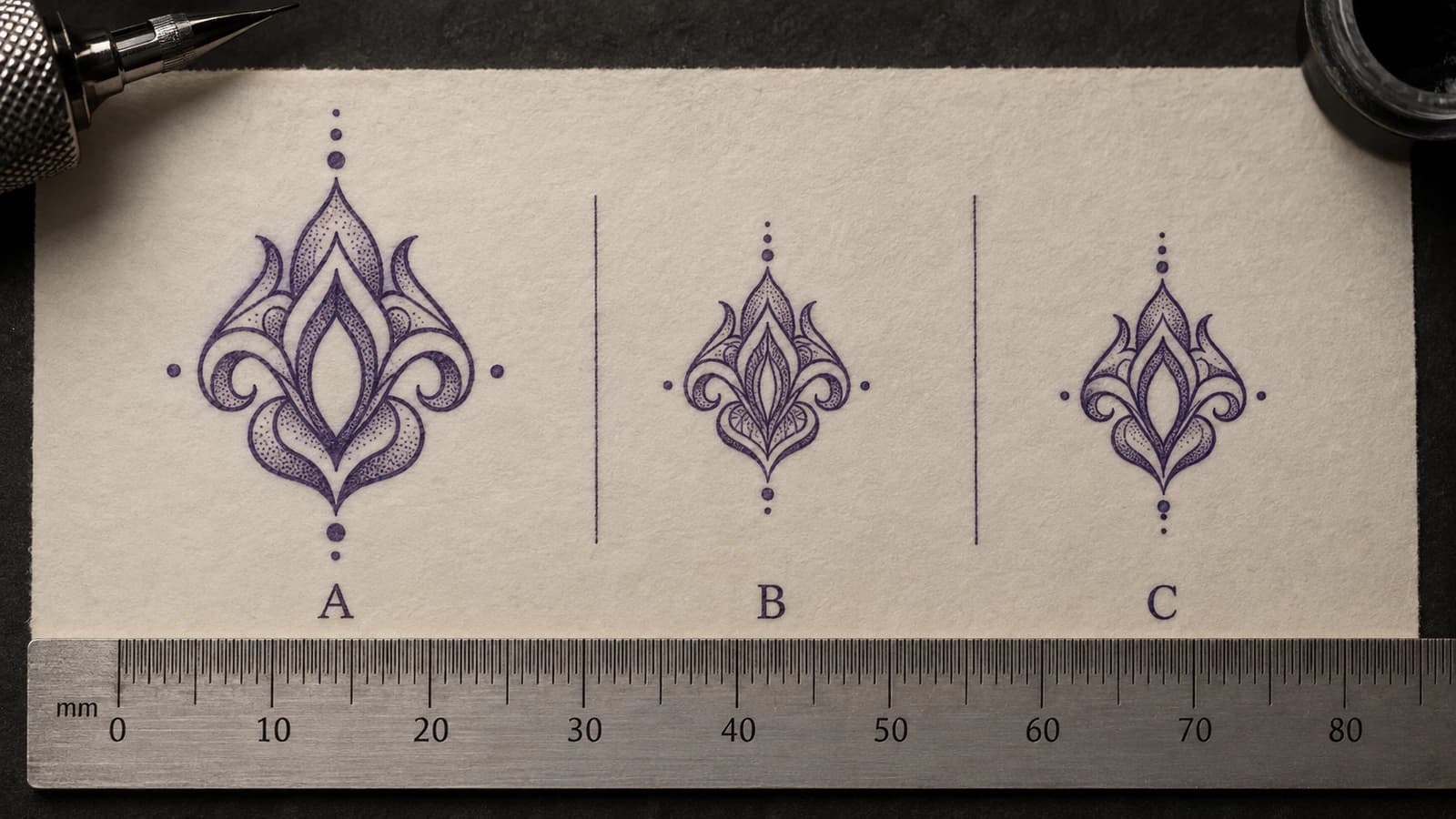
Two lines can both survive reduction while the space between them stops doing its job.
That is the failure this guide is about.
The stencil still contains the intended marks, but one important opening, counter, channel, skin break, or separation becomes so narrow at the planned physical size that separate structures begin to read as one mass. Nothing has to disappear for information to be lost.
Think of the geometry as:
INK / MARK -> OPEN SPACE -> INK / MARK
The open interval is part of the information map. It may tell you that two contours are separate, preserve the hole inside a symbol, keep an eye distinct from surrounding texture, show which petal sits in front, protect a lettering counter, or reserve a strip of light between darker structures.
If that space stops functioning, the stencil has changed even when every black line is technically still present.
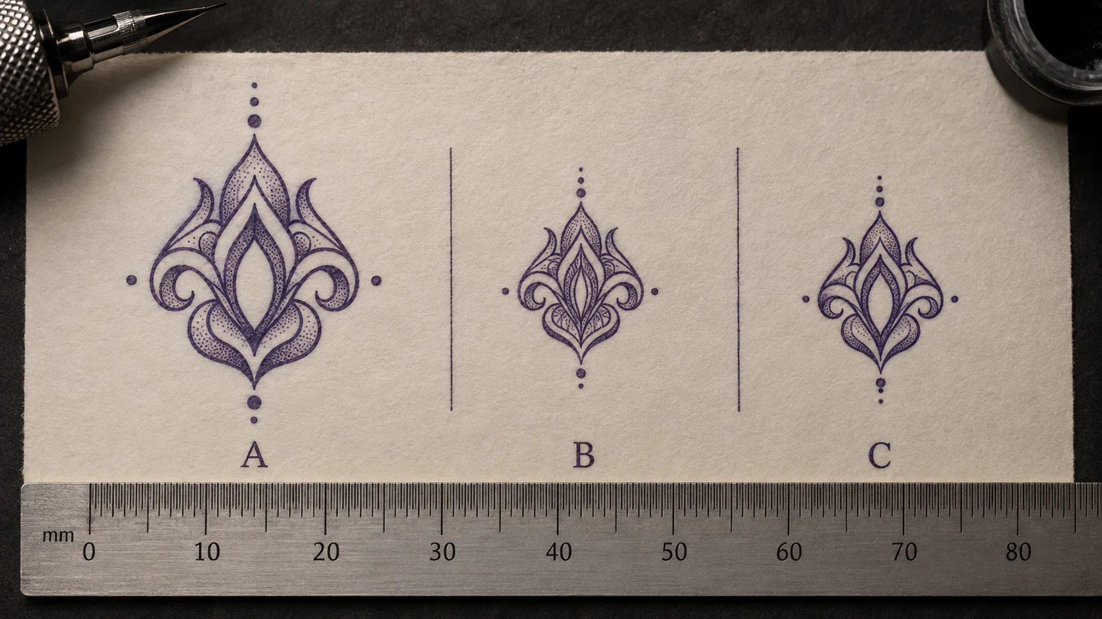
The comparison is conceptual. It does not define a universal minimum gap, line width, tattoo size, printer setting, or skin outcome.
Follow one gap through the workflow
Do not begin by judging the whole stencil as "crowded."
Choose one specific opening that matters and follow it through four checkpoints:
DIGITAL STENCIL -> INTENDED PHYSICAL SIZE -> PRINTED PAPER -> TRANSFERRED RESULT
At each handoff, ask the same question:
Does this exact open space still read as a separate space?
That produces four materially different diagnoses.
The gap is already too tight in the digital stencil
The geometry itself is the first failing state.
The printer is not the first thing to fix. Inspect whether the gap is being consumed by line mass, neighboring information, local spacing, or a design that simply needs more physical room.
The gap looks comfortable while enlarged but fails at intended size
Reduction changed the practical relationship between the marks and the available open space.
This is the central final-size negative-space problem. The useful edit is local: protect the opening that carries structure instead of automatically changing every line in the stencil.
The target-size digital gap is clearly open, but paper closes it
Keep the digital file as your baseline.
A safe target-size opening that becomes materially narrower or closed only on paper is evidence that the physical output changed the geometry. Use the Tattoo Stencil Print Checker to confirm the finished file and target dimensions, then move into the Printer Troubleshooter rather than silently redesigning the artwork first.
If stronger structure survives but a specific feature disappears or breaks on paper, Tattoo Stencil Print Missing Details handles that selective paper-output failure.
Paper is clean, but transfer closes or doubles the gap
The design and print have already passed the comparison.
If the opening changes only after paper reaches skin, continue with the Transfer Troubleshooter. If the change looks like spread, drag, merging, or a second impression rather than simple loss of spacing, the stencil smudging diagnostic helps classify the visible geometry.
Do not keep thinning the source file to compensate for a downstream change you have already isolated.
Negative space carries different kinds of information
Not every white interval deserves equal protection.
A useful edit starts by asking what would become ambiguous if the gap closed.
Identity and recognition gaps
These are openings whose loss changes what the subject looks like rather than merely making it busier.
Examples include:
- the separation around an eye inside surrounding portrait or pet texture;
- the distinction between a nostril mark and the nose-base contour;
- a lip opening that keeps two mouth contours from becoming one band;
- the space separating jaw from neck;
- a muzzle, eye, or ear opening in a pet portrait.
When one of these gaps is failing, low-priority texture nearby is often a better simplification candidate than the identity-defining structure itself.
Structural gaps
These tell you how forms relate.
Examples include:
- a thin opening between overlapping petals;
- the channel between two ornamental loops;
- a cutout inside a symbol;
- the separation between a foreground contour and a background contour;
- a narrow interval that establishes front-versus-back order.
If the gap closes, both marks can remain visible while their relationship becomes unclear.
Lettering counters and apertures
A counter is an enclosed or partly enclosed opening inside a letterform. A word can remain recognizable after one counter has become a pinhole, so whole-word recognition is a poor local test.
Inspect the smallest important counter, join, and aperture in the actual wording. If lettering is the main job, How Small Can Tattoo Lettering Be? goes deeper into counters, repeated verticals, joins, spacing, and word-level readability.
Highlight and tonal reserves
Some stencils deliberately leave an unmarked strip between darker structures to preserve a light landmark or tonal separation.
That reserve does not need to be large to matter. If its job is to stop two dark structures becoming one visual mass, judge whether the reserve still performs that separation at final size.
Texture gaps
Fur, hair, feathers, scales, hatching, and repeated decorative marks often create many small skin breaks.
Some are meaningful directional cues. Others repeat information that stronger marks already communicate.
When space becomes scarce, protect the few gaps that keep the texture organized before protecting every repeated interval equally.
Run a final-size gap check
Use one candidate stencil and one intended physical size. Keep the comparison controlled.
1. Fix the intended physical dimensions
Do not judge a gap from whatever size the editor happens to display.
If the target dimensions are still uncertain, set or verify them with the Tattoo Stencil Size & Print Calculator. The question on this page starts after you have a real intended width or height.
2. Find the smallest important opening
Ignore the largest white region in the composition.
Look for the smallest gap whose closure would change recognition, structure, ordering, lettering anatomy, or a deliberate light reserve.
Typical candidates are:
- eye or nose separations;
- lettering counters;
- ornamental channels;
- petal overlaps;
- small symbol cutouts;
- parallel geometric intervals;
- skin breaks inside dense fur, feather, hair, or hatch clusters.
3. Compare enlarged view with final size
Zoom is useful for locating geometry. It is not proof that the geometry works physically.
At 400 percent zoom, a narrow white strip can occupy a large part of the screen. Zoom enlarged the lines and the gap together. It only proves that white pixels exist.
Reduction changes how much physical room the same relationship occupies on paper.
A technically white strip can therefore survive in the file and still become a poor practical separator at the intended output size.
Use the final-size view as the decision point. If your software cannot give you a trustworthy physical reference, compare with an actual-size plain-paper output after confirming scale.
4. Compare the gap with the marks around it
Do not ask for a magic millimetre number.
Ask relational questions instead:
- Is the gap visually distinct from the surrounding line mass?
- Does it remain open when you stop staring directly at it?
- Does the opening still separate the two structures it is supposed to separate?
- Is a secondary line consuming space that a primary relationship needs?
- Does one side of the gap become much heavier than the other?
- Does a neighboring low-priority mark make the opening fragile?
The same physical distance can behave differently inside different line weights, densities, shapes, printers, and stencil purposes. A universal safe-gap number would hide those differences rather than solve them.
5. Change one relationship and compare again
Make one controlled variant.
Useful tests include:
- remove one low-priority neighboring mark;
- reduce one repeated texture cluster;
- move or re-space one local contour;
- selectively reduce the mass of the line that is consuming the opening;
- increase the whole design size;
- simplify nearby geometry while keeping the important gap fixed.
Then compare the same opening at the same physical size.
If one local change restores the separation, you have stronger evidence than a global "looks cleaner" judgment.
Four problems that can look almost identical
A dark or cramped patch is not enough to tell you what changed.
| Observation | First check | Likely problem class | Next action | |---|---|---|---| | Many regions lose separation together | Does the whole design contain more information than this size can support? | Overall information density | Use Tattoo Stencil Too Detailed for the Final Size and simplify by information priority. | | Individual strokes are visibly too heavy for the spaces around them | Does the same geometry improve when only line mass changes? | Line-weight decision | Compare the Line Weight guide rather than deleting information immediately. | | One important opening becomes fragile while surrounding structure remains valid | Does that specific gap still perform its structural job at intended size? | Local negative-space failure | Protect or reopen that gap with a local geometry, information, or size change. | | Digital final-size gap is comfortably open, but paper materially narrows or closes it | Does the same gap change only after printing? | Physical reproduction mismatch | Keep the digital baseline fixed and investigate the print path. |
There is a fifth visual cousin: a globally heavy stencil where you have not yet established whether density, line mass, print, transfer, or final size caused the appearance. Use Why Is My Tattoo Stencil Too Dark? when the symptom is broad darkness rather than one identified opening.
Local gap failure versus overall over-detail
These two often appear together, but they ask different questions.
Suppose a portrait has forty secondary marks packed around both eyes, nose, mouth, and hairline. Several regions become difficult to separate at final size. That is a broad information-density problem. Start with the too-detailed-for-size diagnostic.
Now suppose the same stencil is otherwise clean, but the tiny opening between two nose contours almost disappears. The constrained object is one specific gap.
The distinction matters because the edits differ.
For overall density, you may need to simplify an information family across a region.
For one failing gap, deleting unrelated detail elsewhere does not fix the geometry that is actually constrained.
Local gap failure versus line weight
Line weight and negative space are coupled, but they are not the same variable.
If the right marks are present and one or more individual strokes carry too much mass, reducing that line mass can reopen surrounding space. The Line Weight guide is the better reference for Fine, Normal, and Bold decisions.
But a gap can remain too tight even when every line is individually reasonable.
Imagine two Normal-weight contours placed almost on top of each other. Switching both to Fine may create a little room, but the relationship can still be poorly spaced. Or it may weaken the primary contour just to rescue a secondary one.
That is why the question is not simply "Can thinner lines create white pixels?"
It is "Which relationship should change so this opening still communicates its job?"
Why globally thinning everything can be the wrong fix
One cramped opening creates a strong temptation to make the complete stencil finer.
Sometimes that helps. It is not a safe default.
Global thinning can:
- weaken primary contours that were already correct;
- flatten the hierarchy between structural and secondary marks;
- make short or isolated marks more fragile elsewhere;
- preserve too many low-priority marks instead of reducing the local information load;
- solve the appearance of one gap while creating a reproduction problem in another region.
Compare that with a selective edit.
If removing one secondary hatch reopens the white landmark beside an eye, the edit preserved more useful information than thinning the eye contour, nose contour, silhouette, lettering, and ornamental structure everywhere else.
If two repeated fur strokes are occupying the only clean opening around an eye, keeping one directional cue may preserve both the texture direction and the eye separation.
If a decorative loop contains one extra internal accent that pinches its counter, remove or move that accent before weakening the full ornamental skeleton.
If the opening itself is part of the symbol's identity, increasing the design size may be more honest than forcing every surrounding line toward minimum weight.
Six real final-size examples
Portrait: nose structure survives, separation does not
Two nose-base marks are both present in the digital stencil. At editing zoom, they look clearly separate.
At the intended physical size, the white interval between them becomes a slit. The nose still contains both lines, but the form reads as one dark unit instead of two related edges.
First decide whether a nearby crease, texture mark, or shadow boundary is consuming space that the nose relationship needs. If the two structural contours themselves are the problem, re-space or simplify that local construction rather than thinning the whole face.
Pet portrait: coat texture invades the eye opening
The eye contour is correct, but several short fur marks terminate very close to it.
At final size the eye no longer has a clean open boundary and begins to merge visually into the coat texture.
The highest-value change may be to remove one or two repeated fur strokes around the eye while leaving the main eye contour alone.
Lettering: the counter becomes a pinhole
The internal opening of a letter still exists as white pixels in the file.
At the intended word width, that counter becomes so small that it no longer reads confidently as an opening. The rest of the word remains readable, which can hide the local failure.
Compare a version with a locally opened counter, adjusted join, reduced nearby flourish, or larger final width. Do not treat a recognizable word as proof that every letterform survived.
Ornamental: two loops become one dark knot
Two decorative paths remain separate while enlarged.
After reduction, the channel between them narrows until the center reads as one knot of inked guidance. The outer ornament still looks correct.
Protect the channel. Removing one secondary interior accent or slightly re-spacing the loops may preserve more hierarchy than changing every stroke in the ornament.
Floral: a petal overlap loses front-versus-back order
Two petal contours are both present, but the negative separation that made the overlap obvious almost disappears.
The flower does not necessarily become darker everywhere. One local relationship becomes ambiguous.
Preserve the overlap-defining gap before preserving tertiary vein marks inside the same petals.
Geometry: parallel lines stay technically distinct
A set of parallel contours never touches in the file.
At final size the intervals become so narrow that the group reads as one heavy band from a normal viewing distance.
This is a good case for comparing three variants: current geometry, selectively increased spacing, and reduced line mass. The result tells you whether spacing, line weight, or overall information count is the first useful lever.
Protect high-information gaps before low-priority texture
When several openings are at risk, rank them by what they carry.
A practical order is:
- Recognition: gaps that keep the subject, face, pet feature, word, or symbol specific.
- Construction: gaps that preserve overlap, direction, front/back order, or distinct contours.
- Letter anatomy: counters, apertures, joins, and repeated vertical separations when text matters.
- Light structure: intentional open reserves separating darker masses.
- Texture rhythm: skin breaks that keep fur, hair, feathers, hatching, scales, or ornament organized.
- Redundant texture: repeated small intervals whose removal changes little because stronger cues already carry the same information.
This is not a universal artistic hierarchy. A texture-driven tattoo may deliberately promote a texture gap into primary structure. The purpose of the ranking is to make the tradeoff explicit for the design in front of you.
Ask one useful question for each opening:
If this gap disappeared, what decision would become harder?
If the answer is recognition, construction, letter identity, or a major tonal separation, protect it before a nearby interval that only repeats surface texture.
When the right answer is to make the design larger
Selective simplification has limits.
If the smallest important opening remains fragile after lower-priority neighboring information is removed, the design may simply need more physical room.
That is especially true when the constrained gap is part of the subject's identity or construction and cannot be widened without changing the design more than an increase in scale would.
Do not use "make it bigger" as a reflex, but do not treat local thinning as proof that every concept can be compressed indefinitely either.
The Size & Print Calculator can help compare candidate physical dimensions. It does not decide the correct artistic size for you.
Paper output is a separate checkpoint
A final-size digital comparison is necessary because it gives you a baseline before printer variables enter the chain.
Suppose the gap is clearly open in the finished file at the intended dimensions. You print the same file and the paper version materially narrows the opening.
Do not immediately enlarge the gap in the artwork.
First compare a known control or the same region across another print path if available. The Printer Troubleshooter and Printer Test Sheet are built for this stage separation.
If the physical marks are present but pale rather than geometrically closed, use the printer faint-lines guide. Faintness and gap closure can coexist, but they are different observations.
A clean digital baseline protects you from repeatedly modifying good geometry to chase a paper-only reproduction change.
Use the first failing gap as the constraint
Do not search the whole design for a generic amount of "breathing room."
Find the first important opening that stops functioning at the intended physical size.
Then identify what is consuming it:
- excessive local information;
- one heavy neighboring line;
- spacing that is too tight even with reasonable line mass;
- a final size that gives the relationship too little room;
- or a physical print or transfer stage that changed a gap which was safe digitally.
The correction follows that evidence.
A stencil can keep every black line and still lose information because the white space between those lines stopped functioning.
Related Guides
Keep reading from here
Tattoo Stencil Too Detailed for the Final Size
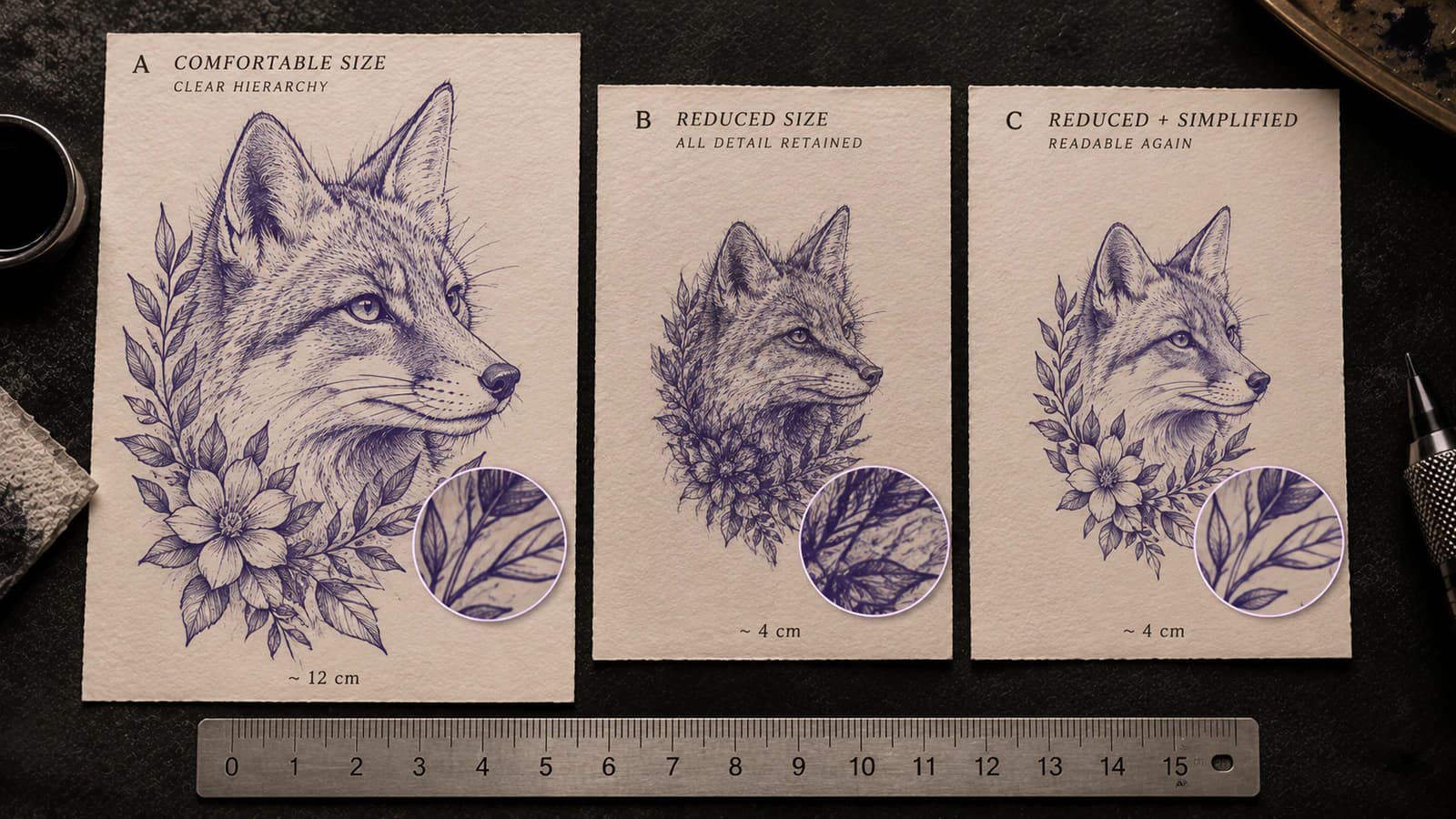
Tell whether a tattoo stencil has too much information for its intended physical size by checking line separation, gaps, landmarks, and texture before printing.
tattoo stencil too detailed · final size readability
Read guide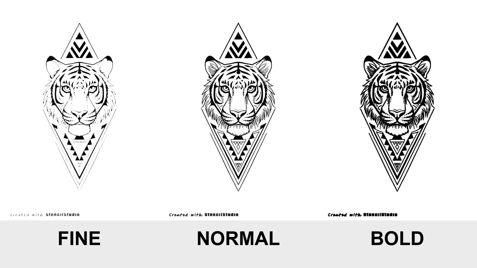
Tattoo Stencil Line Weight: Fine vs Normal vs Bold
Compare Fine, Normal, and Bold on the same tattoo stencil, see where lines disappear or merge, and test the result at the size you will actually print.
tattoo stencil line weight · fine normal bold stencil
Read guide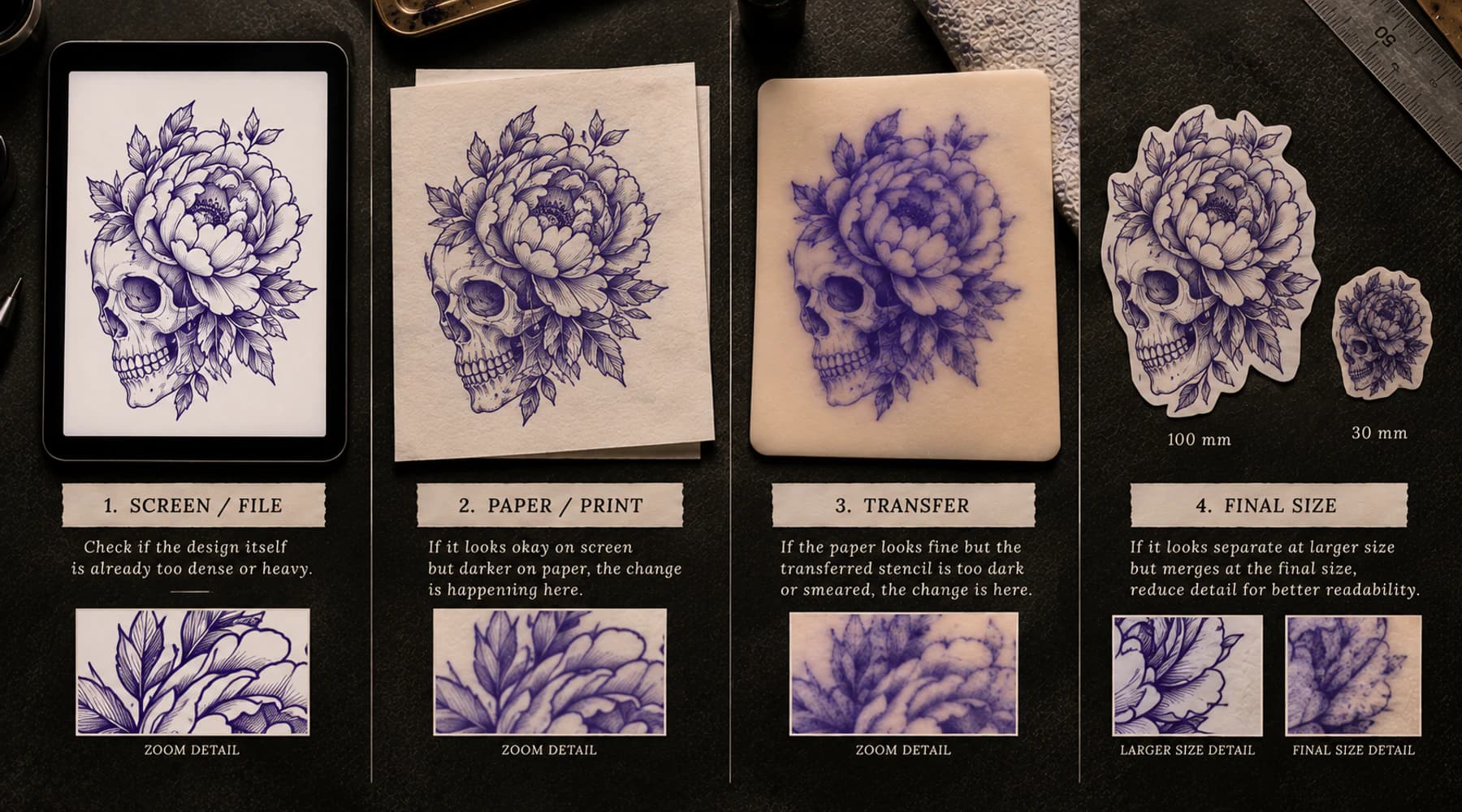
Why Is My Tattoo Stencil Too Dark?
Find where a tattoo stencil first becomes too dark: source, stencil file, print, transfer, or final size, then move to the right next check.
tattoo stencil too dark · dark tattoo stencil
Read guideAuthor
Andrea Mezzadra
Founder and product builder at StencilStudio
Andrea builds StencilStudio and tests how the tools fit into real stencil prep, using real references and outputs to document what works, what changes, and where artist judgment still matters.
In the App
Check the gap at the physical size you intend to print.
Set the intended dimensions, inspect tight geometry in the finished file, and separate a design-side gap problem from a paper-output change.