

Reference Troubleshooting
Is My Tattoo Reference Photo Too Dark?
Diagnose a dark tattoo reference before stencil prep. Separate usable dark tones from crushed shadows, weak local separation, and genuinely missing source detail.
dark tattoo reference · tattoo reference photo too dark · underexposed tattoo photo · tattoo stencil source quality
- August 19, 2026
- August 23, 2026
- 8 min
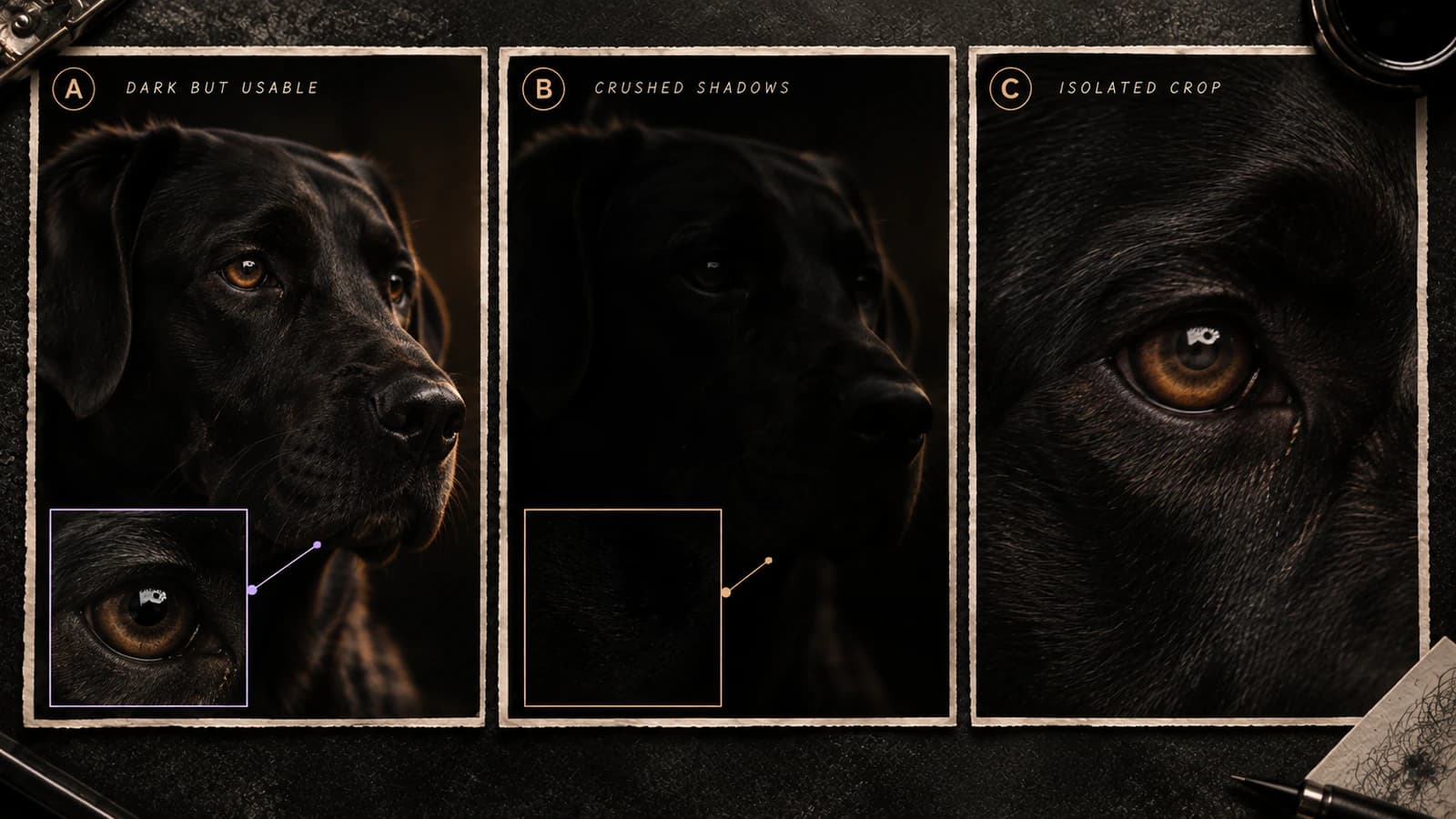
Dark-source triage
Is the reference dark, or has useful shadow information actually collapsed?
Start from the darkest region that contains a feature you need. The decision is about local separation, not whether the whole photo looks bright enough on your display.
A
Dark, but shapes still separate
Low brightness alone is not the failure. Inspect the exact subject crop and the landmarks that must survive.
Check separationB
Several forms become one shadow block
The important issue is local separation. Brightening may expose existing tone differences, but it cannot prove missing structure.
Check shadow evidenceC
Only the background is very dark
Crop before judging the source. A large black background can make the whole file look worse than the actual subject region.
Crop the subjectD
One key feature disappears in shadow
Treat that region locally. An otherwise usable source can still fail when one recognition-critical landmark is ambiguous.
Inspect the landmarkSame darkness, different information
Look for separation inside the shadows.
Two regions can both look nearly black while one still contains usable boundaries and the other has collapsed into an ambiguous mass.
Dark but separable
The region is dark, but several tonal bands and boundaries still exist to describe form.
Shadow detail collapsed
Several forms occupy nearly the same dark range. More brightness may make the block lighter without restoring its internal map.
Whole frame vs useful crop
Do not let background darkness answer a subject question.
Crop first when the subject occupies only part of the frame. A focused region is a better place to judge whether important contours and landmarks survive.
Crop changes the question
A dark background can dominate the full frame while the subject itself remains well separated. Judge and measure the region that could actually become the tattoo.
Quick classification map
A dark photo is not automatically a bad tattoo reference. What matters is whether you can still separate the shapes the tattoo depends on inside the shadows.
A portrait can be dark overall and still show the eyelids, nose, mouth, jaw, and hairline clearly. Another photo can look only slightly darker but lose an eye, ear, pet marking, or overlap inside one nearly black patch.
Before brightening the whole image, inspect the darkest important part first.
Start with the darkest important area
Choose the shadowed region that would actually matter to the stencil: an eye, muzzle, jaw, fold, letter, logo opening, flower overlap, or other defining shape.
Then ask:
- Can I still tell the important shapes apart? The photo may simply be dark but usable.
- Have several shapes merged into one flat dark block? The reference may no longer show enough separation there.
- Is only the background dark while the subject is clear? Cropping may solve most of the problem.
- Does a modest exposure or shadow adjustment make existing boundaries easier to see? That can help inspection.
- Does brightening only turn a black block into a grey block? No useful structure was recovered.
That last test is the most important. A brighter image can be easier on the eyes without becoming a better reference.
Dark is not the same as detail being lost
Dark tones can still contain plenty of usable information.
Imagine a black jacket where you can still see the lapel, folds, seams, and a hand crossing in front. The region is dark, but the shapes remain separate.
Now imagine the shadow side of a face where the eye socket, cheek, hair, and ear all merge into one patch. That is a different problem. The issue is not simply low brightness; it is that the boundaries you need are no longer clear enough.
A useful practical distinction is:
- Dark but readable: important forms still separate from each other.
- Dark and crushed: several important forms merge together and their boundaries become uncertain.
The Tattoo Reference Photo Quality Checker can inspect tonal spread, local contrast, and near-black clipping in the full image or a selected area. If the problem is instead a smeared, doubled, or soft edge, use the blurry tattoo reference diagnostic.
Judge the difficult area, not the whole photo
A photograph can contain bright highlights and still hide one critical region in shadow.
This happens often with side lighting, bright windows, dark clothing, black fur, or a dark background. The overall image can look well exposed while the exact feature you need is nearly lost.
Examples:
- a portrait with a bright forehead but one eye and side of the nose disappearing into shadow;
- a black dog where the coat looks fine but the eye socket and muzzle merge together;
- a flower where the petals are bright but overlapping leaves become one dark mass;
- a mechanical reference where polished highlights are clear but two dark components have no visible edge between them;
- lettering on dark fabric where the characters and fabric are too similar in tone to separate cleanly.
Judge the part that will actually control the tattoo, not the average brightness of the full frame.
Crop before deciding the photo is too dark
Background can make a usable subject look worse than it is.
Crop to the face, pet, object, lettering, or other region that could actually become the tattoo. Then inspect that crop on its own.
A tighter crop helps because it:
- removes irrelevant dark or bright background;
- makes the important region easier to inspect;
- lets tools measure the area you actually care about instead of averaging it with the rest of the photograph.
For the broader reference-preparation workflow, including crop, blur, compression, missing landmarks, simplification, and final-size review, use How to Make Tattoo Stencils From Photos.
For a human portrait, once the dark areas are clear enough to trust, How to Prepare a Portrait Photo for a Tattoo Stencil covers choosing the main reference and using alternate photos to check uncertain features.
Brightening can reveal what is there, but it cannot invent what is missing
Exposure and shadow adjustments are useful when the image already contains subtle differences that are simply hard to see on screen.
A controlled adjustment may make a real eyelid, fold, contour, or overlap easier to inspect. But aggressive editing can also amplify:
- sensor noise;
- compression blocks;
- color noise in shadows;
- sharpening halos;
- banding;
- artificial local contrast;
- enhancer-generated texture.
Keep the untouched photo beside the edited version. If a new boundary appears only after aggressive processing, look back at the original before treating that boundary as trustworthy.
A simple rule works well: if brightening reveals a boundary that was faintly present, useful; if it creates a convincing boundary where the original was featureless, be cautious.
Protect the landmarks that actually matter
A dark reference becomes risky when the tattoo depends on a feature that you cannot place confidently.
For a portrait, check especially:
- the eye corner on the shadow side;
- the mouth edge disappearing into facial hair;
- the jaw merging into a dark collar or background;
- the ear boundary disappearing into hair;
- the nostril and nose base merging into one dark patch.
For a pet portrait:
- one eye disappearing into dark fur;
- the muzzle edge merging into the neck;
- coat markings losing their boundary;
- the ear silhouette blending into the background.
For ornamental work, logos, or objects:
- internal openings closing into a dark mass;
- overlaps where you can no longer tell which element sits in front;
- repeated dark components merging together;
- narrow light gaps disappearing between two dark forms.
If an important feature has several plausible shapes, increasing contrast does not tell you which shape was correct. Find another source or make the artist's interpretation an explicit design choice.
A dark background and a dark subject are different problems
A black background is not a problem when the subject still separates clearly from it.
The harder case is a dark subject against a similarly dark background. Then the silhouette itself can disappear even when some internal detail is still visible.
Check two things separately:
- Subject against background: can you see where the tattoo subject ends?
- Inside the subject: can you still see the landmarks, gaps, and overlaps you need?
A reference can pass one check and fail the other.
Shadow detail and stencil shading are separate decisions
A dark photograph can contain many tonal transitions that should never become stencil lines.
First decide whether the reference is clear enough. Then decide which shadow information is actually useful in the stencil.
The tattoo stencil shading guide covers that next step: keeping useful dark landmarks, hard boundaries, contact shadows, fade direction, and light reserves without tracing every tonal change.
Do not react to a dark reference by outlining every visible shadow edge. That usually creates a crowded stencil instead of fixing the source problem.
Final tattoo size changes which shadow detail matters
Some real detail may be visible in the photograph but unnecessary at the intended tattoo size.
A subtle cheek transition that helps a 20 cm portrait may not need a separate stencil cue at 7 cm. At the same time, a small eye landmark can remain essential even when surrounding skin texture is removed.
Ask both:
- Can I see this detail clearly enough?
- Does this detail need to survive in the stencil at the planned size?
The Tattoo Reference Photo Quality Checker can inspect the selected crop in intended-size context. For exact physical dimensions and 1:1 print output, use the Tattoo Stencil Size & Print Calculator.
Compare the same dark area before and after editing
Pick one difficult area and keep looking at that same area through the workflow.
For example, choose the shadow-side eye in a portrait or the dark muzzle of a pet. Compare it in:
- the untouched original;
- a tighter crop;
- a basic exposure or shadow adjustment;
- any denoise or enhancement pass;
- the first stencil draft.
This prevents an easy part of the photo from making the edit feel successful while the actual problem area remains unresolved.
It also makes invented enhancement detail easier to spot.
Ask for a better source when the key shape is still unclear
Sometimes the fastest fix is another photo, not another edit.
Look for:
- the original camera file instead of a compressed social download;
- another frame from the same shoot;
- a second photo with light from a different direction;
- another angle that separates a hidden contour;
- the original artwork instead of a dark screenshot;
- another approved reference that clarifies only the missing feature.
A second image can help you understand a hidden shape, but do not silently replace the client's chosen pose, expression, or identity-specific details with a different photograph.
If you are organising several references before the design is settled, the Tattoo Reference Board Maker can keep the main reference and supporting images clearly separated.
Do not confuse a dark reference with a dark stencil
These are different stages and need different fixes.
- Dark reference: can you still distinguish the shapes you need in the photo?
- Dark digital stencil: have too many marks, heavy line weight, dense shading cues, or closed negative spaces made the stencil itself too heavy? Use the too-dark stencil diagnostic.
- Dark paper output: if the digital stencil is clean but the printed result gains too much mass, move into printer troubleshooting.
Brightening the original photo is not a meaningful fix for a stencil that became too dense later in the workflow.
A quick decision rule
Use three outcomes:
Dark but readable: the important shapes still separate. Keep the reference, crop deliberately, and continue.
Dark but uncertain: a modest adjustment reveals some structure, but one or more important features remain questionable. Compare with the original and look for another real reference before locking those shapes into the stencil.
Dark with key detail lost: the required forms have merged into a flat or artifact-heavy region. Prefer another source or a conscious artist interpretation rather than treating stronger contrast as recovered detail.
The goal is not to make every reference bright. It is to know whether the tattoo's important shapes are still visible clearly enough to work from.
Related Collections
Jump from the guide to reviewed stencil examples
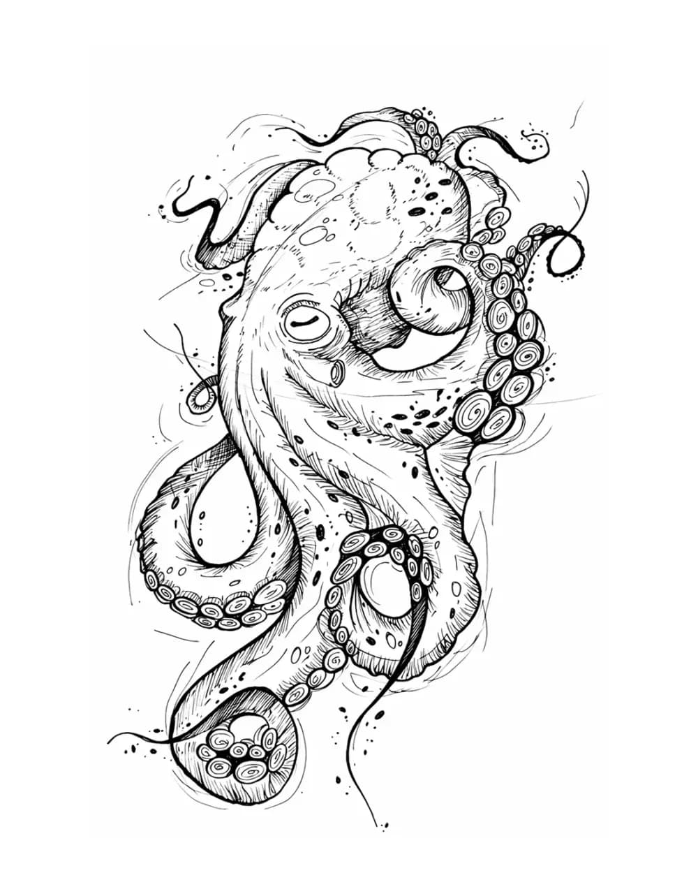
Animal Tattoo Stencil Gallery
12 curated examplesCompare 12 curated animal tattoo stencil examples across wildlife, pets, birds, and sea life. Start with the animal silhouette and recognition landmarks, then compare ho…
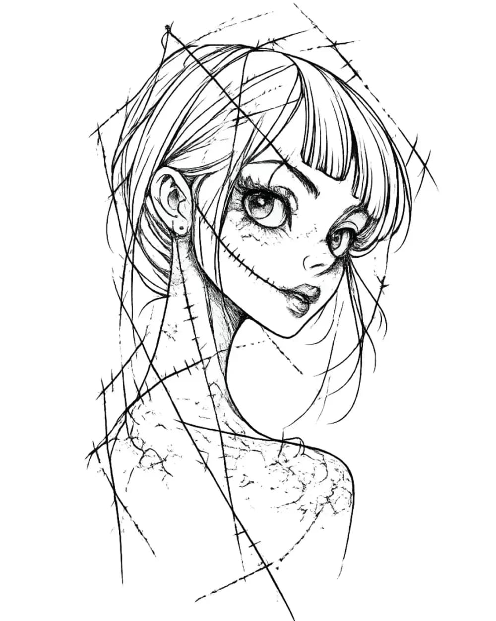
Portrait & Figure Tattoo Stencil Examples
9 curated examplesCompare first-party portrait, face, and figure tattoo stencil examples to see which recognition anchors, expression cues, body shapes, and detail clusters need to surviv…
Related Guides
Keep reading from here
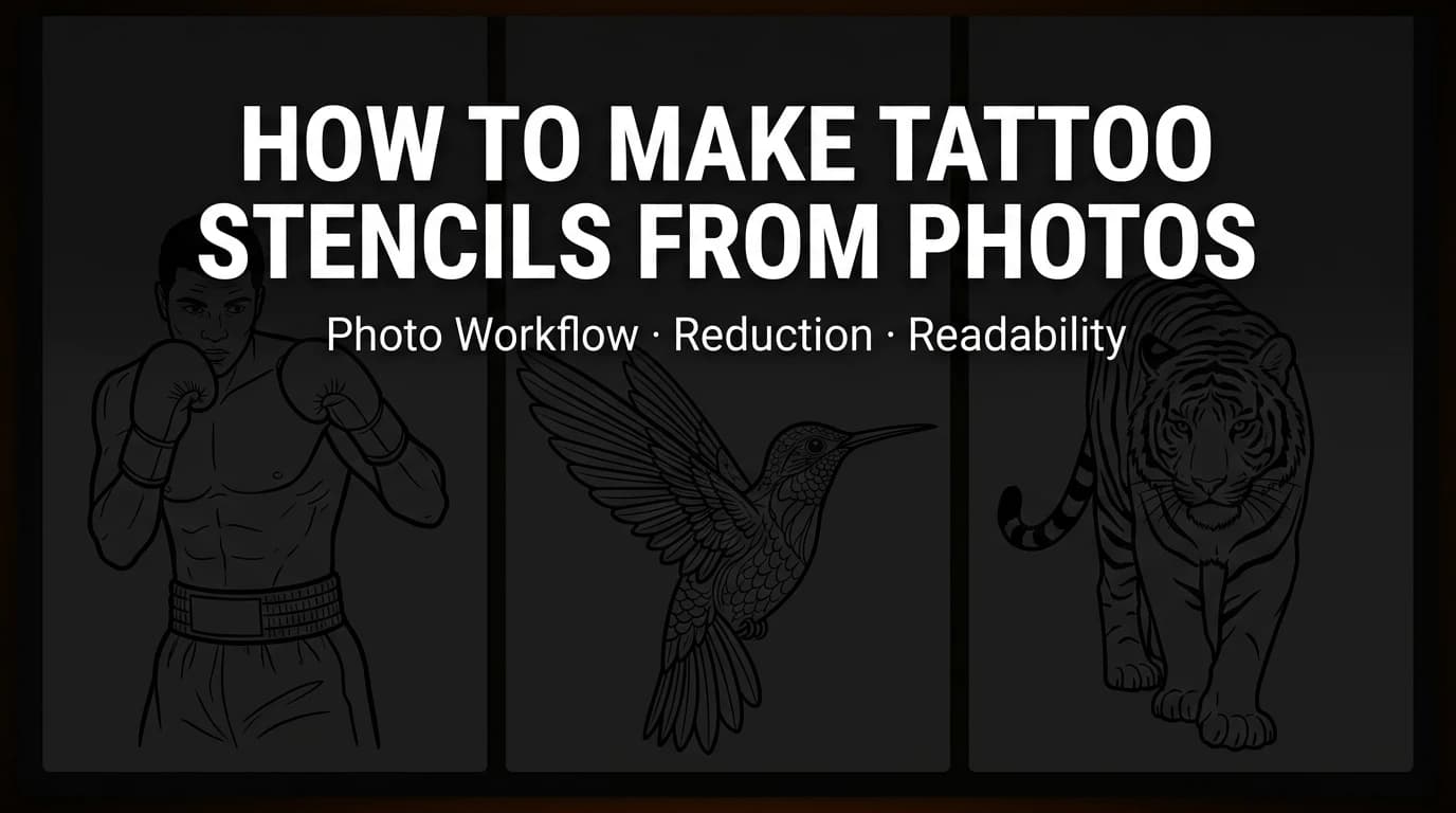
How to Make Tattoo Stencils From Photos That Stay Readable
Choose, crop, simplify, and review a photo so the resulting tattoo stencil stays readable at placement size, including blurry and low-resolution references.
tattoo stencil from photo · stencil workflow
Read guide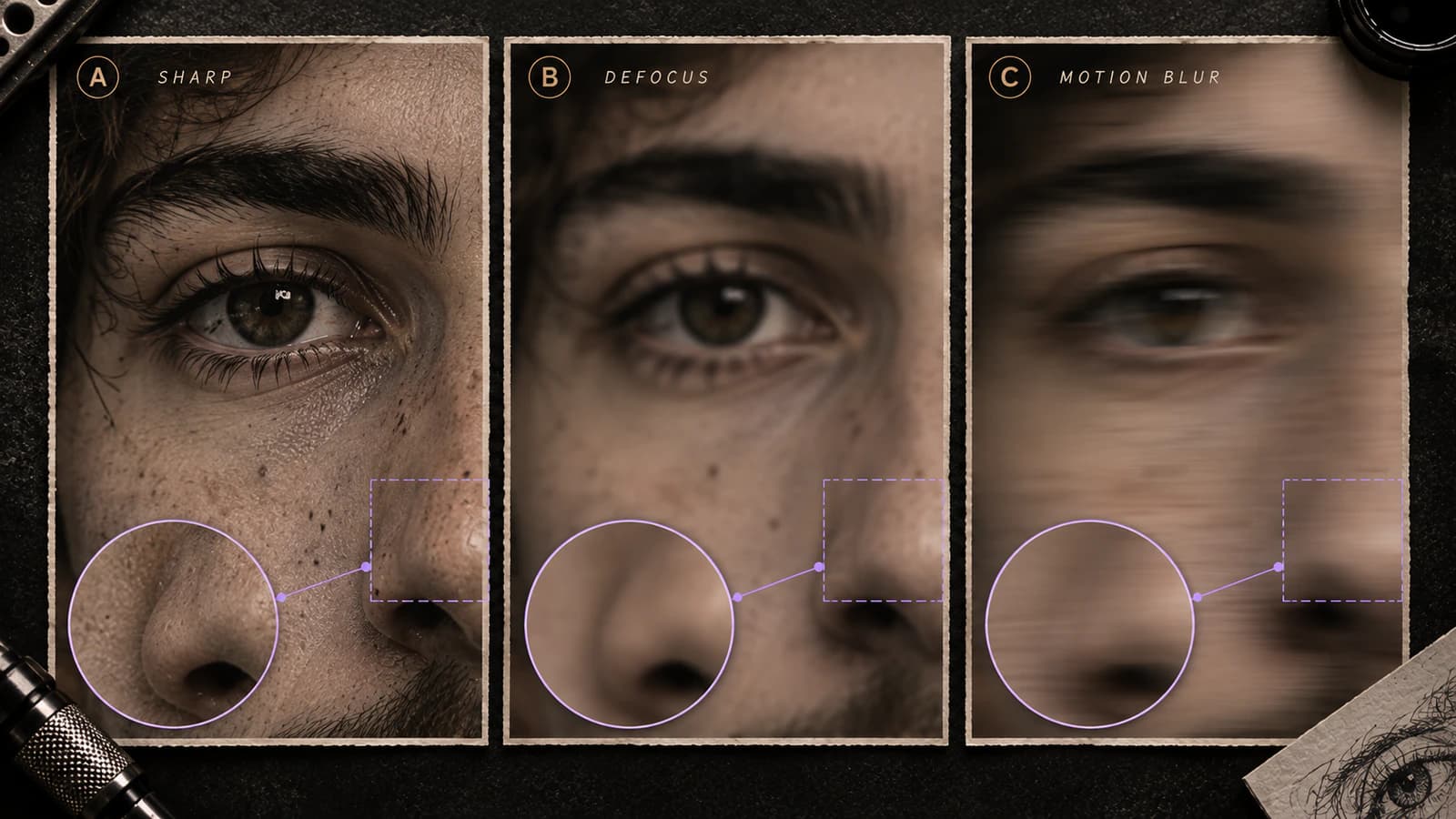
Blurry Tattoo Reference Photo: Is It Usable for a Stencil?
Diagnose a blurry tattoo reference before stencil prep. Separate recoverable softness from missing or uncertain structure, then decide whether to proceed, simplify, or request a better source.
blurry tattoo reference · tattoo reference photo blur
Read guide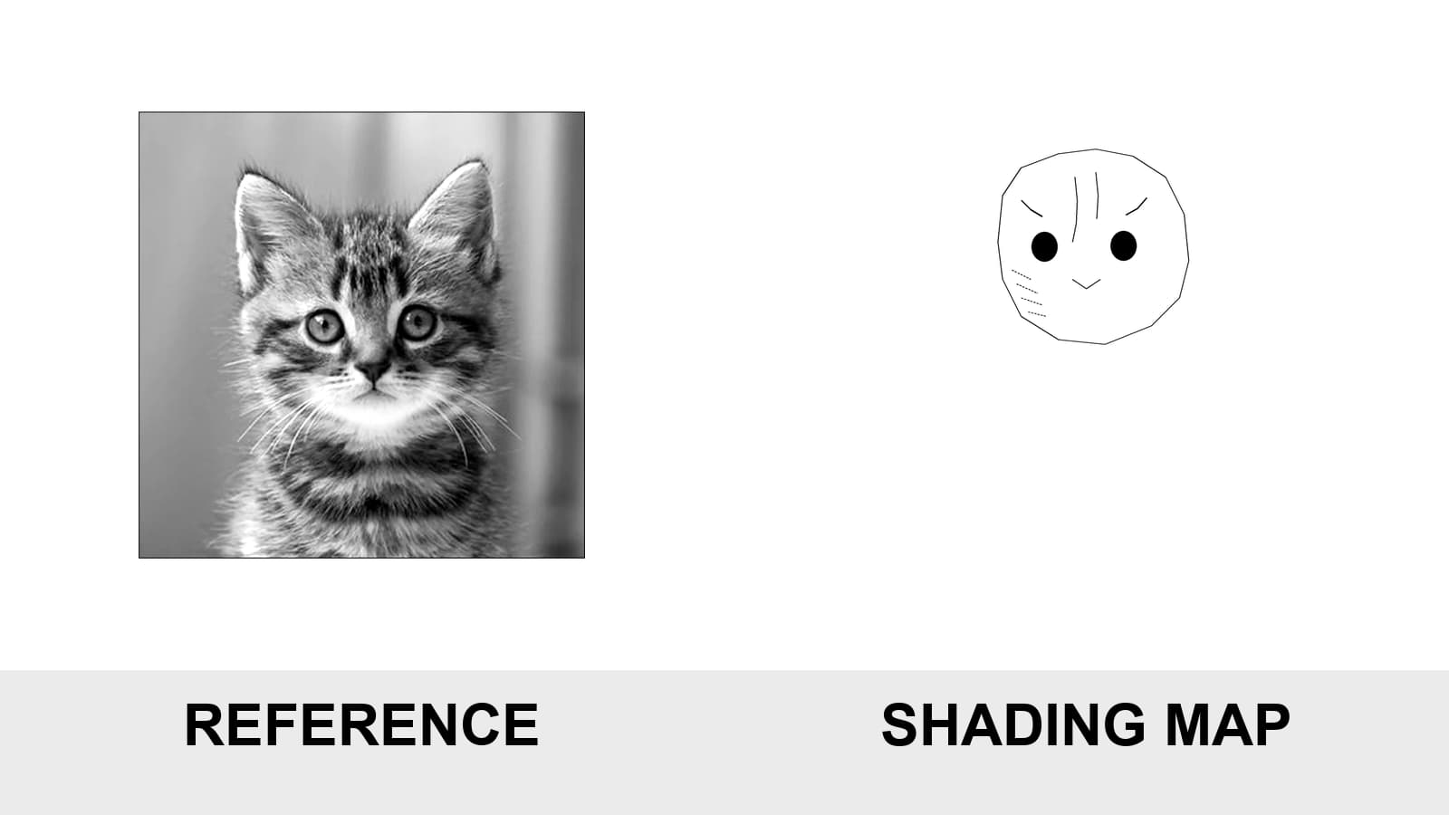
Tattoo Stencil Shading: Map Shadows Without Overloading the Stencil
Learn which shadow landmarks belong in a tattoo stencil, how to map hard edges and soft fades, and how to avoid transfers that are either empty or overloaded.
tattoo stencil shading · shading map stencil
Read guideAuthor
Andrea Mezzadra
Founder and product builder at StencilStudio
Andrea builds StencilStudio and tests how the tools fit into real stencil prep, using real references and outputs to document what works, what changes, and where artist judgment still matters.
In the App
Measure the dark crop instead of guessing.
Use the Reference Photo Quality Checker to inspect tonal separation, near-black clipping, sharpness, crop coverage, and intended-size sampling in the exact region you plan to use.