

Detail Control
Tattoo Stencil Shading: Map Shadows Without Overloading the Stencil
Learn which shadow landmarks belong in a tattoo stencil, how to map hard edges and soft fades, and how to avoid transfers that are either empty or overloaded.
tattoo stencil shading · shading map stencil · realism tattoo stencil
- August 6, 2026
- August 11, 2026
- 9 min
Shading map workbench
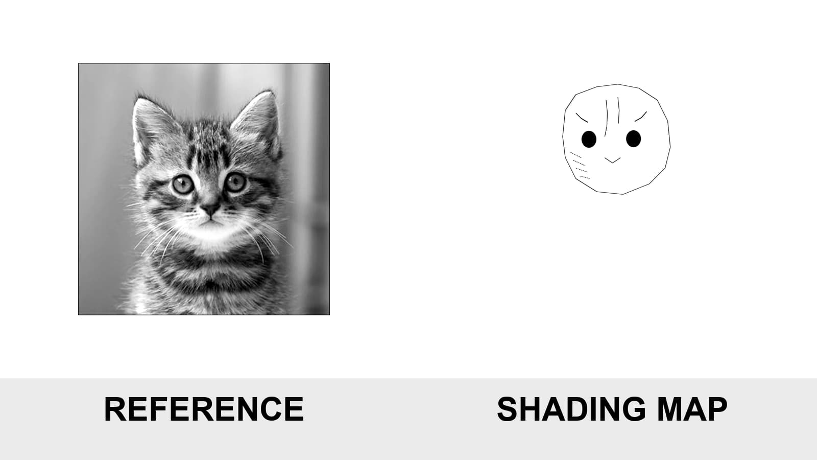
Same reference. Same crop. Different mapping decisions.
Compare the reference with under-mapped, working, and over-mapped guidance. The useful map preserves decisions that are hard to reconstruct without turning every tonal change into a mark.
These examples are controlled editorial maps built from the same reference, crop, and canvas. They demonstrate mapping trade-offs, not one universal artist code or the exact result of every model, printer, and paper path.
Recognition-critical planes, dark cores, and soft transitions.

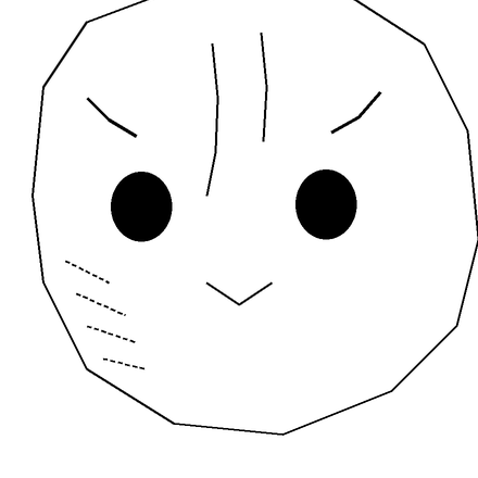
The map keeps the decisions that are difficult to reconstruct while leaving soft rendering and microtexture in the reference.
- Hard edge. Selective solid mark where a value or form ends crisply.
- Dark core. Compact grouped marker for the deepest value mass.
- Contact shadow. Short selective boundary at an overlap.
- Fade direction. Sparse short dashes following the direction the value releases.
- Light reserve. Protected unmarked negative space that must remain open.
Different artists use different codes. Inside one stencil, consistency matters more than copying somebody else's legend.
A shading stencil fails in two opposite ways.
With too few landmarks, the artist has to rebuild the reference from memory. With too many, every soft transition becomes a hard contour and the transfer turns into noise.
The useful map sits between them.
It does not reproduce every tone. It preserves the decisions that are difficult to recover once the reference and the skin are no longer in the same visual plane.
The controlled comparison above keeps the same source, crop, canvas, and scale. Only the amount and purpose of the shading guidance changes.
The practical rule is:
Map decisions, not every tone.
A shading stencil is not a finished render
A finished image describes the full result:
- light;
- middle values;
- deep shadows;
- texture;
- atmosphere;
- soft transitions;
- small reflected lights.
A shading map has a narrower job.
It helps you relocate:
- where a form turns;
- where a shadow begins or ends decisively;
- where two forms touch;
- where the deepest value sits;
- which direction a fade releases;
- which light area must remain open.
The stencil does not need to carry the complete rendering. The reference still does that.
This distinction protects the transfer from becoming a second, lower-quality copy of the photograph.
The legend is personal. The logic must be consistent.
Artists do not all use the same code.
One artist may use dots for a soft boundary. Another may use short dashes. Some mark only the deepest shadows. Others add a few directional guides.
The examples on this page use one consistent legend so the comparison remains readable:
- Hard edge: a selective solid mark where a value or form ends crisply;
- Dark core: a compact grouped marker for the deepest value mass;
- Contact shadow: a short boundary where one form sits against another;
- Fade direction: sparse dashes following the direction in which the value releases;
- Light reserve: protected negative space that must remain visually open.
These are not universal symbols.
The useful standard is internal consistency: the same mark should mean the same thing throughout one stencil.
Five landmarks worth preserving
1. Hard value terminations
A hard edge is a real visual stop.
Examples include:
- the edge of a cast shadow;
- the boundary of a dark object against a light one;
- a crisp fold;
- a sharp eye or nostril corner;
- a clear petal overlap.
A hard-edge mark does not automatically mean that a hard tattoo line belongs there. It tells you that the value transition is precise.
2. Deepest dark masses
The darkest zones organize the value structure.
Marking the core of an eye socket, nostril, deep fold, or central overlap can help you recover the contrast hierarchy even after parts of the transfer become less visible.
Do not convert the entire dark area into a large black stencil fill. The goal is location and extent, not a finished patch of tone.
3. Contact shadows
Contact shadows explain depth quickly.
They appear where:
- one petal folds over another;
- a lip meets the surrounding plane;
- an object rests against another object;
- a crease closes;
- one anatomical form tucks behind another.
A few correct contact-shadow cues can communicate more depth than dozens of minor tonal contours.
4. Fade direction
A soft transition needs direction more than an outline.
Sparse dashes can indicate:
- where the value begins;
- which way it releases;
- whether the form turns left, right, upward, or around a volume.
Outlining both sides of every fade turns a soft transition into a hard band.
5. Light reserves
Highlights and skin breaks are often useful because they remain unmarked.
Protect:
- the small opening inside a dark structure;
- the bright edge separating two shadows;
- the highlight that preserves an eye, petal, or reflective surface;
- the negative space that stops nearby marks from merging.
A light reserve does not always need its own contour. Sometimes the correct mark is the decision not to add one.
What an under-mapped stencil loses
An under-mapped stencil can look clean and still be unhelpful.
The silhouette may survive while the tonal route disappears.
Look for missing:
- deep-shadow anchors;
- plane changes;
- contact shadows;
- likeness-critical internal landmarks;
- fade direction;
- protected light areas.
The problem is not that the stencil contains few marks.
The problem is that the remaining marks do not protect the difficult decisions.
A minimal map is useful when the artist already knows exactly what can be reconstructed from the reference. Minimal is not automatically the same as incomplete.
What an over-mapped stencil adds
An over-mapped stencil often begins with a reasonable goal: preserve more information.
The failure appears when every small tonal variation becomes equally important.
Common signs include:
- nested contour rings around a soft gradient;
- texture converted into a dense field of marks;
- every highlight outlined;
- multiple tonal bands competing with the silhouette;
- short marks with no clear meaning;
- guide lines that cannot be distinguished from intended hard edges.
The stencil may look technically detailed while becoming slower to understand.
More marks do not create more certainty when the marks lack hierarchy.
Hard edges and soft fades need different treatment
A hard edge can tolerate a precise boundary.
A soft fade cannot.
When a gradient is outlined like a shape, the stencil invents a visual stop that the reference does not contain.
For soft transitions, ask:
- Where does the fade begin?
- Which direction does it travel?
- Where is its darkest anchor?
- Which light area must remain open?
A few directional marks can answer those questions without drawing the entire gradient.
For hard transitions, ask:
- Is the edge actually crisp in the reference?
- Is it important for recognition or depth?
- Does it need a complete boundary or only a short registration segment?
The map should preserve the edge behavior, not simply the edge location.
Organic forms and recognition
Faces, animal heads, and other organic subjects can lose identity through very small errors.
Prioritize:
- eye placement and socket mass;
- nose or muzzle structure;
- mouth and jaw relationships;
- the darkest recognition-critical shapes;
- the major turn from light into shadow.
Do not trace every hair, pore, wrinkle, or small value fluctuation.
Texture can remain in the reference unless one directional pattern is necessary to explain the form.
The useful test is not whether the stencil looks realistic by itself.
It is whether the map lets you return to the same structure reliably.
Floral depth and overlap
Floral forms often depend more on overlap than outline.
Inspect:
- which petal sits above;
- where the contact shadow begins;
- where the fold turns away from the light;
- which light strip separates two adjacent dark regions;
- whether the central mass still reads without outlining every tonal change.
A contact-shadow cue under the correct petal can preserve depth.
Three extra contour rings inside every petal can remove it.
Detail level, line weight, and shading map are different controls
These controls solve different problems.
Detail level decides how much structural information survives.
Line weight decides how much visual mass the surviving marks carry.
Shading map decides how tonal structure is represented.
Changing line weight will not fix a missing dark-core landmark.
Increasing detail will not automatically create a meaningful value hierarchy.
Adding more tonal marks will not restore a structural contour that was removed earlier.
Choose the control that matches the actual failure.
The stencil map and the station wash line are also different layers. The map tells you where the value changes belong; the grey wash setup tells you which repeatable dilutions are available when you shade them. If the map is already settled and the next job is preparing the black-to-light sequence, use the Tattoo Grey Wash Calculator to record black-drop counts or scale a measured cap recipe without turning the stencil itself into a tonal recipe sheet.
Final size can change the map
A tonal map that reads clearly while zoomed in may become crowded when printed smaller.
At final size:
- dotted boundaries can merge;
- short dashes can become texture noise;
- narrow light reserves can close;
- a compact dark-core marker can become a black patch;
- multiple tonal bands can become indistinguishable.
Set the intended physical dimensions with the Tattoo Stencil Size & Print Calculator, then inspect the map at that size.
Use the same:
- source;
- crop;
- paper path;
- printer path;
- physical dimensions.
Change one variable at a time.
The screen can show relative differences. It cannot prove the final transfer.
A practical inspection sequence
Use this order:
- Keep the reference visible.
- Confirm the silhouette and recognition-critical structure.
- Mark the deepest dark masses.
- Add hard boundaries only where the reference is actually hard.
- Add contact-shadow cues at important overlaps.
- Mark the direction of major fades.
- Protect light reserves and negative-space openings.
- Remove texture marks that do not change a decision.
- Check that every mark has one clear meaning.
- Review the map at the final physical size.
- Compare the map with the reference again.
- Remove anything that makes the map slower to read.
The goal is not the fewest marks.
The goal is the smallest coherent map that still protects the tonal structure you need.
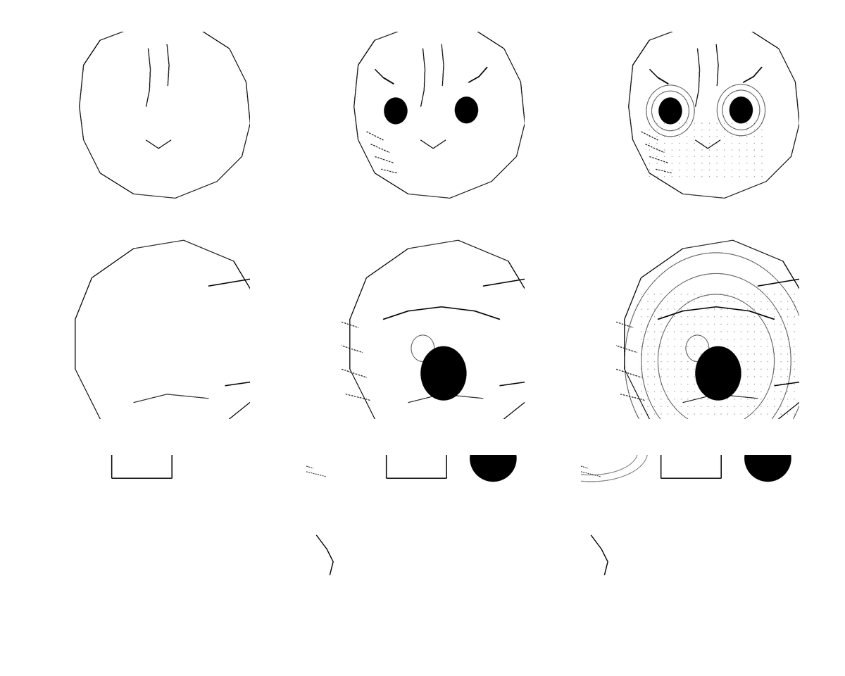
Columns from left to right: Under-mapped, Working map, Over-mapped. Rows from top to bottom: organic form, floral depth, diagnostic strip. The useful map preserves the important decisions while leaving soft rendering and microtexture in the reference.
FAQ
Should a tattoo stencil include shading?
It can include selected shading landmarks when they help relocate dark masses, hard boundaries, contact shadows, or fade direction. It does not need to reproduce every tonal change in the reference.
What do dotted lines mean on a tattoo stencil?
There is no universal meaning. Some artists use dotted lines for soft transitions or lighter guidance, while others use a different code. What matters is using one consistent legend throughout the stencil.
How do I mark a soft gradient without outlining it?
Mark its darkest anchor, the point where the fade begins, and the direction in which it releases. Sparse directional guidance usually preserves softness better than drawing a closed contour around the whole gradient.
How many shadow values should I map?
There is no universal number. Preserve the value groups and landmarks required to navigate the reference, then remove bands that do not change a structural or tonal decision.
Is a more detailed shading stencil always better?
No. Extra tonal contours can harden soft transitions, compete with structural marks, and make the transfer slower to read. More information is useful only when its meaning remains clear.
Can I judge a shading map from my phone screen?
You can compare states relatively, but the screen does not prove physical size, printer behavior, paper behavior, or transfer clarity. Inspect the map at the dimensions you intend to print.
Related Guides
Keep reading from here
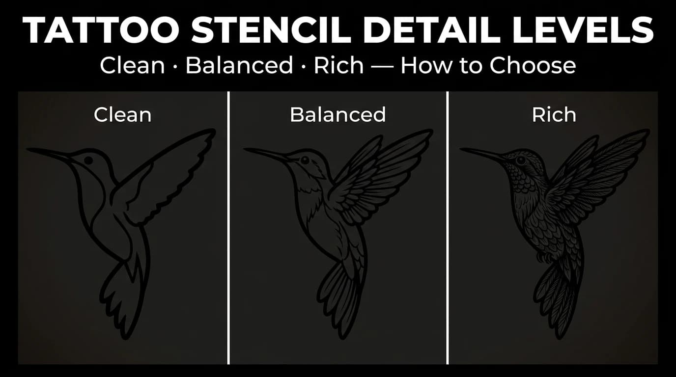
Tattoo Stencil Detail Levels: Simple, Standard, and Detailed
Compare Simple, Standard, and Detailed tattoo stencil modes and choose the amount of structural guidance that suits the size, subject, and placement.
tattoo stencil detail levels · tattoo stencil readability
Read guide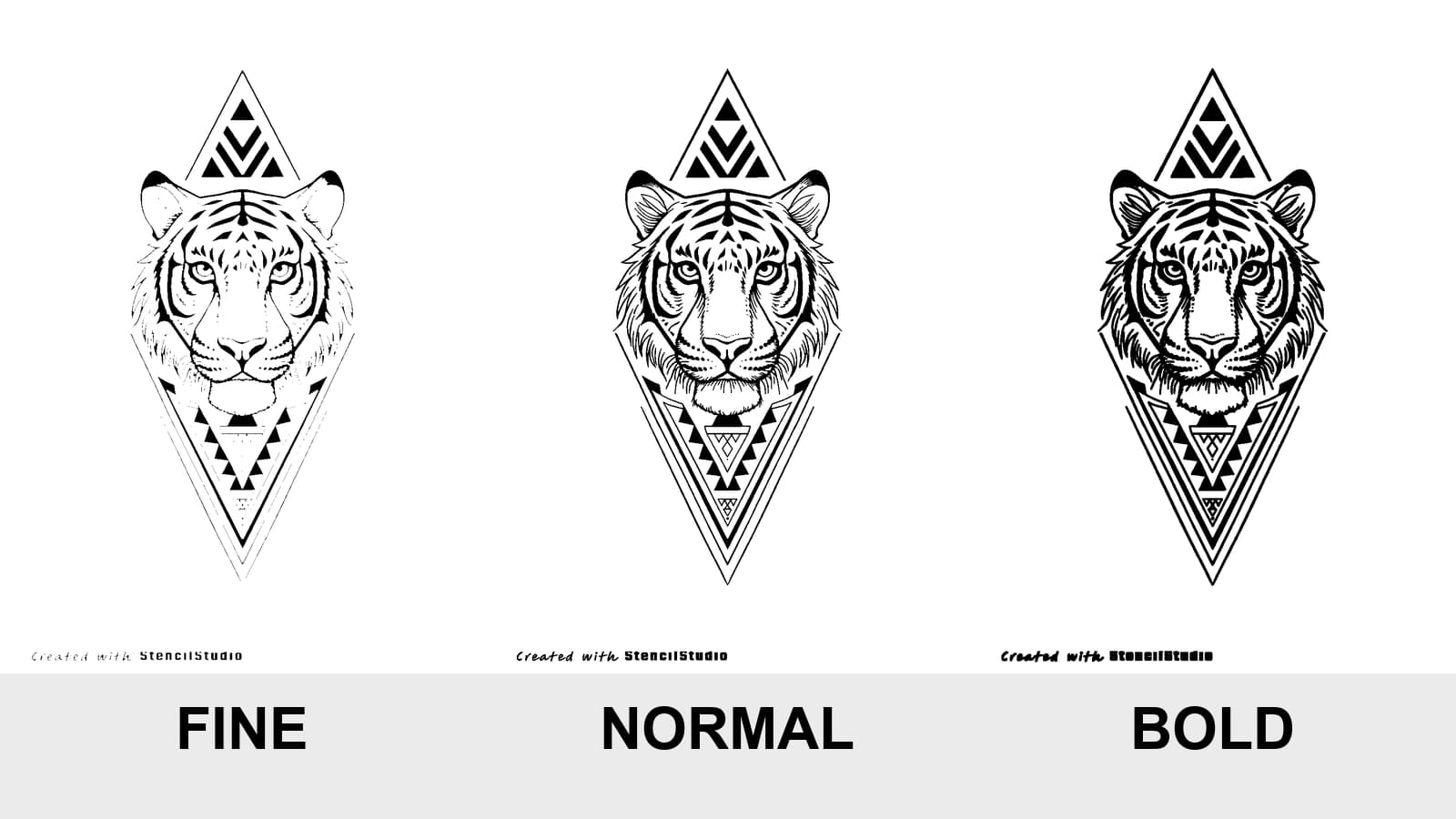
Tattoo Stencil Line Weight: Fine vs Normal vs Bold
Compare Fine, Normal, and Bold on the same tattoo stencil, see where lines disappear or merge, and test the result at the size you will actually print.
tattoo stencil line weight · fine normal bold stencil
Read guide
How to Make Tattoo Stencils From Photos That Stay Readable
Choose, crop, simplify, and review a photo so the resulting tattoo stencil stays readable at placement size, including blurry and low-resolution references.
tattoo stencil from photo · stencil workflow
Read guideAuthor
Andrea Mezzadra
Founder and product builder at StencilStudio
Andrea builds StencilStudio and tests how the tools fit into real stencil prep, using real references and outputs to document what works, what changes, and where artist judgment still matters.
In the App
Keep the structure. Leave the rendering in the reference.
Use StencilStudio to create a readable stencil draft, then review its tonal landmarks at the size you plan to print.