
Detail Control
Tattoo Stencil Detail Levels Explained: Clean vs Balanced vs Rich
Learn how to choose the right tattoo stencil detail level so the transfer stays readable without dropping the information that still matters.

Most tattoo stencils fail at one of two extremes. They either keep too much noise and become hard to transfer, or they simplify so aggressively that the artist loses the structure needed to guide the piece. The right detail level sits between those two failures.
What a detail level is really controlling
Detail level is not just "more lines" versus "fewer lines." It changes how much internal guidance survives the reduction from source artwork to stencil-first linework.
The real decision is about what the stencil must do on skin:
- protect the silhouette
- preserve important internal landmarks
- stay readable at the actual placement size
- avoid clutter that turns transfer into cleanup
If you are starting from photos, this sits directly after source selection. The workflow in How to Make Tattoo Stencils From Photos gives the setup. Detail level is the next gate.
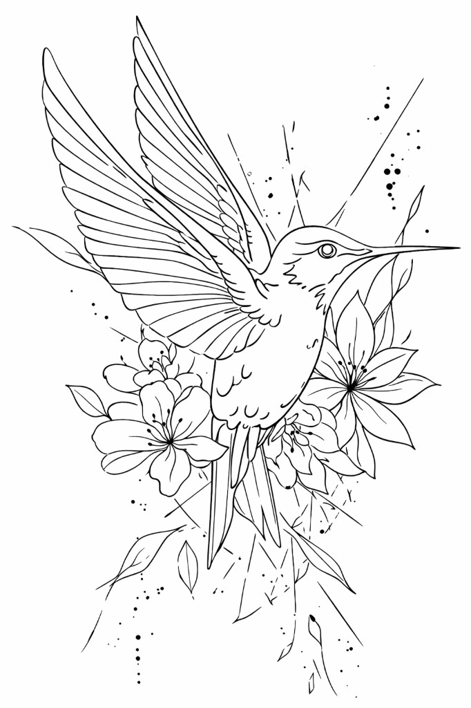
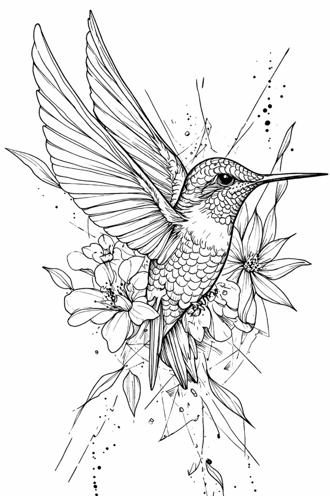
When a clean stencil works best
A clean stencil is the safest choice when the design depends on a strong outer contour and a few major internal separations. It is usually the best fit for bold placement, smaller sizes, or subjects that can get muddy if too much texture survives.
Clean usually works well when:
- the silhouette is doing most of the recognition
- the tattoo is going on a smaller or more curved area
- the artist already knows where rendering decisions will happen later
- the source image contains texture that should never reach the stencil
The symbols collection is a good reference here. Many strong symbol-based stencils stay useful specifically because they refuse unnecessary information.
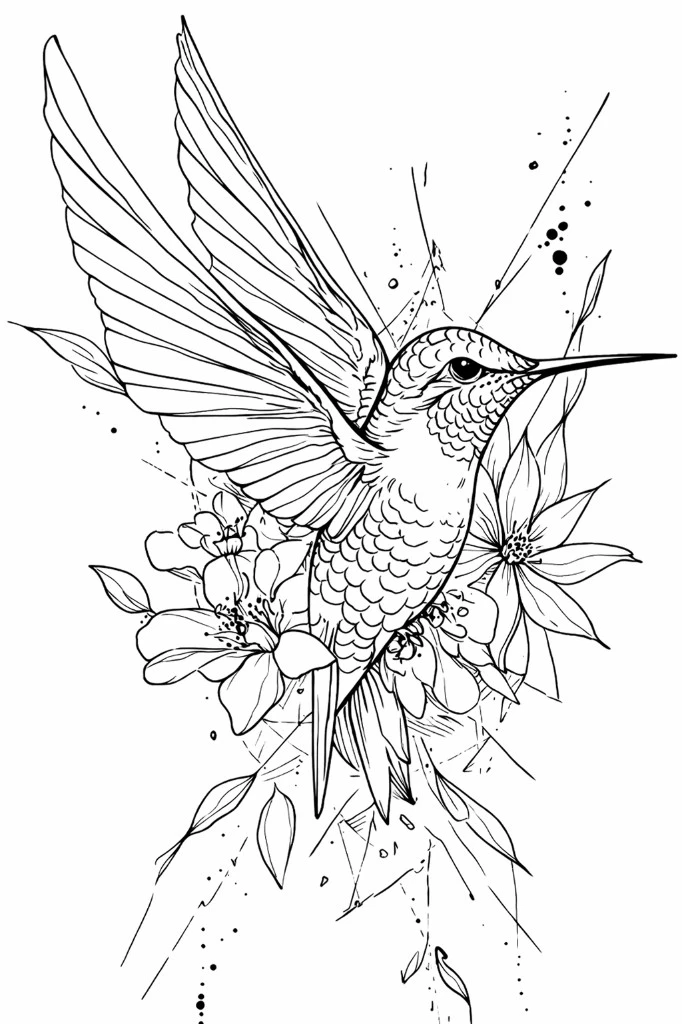
When balanced detail is the default answer
Balanced detail is the day-to-day working mode. It keeps enough internal structure to guide the tattoo without turning the stencil into visual static. For many artists, this is the level that feels closest to "ready for review."
Balanced tends to work best when you need:
- clear outer shape
- stable internal landmarks
- enough information for placement checks
- room for the artist to simplify further if needed
For mixed-subject reference work, this is usually the starting point worth trying first.
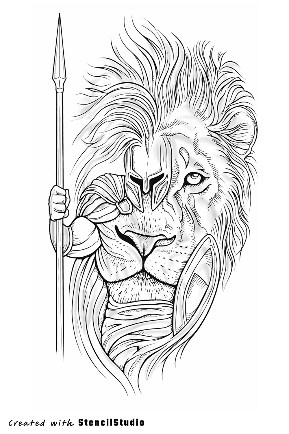
When rich detail still makes sense
Rich detail is useful when the design genuinely depends on more internal information. That does not mean every visible detail deserves to survive. It means the stencil still needs more guidance than a cleaner pass can hold.
Rich detail is usually justified when:
- the subject has layered structure that must stay distinct
- the tattoo will be large enough to support that information
- the artist needs more internal anchors before the rendering phase
- a simpler pass removed landmarks that the design actually needs
The fantasy collection is where this decision often matters. Some compositions carry more armor, ornament, or internal form changes, so the right move is not maximum reduction. It is controlled retention.
How to choose faster without second-guessing
A simple rule helps: start from the minimum detail that still protects the design's meaning. Then add only the information that solves a real readability problem. If you want visual proof of what that change looks like, the Samples page is the fastest supporting page.
That keeps the process anchored in utility instead of in fear of losing something. If a richer pass only adds visual noise, it is not richer in a useful way.
FAQ
What is the best default tattoo stencil detail level?
Balanced is usually the best default because it preserves the core structure of the design without pushing too much noise into the transfer stage.
When should you choose a clean stencil instead of a rich one?
Choose clean when silhouette, placement, and transfer speed matter more than preserving small internal information. Smaller tattoos and bold subjects usually benefit most from this choice.
Does richer detail always make a better stencil?
No. Richer detail only helps when the added structure still improves readability and execution. If the extra lines create clutter, the stencil gets worse, not better.
Related Collections
Jump from the guide to live stencil examples

Stencil Gallery
Animal Tattoo Stencil Group
This animal stencil group is broad on purpose: it now spans sea life, birds, big-cat portraits, wolf-led hybrids, raccoon and pet studies, cat-sheet flash, and a few pla…

Stencil Gallery
Fantasy Tattoo Stencil Group
Fantasy subjects only stay useful as stencil references when the main idea lands before the ornament does. This set is stronger now because it can compare fox spirits, d…

Stencil Gallery
Symbol Tattoo Stencil Group
Symbol-led stencils live or die on shape language. The subject usually has to land before texture or narrative does, which makes spacing, contour discipline, and focal h…
Related Guides
Keep reading from here
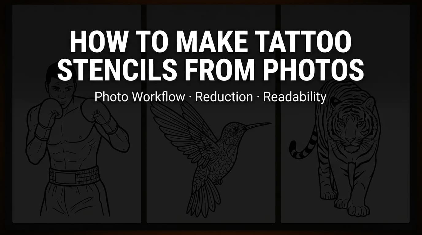
How to Make Tattoo Stencils From Photos Without Losing Readability
A practical workflow for turning photos into tattoo stencils that stay readable, editable, and placement-ready before the session starts.
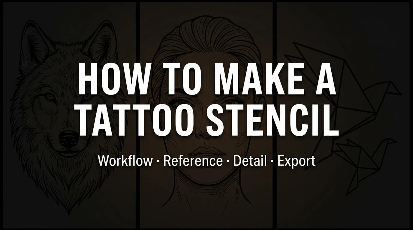
How to Make a Tattoo Stencil Without Turning the Draft Into Cleanup
Follow a practical tattoo stencil workflow from reference to readable draft, placement check, and export without avoidable redraw.

How to Fit a Tattoo Stencil to Body Placement Before You Export
A practical placement-prep checklist for adjusting tattoo stencils to curved body areas before printing, transferring, or finalizing the draft.
In the App
Pick the right amount of stencil information before you export
StencilStudio lets you move between cleaner and richer passes so the draft fits the tattoo, not just the source file.
Author
StencilStudio Editorial Team
StencilStudio publishes workflow-first content around tattoo stencil generation, readability, placement prep, and the decisions that matter before ink touches skin