

Troubleshooting
Why a Portrait Tattoo Stencil Loses Likeness
Diagnose why a portrait stencil no longer looks like the reference by checking silhouette, feature relationships, asymmetry, expression, and value boundaries before adding detail.
portrait tattoo stencil · portrait likeness · tattoo stencil troubleshooting · facial landmarks · portrait reference
- August 23, 2026
- 12 min
The reference clearly looks like the person. The prepared stencil does not.
When that happens, adding more detail is usually the wrong first move. Portrait likeness depends heavily on where the features sit in relation to each other, the head silhouette, asymmetry, expression, and the way the photographed face is angled.
Use this page when the reference itself is clear but the stencil changed the face during conversion, tracing, simplification, or cleanup.
If the original photo is blurry or too dark to show an important feature reliably, fix the reference problem first with the blurry-reference diagnostic or dark-reference diagnostic. If likeness only falls apart when the stencil is reduced, use the final-size detail diagnostic. If the digital stencil looks right but the paper print loses facial information, use the missing-detail print diagnostic.
The central rule is simple:
Fix the relationship that changed before adding detail around it.
A portrait can keep wrinkles, lashes, beard hairs, pores, and hair texture and still look like the wrong person. A simpler stencil can keep strong likeness when the important proportions and feature relationships survive.
Diagnose likeness from the top down
Do not give every facial mark the same priority. Check the face in this order.
1. Overall structure
- head tilt and axis;
- outer silhouette;
- face width and height;
- cheeks, jaw, and chin;
- major hair mass when it changes the silhouette.
2. Relationships between features
- eye spacing and height;
- brow-to-eye spacing and angle;
- nose width;
- nose-to-mouth distance;
- mouth width and position;
- characteristic asymmetry.
3. Individual feature shapes
- eyelid contour and openness;
- nostril and nose-base shape;
- lips and mouth corners;
- ear placement;
- hairline and parting.
4. Secondary form
- cheek and orbital boundaries;
- folds and creases;
- useful shadow boundaries;
- grouped hair or beard direction.
5. Texture
- individual hairs;
- lashes;
- pores;
- tiny wrinkles;
- incidental marks.
The exact feature that carries likeness differs from face to face. The point is not to force every portrait through a formula. It is to avoid polishing texture while a more important relationship is still wrong.
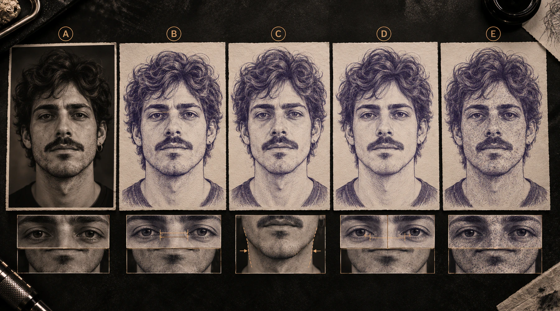
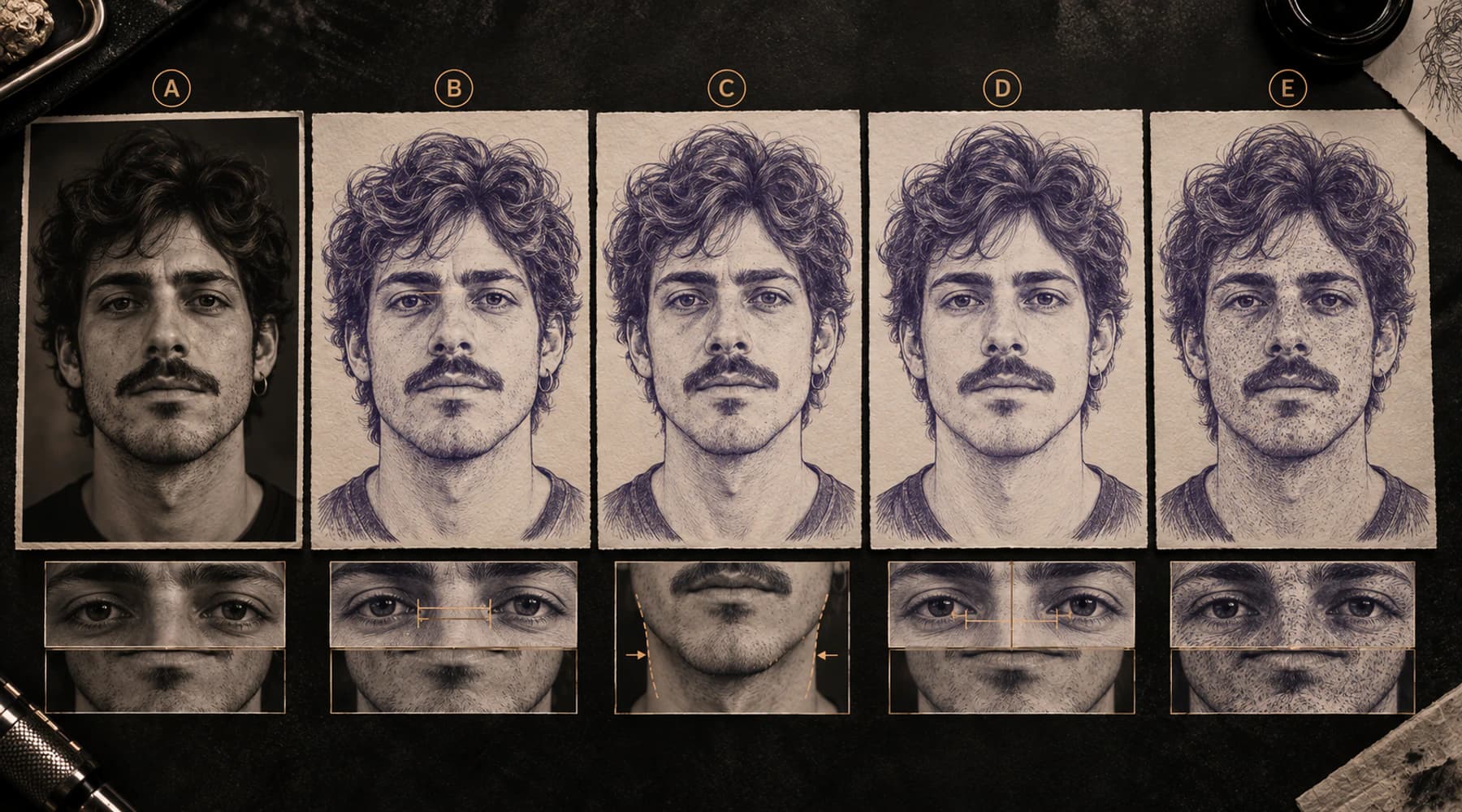
Find the first mismatch that changes the face
When a portrait feels wrong, compare the reference and stencil in a fixed order:
- match crop, orientation, visible face size, and mirror state;
- compare head tilt and silhouette;
- compare the eye pair;
- compare nose-to-mouth spacing;
- compare mouth width and angle;
- compare jaw and chin;
- compare asymmetry and expression;
- only then inspect smaller form and texture.
Look for the earliest change that makes later features read differently.
A jaw that becomes too narrow can make a correctly sized mouth feel too wide. Eyes moving inward can make the nose feel broader. Flattening one eyelid can change the expression even when the iris is in roughly the right place.
That is why "the nose looks wrong" is often not specific enough. The nose may be wrong, or the surrounding proportions may have changed enough to make it look wrong.
Nine common ways likeness gets lost
1. A feature moved
An eye shifts inward, the mouth rises, the nose moves sideways, or the chin comes too close to the lower lip.
A beautifully drawn feature in the wrong position still changes the person.
2. A feature changed size
Both eyes become larger, the nose narrows, the mouth shortens, or the chin widens.
Compare the stencil with the actual reference, not with an average face or anatomy diagram.
3. An angle changed
Small angle changes can alter both expression and identity: a flatter brow, a straighter nose axis, a levelled mouth corner, or a more horizontal eye line.
These errors are easy to miss when you inspect each feature separately.
4. A distinctive shape became generic
A particular eyelid becomes a standard almond shape. An irregular nostril becomes a clean oval. A characteristic jaw bend becomes a smooth curve. A recognisable hairline gets regularised.
Cleaner is not automatically more accurate.
5. The spacing between features changed
Sometimes every feature looks plausible by itself and the face still feels wrong.
Check the gaps:
- eye to eye;
- brow to eye;
- nose to upper lip;
- mouth corner to jaw;
- lower lip to chin;
- hairline to brow where relevant.
The portrait is read as an arrangement, not as a collection of independent parts.
6. Real asymmetry was removed
One eye may be more closed. One brow may sit higher. The nostrils may differ. One mouth corner may rise more. The two jaw sides may not look identical in the chosen camera view.
Do not automatically "fix" those differences. Some of them are exactly what makes the face recognisable.
7. The expression became neutral
A slight smile, squint, compressed lip, or raised brow changes the geometry between features.
Opening both eyes evenly, levelling the brows, or flattening the mouth can make the stencil look like a different photograph of the same person, or a different person entirely.
8. The outside contour became too generic
A simplified oval can erase cheek projection, temple narrowing, jaw bend, chin projection, or the relationship between the face and hair mass.
If the portrait looks wrong from a distance, check the silhouette before adding lines inside the face.
9. Texture is hiding the real error
Wrinkles, eyebrow hairs, beard strands, pores, and skin creases can make a stencil look sophisticated while the eyes are too close or the mouth is too short.
Texture does not rescue incorrect proportions.
Compare the spaces as well as the features
The gaps between facial features are often easier to compare than the features themselves.
Check:
- inner eye corner to inner eye corner;
- lash line to brow;
- lower eyelid to nose wing;
- nose base to upper lip;
- mouth corner to jaw edge;
- lower lip to chin;
- ear to jaw hinge;
- hairline to brow when it is distinctive.
These are not universal ratios. They are the distances in this specific reference.
The same applies to negative shapes: the space under a brow, between the lips, beside the nose, or between jaw and neck can reveal drift quickly.
Do not correct the person toward textbook proportions
Portrait drawing rules are useful for learning, but averages should not overrule a clear photograph.
If the reference shows closer-set eyes, an uneven jaw, a high brow, a long philtrum, a short chin, or a crooked smile, those differences may be central to likeness.
The useful question is not:
Is this face anatomically average?
It is:
Did the stencil keep the relationships visible in the chosen reference?
Preserve asymmetry and expression on purpose
Run a deliberate check before calling the face finished:
- Which eye is more open?
- Are the brows actually level?
- Are both mouth corners at the same height?
- Is the nose perfectly centered in this camera view?
- Do both sides of the jaw look the same?
- Are the nostril openings identical?
- Does one cheek compress more because of expression or head angle?
Remove accidental tracing wobble. Keep the real differences that belong to the photographed face.
Respect the camera angle you actually chose
A photograph is a perspective view, not a flat front-view diagram.
Head turn and camera distance change how much of each cheek, eye, ear, nose, and jaw side you see. The nearer eye may appear larger. One cheek may be wider. One ear may disappear. The nose may project more strongly.
If you force those photographed relationships toward an imagined perfectly frontal face, the stencil can become less like the reference.
This guide assumes the artist and client have already chosen a usable portrait photo. If you are still deciding which image should control pose and identity, use How to Prepare a Portrait Photo for a Tattoo Stencil first.
Do not turn every shadow edge into a contour
Some facial form is visible through gradual changes in light, not literal lines.
Two opposite mistakes are common:
- Hardening every tonal edge: a soft cheek or nose shadow becomes a strong contour and physically reshapes the face.
- Deleting every soft boundary: the stencil loses a subtle guide the artist needs to rebuild form.
Keep the tonal boundaries that help navigation and remove the ones that only add clutter. The tattoo stencil shading guide goes deeper into that decision.
Automatic tracing and generation still need a likeness check
Manual tracing and automatic conversion can fail in similar ways:
- distinctive shapes become generic;
- obvious texture survives while subtle facial relationships disappear;
- a soft shadow turns into a hard line;
- nearby features merge;
- asymmetry gets cleaned away;
- uncertain areas become overly confident shapes;
- local edits are made without checking the whole face again.
Judge the result, not how sophisticated the conversion method was.
More detail is often the wrong fix
If the eyes are too close, lashes will not move them apart.
If the jaw is too narrow, beard texture will not restore it.
If the mouth is too short, lip creases will not restore its width.
When likeness is weak, stop polishing and correct the biggest structural mismatch first.
The reverse is also true: simplifying more is not automatically better. A minimal portrait works only when the few marks that remain protect the right relationships.
Use a matched comparison, not a general "vibe" check
A disciplined comparison is faster than repeatedly redrawing whatever feels strange.
Side by side
Put the reference and stencil beside each other at a similar face size. Match crop, orientation, and mirror state as closely as practical.
Then compare one region at a time rather than staring at the whole face and asking whether it feels right.
Overlay
When the stencil comes directly from the same photograph and you have not changed perspective, an overlay can expose shifted landmarks, width changes, altered angles, jaw drift, hairline drift, or lost asymmetry.
Align a few stable landmarks first. Do not expect every stencil line to coincide with the photo because a stencil intentionally simplifies and interprets tonal form.
Blink or toggle
Alternating two versions makes movement easier to notice.
For two stencil revisions, the Tattoo Stencil Version Compare provides side-by-side, overlay, blink, manual alignment, mirror, and difference views. It does not score likeness for you.
One region at a time
If the whole face feels wrong, isolate the eye pair, then the nose-to-mouth block, then jaw/chin, then hairline. Ask whether position, size, angle, shape, or spacing changed.
That turns "something is off" into a specific edit.
Use a small-view check
Zoom out until fine texture stops dominating your attention.
Ask:
- Does the head silhouette still agree?
- Do the eyes, nose, mouth, jaw, and hairline still read as the same person?
- Is the expression still present?
- Which feature appears to jump when you toggle between reference and stencil?
If likeness survives at small view, the main structure may be sound and the remaining issue may be local. If likeness only appears when you zoom in and admire texture, go back to the larger relationships.
A practical recovery workflow
When a portrait stencil has lost likeness:
- Stop adding detail. Save the current version for comparison.
- Return to the untouched approved reference. Do not compare only against a beautified or heavily enhanced edit.
- Match crop, orientation, scale, and mirror state.
- Check silhouette and head angle first.
- Choose the few relationships that make this face recognisable. Eye spacing, nose-to-mouth gap, jaw shape, hairline, or one asymmetric brow may matter more than anything else.
- Name the actual change: position, size, angle, shape, or spacing.
- Correct the largest mismatch first. Then look at the whole face again before making another large change.
- Restore real asymmetry and expression.
- Recheck tonal boundaries. Remove hard contours created from soft shadows when they reshape the face.
- Add secondary detail only after likeness is back.
- Check the result at the intended tattoo size.
Change one major relationship at a time. If you move the eyes, reshape the jaw, widen the mouth, and change the nose in one pass, you will not know which edit helped.
Quick diagnostic examples
Accurate eye shapes, wrong eye spacing
Both eyes are well drawn, but cleanup moves them slightly toward the center.
Result: the portrait looks like another person.
Fix: restore the spacing before touching lashes, irises, or wrinkles.
Real uneven brows became symmetrical
One brow is clearly higher and one eye slightly more closed in the reference. Cleanup levels them.
Result: the stencil becomes tidier and more generic.
Fix: restore the real asymmetry.
Soft cheek shadow became a hard line
A gradual cheek-to-shadow transition is traced as a definite contour too far inward.
Result: the face becomes narrower.
Fix: move, soften, or remove that guide depending on what the artist needs to rebuild the form.
Wrinkles survived, mouth and jaw did not
Forehead creases and skin texture are preserved, but the mouth becomes shorter and the jaw smoother.
Result: age detail survives while identity weakens.
Fix: restore mouth width and jaw/chin structure first.
Less hair detail, stronger likeness
A simpler version removes individual hairs but keeps the hairline, major hair mass, eye spacing, nose-to-mouth relationship, and jaw.
Result: fewer marks, stronger likeness.
The removed information was texture, not identity.
The original photo is too blurry around the eyes
If the eyelid corners or iris boundaries are already smeared in the source, repeated stencil edits are partly guesses.
Fix: go back to the blurry-reference diagnostic and look for another photo before treating it as a stencil-conversion problem.
Hair, beard, glasses, and accessories
Hair usually matters through the hairline, parting, fringe shape, outer mass, and characteristic direction groups more than through individual strands.
Accessories can change how the face reads too:
- glasses alter visible eye boundaries and bridge relationships;
- beard mass changes the apparent jaw silhouette;
- hats change forehead and hairline context;
- earrings can help with ear placement or head angle.
Use them as context, not camouflage. If removing the glasses makes it obvious that the eyes are misplaced, the glasses were hiding the real problem.
Bad fixes to avoid
- Do not make the face symmetric by default.
- Do not replace a clear unusual feature with generic anatomy.
- Do not add texture to hide a structural mismatch.
- Do not trust a clean trace just because it follows many local edges.
- Do not use a beauty-filtered or heavily retouched image as your only comparison.
- Do not "correct" every deviation from textbook proportions.
- Do not turn every tonal change into a hard line.
- Do not compare mismatched crop, scale, mirror state, or head angle and draw strong conclusions from the overlay.
- Do not keep editing the whole face when one relationship is the first real mismatch.
The shortest useful rule
When a portrait stencil stops looking like the person, check in this order:
overall structure -> feature relationships -> feature shapes -> asymmetry and expression -> secondary form -> texture
Fix the earliest level that changed.
If the reference itself cannot show the feature clearly, go back to the reference. If likeness fails only after reduction, diagnose final size. If the digital stencil is correct but the print loses information, diagnose the print.
But when the reference is clear and the stencil changed the person's proportions or relationships, adding more detail is not the answer. Restore the relationship first.
Related Collections
Jump from the guide to reviewed stencil examples
Related Guides
Keep reading from here
How to Make Tattoo Stencils From Photos That Stay Readable
Choose, crop, simplify, and review a photo so the resulting tattoo stencil stays readable at placement size, including blurry and low-resolution references.
tattoo stencil from photo · stencil workflow
Read guide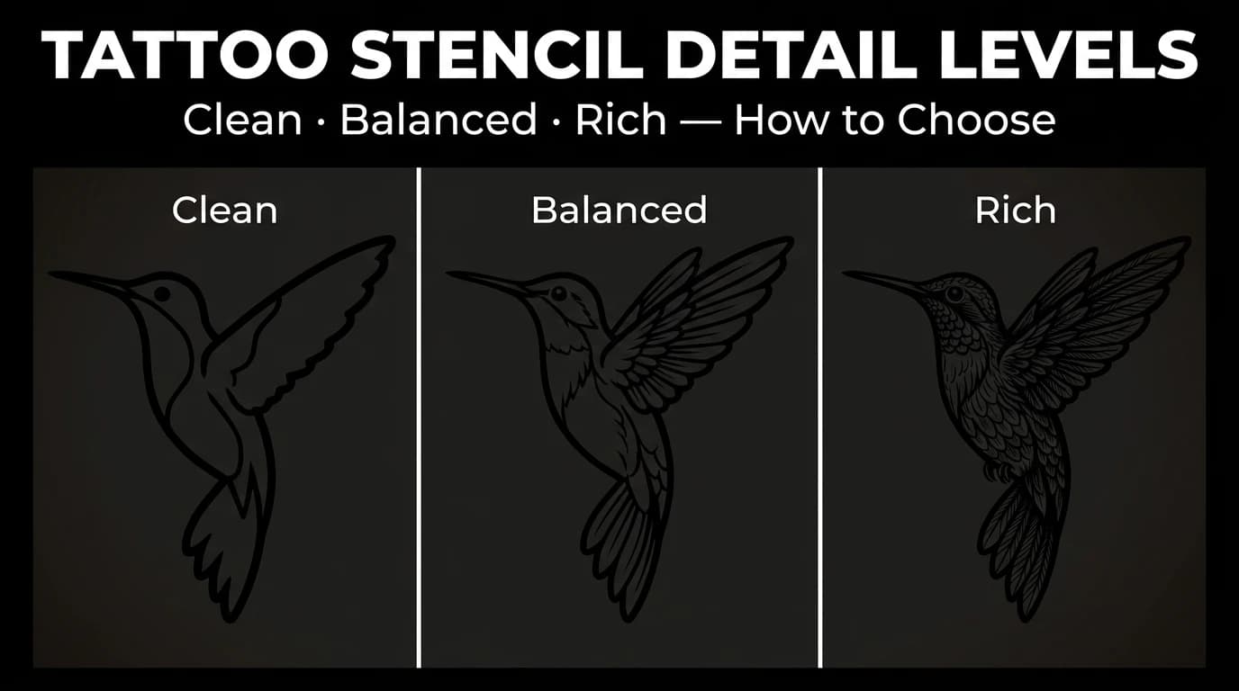
Tattoo Stencil Detail Levels: Simple, Standard, and Detailed
Compare Simple, Standard, and Detailed tattoo stencil modes and choose the amount of structural guidance that suits the size, subject, and placement.
tattoo stencil detail levels · tattoo stencil readability
Read guide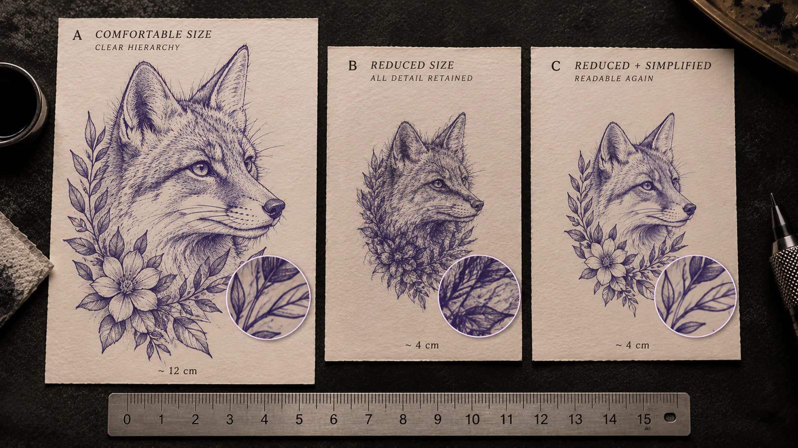
Tattoo Stencil Too Detailed for the Final Size
Tell whether a tattoo stencil has too much information for its intended physical size by checking line separation, gaps, landmarks, and texture before printing.
tattoo stencil too detailed · final size readability
Read guideAuthor
Andrea Mezzadra
Founder and product builder at StencilStudio
Andrea builds StencilStudio and tests how the tools fit into real stencil prep, using real references and outputs to document what works, what changes, and where artist judgment still matters.
In the App
Compare the structural change before generating another version.
Use Version Compare to blink or overlay two stencil revisions, align them manually, and localize where the geometry changed.