

Line-only stencil vetting

Vet any line-only design before it becomes a stencil

Linework lives or dies on continuity. Compare weight tiers across styles, enforce junction and open-gap floors, run the final-size dropout check, then transfer one clean stencil.

Built for working artists vetting line-only designs. This page covers style-independent linework checks and line-only transfer prep, not tattoo application or healing advice.

What makes line-only work stencil-viable

Tiers, junctions, and continuity decide the result.

A line-only stencil has no fill to hide behind. These three checks predict whether its paths survive reduction, print, and transfer.

Weight tier behavior

Line-only work has no fill to rescue it, so the mass of the lines is the structure. One design drawn in a single hairline mass prints weakly and breaks up on transfer, while the same design drawn uniformly bold closes its own gaps. Working artists rank lines into tiers (anchor, working, accent) so the first read survives and the lightest marks still transfer.

Check: Cover all accent detail on the reference. If the anchor and working lines still describe the design at the intended size, the tier structure is sound. If the design vanishes without its lightest marks, the tiers are inverted.
Junction and open-gap floors

Line-only designs fail where lines meet, cross, or run near parallel: T junctions blob, crossings fill, and close parallels merge into one band. The white space between marks is the structural material. Screens forgive crowding that paper and skin do not, so junctions and gaps must be judged on a measured 1:1 print, not on zoom.

Check: Print at 100 percent with scaling off, then find the tightest must-keep junction and the narrowest must-keep gap. Confirm both stay visibly open at arm's length. As a practical starting point, many artists test close parallel detail at about 2 mm separation and allow more room on hands, fingers, feet, and high-movement areas.

Continuity and dropout

A line-only stencil is a set of continuous paths. Any break the eye must bridge on paper becomes a break the needle must guess on skin: dotted-looking long runs, tapered tails that vanish, and enclosed loops that open during transfer. Dropout is the specific linework failure where part of a path prints or transfers faintly while the rest reads solid.

Check: Trace every must-keep path end to end on the 1:1 paper print with a finger. If you lift your finger at a faint segment, a hairline tail, or a junction blob, mark it as dropout and repair it before transfer. A line-only design passes when every protected path runs unbroken at true size.

Weight-tier comparison

Rank the lines before judging the design.

The same three tiers behave the same way whether the subject is floral, script, ornamental, or illustrative. Assign every line a tier first, because each tier fails in a different place.

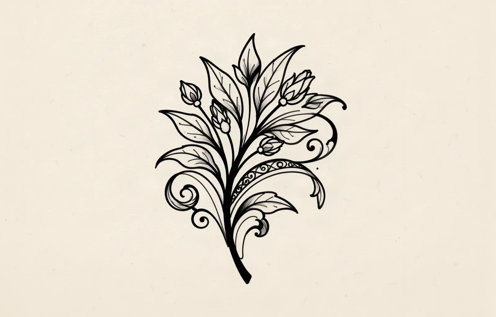
Illustrative botanical linework motif drawn with bold anchor strokes on the main stem and outer silhouette, medium working strokes on leaf outlines, and fine accent strokes on interior veins and tail ends.
Illustrative tier study. One motif, three stroke weights: anchor mass carries the stem and silhouette, working mass describes the leaf contours, and accent mass finishes the veins and tail ends. Synthetic artwork for weight comparison, not app output or a print sample.

Accent tier (lightest marks)

Tapered tails, fine hatching ticks, small interior flourishes, and delicate connector lines. These marks finish the design but never carry the first read on their own.

Strengths: Adds air, movement, and finish without visual weight. Useful for tails that taper off a stronger stem, restrained interior texture, and light direction cues inside open shapes.

Constraints: The first marks to vanish on print and transfer. Faint accent lines print as dotted segments on low-contrast output and wipe off first during placement. Never assign a must-keep contour to this tier.

Choose when: Choose it only for marks the design survives without: tail finishes, secondary texture, and optional flourishes. If removing all accent marks changes what the design is, promote those marks to the working tier.

Working tier (majority of lines)

The main contour system: stems, petals, letter skeletons, ornamental bands, and figure outlines that describe the subject. Most lines in a readable line-only stencil live here.

Strengths: Carries recognition at a glance and transfers reliably across printers and papers. The tier to judge first at 1:1, because a design that reads in working-tier lines alone is structurally sound.

Constraints: Uniform working mass across every line flattens hierarchy: junctions where three working lines meet are the first places to blob. Close working parallels need explicit gap floors or they merge into bands.

Choose when: Choose it as the default for every line that changes recognition, direction, or overlap. Demote lines that only decorate, promote lines that define the silhouette.

Anchor tier (heaviest marks)

The few outer and structural lines that establish the subject, gesture, and main overlaps: the primary silhouette, the longest travel line, the structural spine of a composition.

Strengths: Keeps the first read intact at distance and through transfer, and gives the eye a path to follow when accent detail drops back. On the stencil, anchor lines are the paths that must never break.

Constraints: Anchor mass expands into nearby space. Every anchor line placed beside a working parallel narrows the gap between them, so anchors demand the widest local spacing. More than a few anchors per design turns linework into bold blackwork and changes the style.

Choose when: Choose it for the two to five lines that carry the composition: outer silhouette, main stem, dominant band. If everything feels like it needs anchor mass, the design is too small for its detail count.

Delicate-contour fine-line drafting with density and line-weight generation controls stays with the fine-line maker, and sacred-geometry direction choice stays with the geometric owner. This comparison exists to rank tiers in any line-only design, not to replace those workflows.

Final-size vetting framework

Score the linework in minutes, then act on the weakest check.

Four line-only constructions at labeled sizes. Each one names the protected structure, the fix, and the go or no-go verdict at that exact size. Confirm every verdict with a measured 1:1 print.

PRINT-READY

Open botanical linework with ranked tiers at 10 cm

Intended width 100 mm

Source
Flowing stem with leaves and small buds drawn in two clear masses: a heavier stem and leaf outline family plus lighter interior vein cues, with open channels between every leaf.
Protect
The stem travel line and outer leaf contours, plus the open channel between each leaf.
Fix
Adjust nothing structural. Confirm the tightest leaf channel at 1:1 and keep accent veins subordinate.
Candidate stencil
Same construction with tiers ranked, junctions separated, and gaps reopened for the stated size.
Final-size verdict
Print-ready at 10 cm. Anchor and working lines describe the sprig without accent help, and every channel stays open at arm's length on the measured print.

REPAIR THE JUNCTIONS

Ornamental linework with blobbed crossings at 9 cm

Intended width 90 mm

Source
Attractive symmetrical ornament with multiple bands crossing at shared nodes. Readable on screen, but three crossings share one small node area and print as a single filled pocket on paper.
Protect
The outer symmetry axis, the two longest bands that define the shape, and the cleanest single crossing as the rebuild reference.
Fix
Separate the crossings: stagger nodes so no more than two lines share one point, shorten the weakest band so it terminates instead of crossing, or convert one band to a broken gap at the node. Recheck the node on fresh 1:1 paper after each change.
Candidate stencil
Same construction with tiers ranked, junctions separated, and gaps reopened for the stated size.
Final-size verdict
Not stencil-ready until every crossing reads as distinct lines with open skin at the node. Thicker lines or a larger size will not rescue a shared-node blob.

REOPEN THE GAPS

Script linework with closing counters at 8 cm

Intended width 80 mm

Source
Continuous script word with even line mass and appealing rhythm, but the smallest enclosed counters and the channel between two downstroke parallels narrow to hairlines at true size.
Protect
The letter skeletons, the counter openings, and the downstroke rhythm.
Fix
Widen local spacing around the single tightest counter first, then drop the weakest parallel flourish if the channel still closes. Do not thin lines to save the gap: thinner lines print weaker while the gap stays closed.
Candidate stencil
Same construction with tiers ranked, junctions separated, and gaps reopened for the stated size.
Final-size verdict
Holds at 8 cm when the tightest counter stays background on the measured print. If protected letterforms start changing shape, enlarge the word instead of further editing.

ENLARGE OR SIMPLIFY

Dense illustrative linework forced into a 5 cm panel

Intended width 50 mm

Source
Detailed illustrative composition with layered line families, fine hatching, and small enclosed loops, drawn with light mass suited to a much larger piece. At 5 cm the hatching merges and the smallest loops function as one gray pocket.
Protect
The single strongest contour pair and the main travel direction as the rebuild anchor.
Fix
Keep one contour family with open channels, remove the hatching layer or convert the weakest loops to open skin, and hold one anchor line heaviest. If the full layered design must stay, enlarge past the point where channels transfer as separate gaps.
Candidate stencil
Same construction with tiers ranked, junctions separated, and gaps reopened for the stated size.
Final-size verdict
At 5 cm the layered detail functions as one band. Simplify to a single readable layer, enlarge, or reselect a cleaner reference for this width.

Character likeness and anime line-density examples stay on the anime collection, and clean-contour cross-subject outline browsing stays on the simple-outline owner. This framework exists to judge tier structure, junction integrity, and dropout at a stated size, not to replace those owners.

Tiers, junctions, and gaps at final size

Judge the white space at the size you will print.

Screens forgive crowding that paper and skin do not. Set the dimensions first, then inspect each feature below at true physical size with scaling off.

About 5 cm and below

Finger-adjacent marks, behind-ear pieces, wrist accents, and small gap fillers.

Carry one contour family maximum with a single accent layer or none. If any junction blobs or any gap closes at 1:1, enlarge or reselect rather than forcing reduction.

About 6 to 12 cm

The common linework band: forearm panels, calf work, script words, small ornamental pieces.

The most flexible band. Two tiers plus restrained accent work can hold when every junction and gap is verified open at true size. Check the tightest node first, then the narrowest gap.

About 12 cm and above

Back panels, thigh pieces, large ornamental compositions, and full illustrative linework.

Room for three tiers and real interior detail, but only when open skin separates every path. Larger size does not rescue shared-node blobs or inverted tiers.

Linework feature checks by size band
FeatureAbout 5 cm and belowAbout 6 cm and above
Anchor contoursKeep anchors on the silhouette only. If an anchor-adjacent gap closes at 1:1, widen spacing or drop a neighboring line rather than thinning the anchor.Same priority. Larger size allows slightly finer anchors, but tier hierarchy still beats uniform thinness.
Junctions and crossingsAllow at most two lines per node with visible open skin between entry angles. Three-line nodes blob first at small sizes.Multi-line nodes can work when each entry angle keeps open skin at true size. Stagger nodes instead of stacking them.
Close parallels and countersEach parallel channel and enclosed opening must read as background at arm's length. Merge means fewer lines or a larger piece, not thinner lines.Parallels can sit closer relative to size, but each one must still survive print and transfer as a separate gap.
Accent detail and tailsKeep at most one accent family or none. Tapered tails that vanish on the 1:1 print will not reappear on skin.Accent layers can work when they stay subordinate on the squint check and every tail transfers as an unbroken path.

Reference to clean stencil

Rank, repair, then reopen.

Work in this order so one change at a time can be judged at the same size. Stop when tiers, junctions, gaps, and continuity each read correctly.

  1. 01

    Lock size and placement first

    Set the intended physical dimensions in millimeters and name the body area before judging the reference. A line-only design that holds at 12 cm on a flat forearm can close the same gaps at 6 cm on a curved wrist with no line being wrong on its own. Use the size calculator when target dimensions are still open.

  2. 02

    Rank every line into a tier

    Assign each mark a job: anchor lines that carry the first read, working lines that describe the subject, accent lines that finish it. Strengthen anchors first, keep working lines uniform, and mark one removable family that can go without changing identity. A design that vanishes when accent detail is covered has inverted tiers.

  3. 03

    Repair junctions before touching weight

    Find every node where three or more lines meet and every crossing that shares one small area. Stagger nodes, terminate the weakest line at the node, or convert one pass to a broken gap. Rebuild shared-node blobs before adjusting mass: thicker lines make blobbed junctions worse, not better.

  4. 04

    Reopen gaps and trace continuity at 1:1

    Print at 100 percent with scaling off, find the tightest must-keep gap, and confirm it stays open at arm's length. Then trace every protected path end to end on the paper print and mark any faint segment, hairline tail, or transfer break as dropout. Enlarge the piece or remove a neighboring mark when a gap closes; thicken or consolidate when a path drops out.

  5. 05

    Verify print and transfer path

    Export a true-size PDF with no fit-to-page scaling, inspect the narrowest junction and smallest loop on plain paper, then measure the physical print with a ruler. If the digital file passes and only paper fails, move to print-stage evidence instead of simplifying again.

Dropout checklist

Approve the linework only when every path passes

Run this short sequence with scaling off and a ruler in hand. One failed line means fix, enlarge, or reselect before transfer.

  • Confirm intended dimensions in millimeters and the named placement.
  • Confirm every line has a tier: anchor, working, or accent, with no must-keep contour in accent mass.
  • Confirm no node joins three or more lines in one blobbed point at 1:1.
  • Confirm every enclosed loop and counter stays open on the measured print.
  • Confirm every protected path traces unbroken end to end on paper at arm's length.
  • Export a true-size PDF with scaling off and measure the physical print with a ruler.

Line-only transfer prep

Transfer without breaking the paths

Line-only transfers fail at four predictable points. Each one below names the early sign and the prevention that keeps every path continuous.

Faint accent dropout

Early sign: Light tails and fine interior ticks transfer as dotted segments or vanish while anchors read solid.

Prevention: Promote any must-keep mark out of accent mass before transfer, and confirm the lightest protected line on the 1:1 paper print first. Keep accent marks strictly optional so their loss never breaks the design.

Junction smudge and merge

Early sign: Crossings that looked open on screen transfer as one filled pocket because solution spread or pressure closed the node.

Prevention: Judge nodes on the measured paper print, not the screen. Use a light even solution layer, set the stencil down without sliding, and stagger any node that still reads tight before committing transfer paper.

Broken long runs

Early sign: A long stem or contour transfers solid at both ends with a faint patchy middle where contact lifted.

Prevention: Confirm the placement area is clean, dry, and settled in its worn position, anchor the middle of long runs first, then smooth toward both ends in short passes. Lift to confirm the run before the second half touches skin.

Parallel merge on curves

Early sign: Close parallels that held on flat paper merge where the stencil wraps a curved placement.

Prevention: Preview wrap on the live body photo while edits are still cheap, widen local spacing around the tightest parallel before print, and plan the anchor point so the curve cannot drag the lines together on first contact.

Prerequisites before the transfer touches skin

Confirm the measured 1:1 paper print with a ruler, a clean dry placement area, and the planned anchor point (middle of the longest run for open compositions, lead end for wrap placements). Transfer in sections from the anchor so the free ends cannot drag lines together. If the first contact looks faint or patchy, diagnose the layer with the transfer troubleshooter instead of pressing harder.

Open the transfer troubleshooter
Rank tiers first Trace every path at 1:1 Measure the print

FAQ

Linework stencil decisions, answered

Short answers for the tier, junction, gap, and transfer checks that recur when a line-only design moves toward transfer-ready output.

It holds when three checks pass on a measured 1:1 print at the exact physical size: anchor and working lines describe the design without accent help, every junction and gap stays open at arm's length, and every protected path traces unbroken end to end. If any check fails, the fix list on this page names whether to repair a junction, reopen a gap, promote a tier, or enlarge the piece before print.

Next steps

Use the neighboring owners for adjacent jobs.

This guide covers style-independent linework vetting and line-only transfer prep. Use the links below for style-specific drafting, subject browsing, and production tooling.

Fine-line generation steps, geometric symmetry method, outline selection, subject browsing, paper manufacturing detail, and placement mechanics stay in their specialist owners. The links above hand off instead of repeating that detail.

From vetted linework to working stencil

Turn the approved line-only design into a stencil draft.

Start from the tiers that passed the final-size check, then continue on iPhone for body fit, exact-size print, mirror and professional export.