Style construction
Fine-line
Decides which contours, negative spaces, interior landmarks, texture cues, and tonal marks belong in the design.


Fine-Line Stencil Workflow
Fine-line is not just a thinner version of any stencil. The construction depends on selective contours, breathing room, restrained interior detail, and tiny marks that still separate at the size you will actually tattoo.
Web: upload, crop, Simple / Standard / Detailed, one free generation, PNG download. Max Quality, Fit to Body, mirror, exact-size print prep, and PDF workflow are in the iPhone app.
Reviewed examples
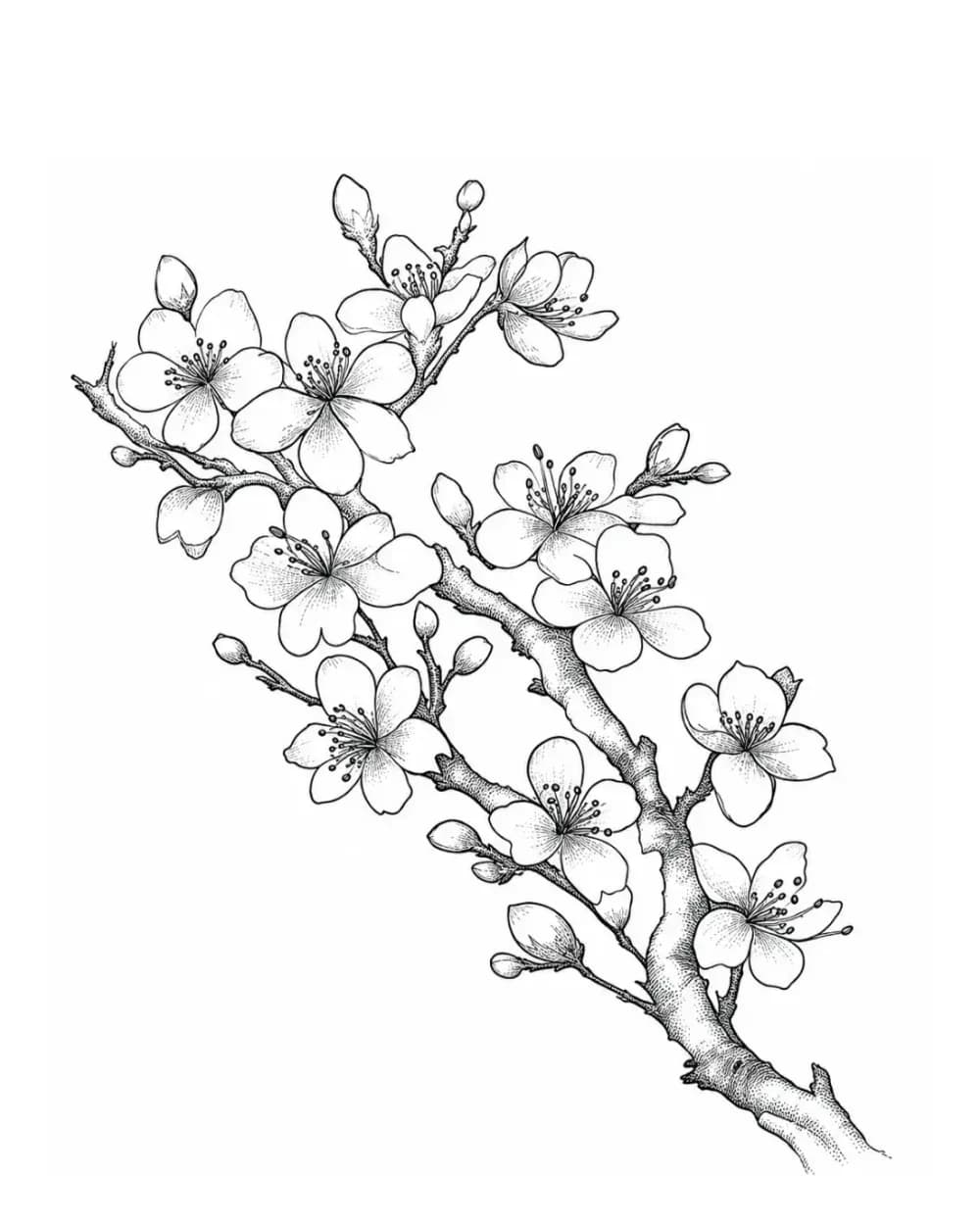
These examples span portraits, expressive faces, hummingbird detail, cherry blossom, and a flowing lotus composition. Compare the hierarchy and open space before comparing how thin any individual line appears.
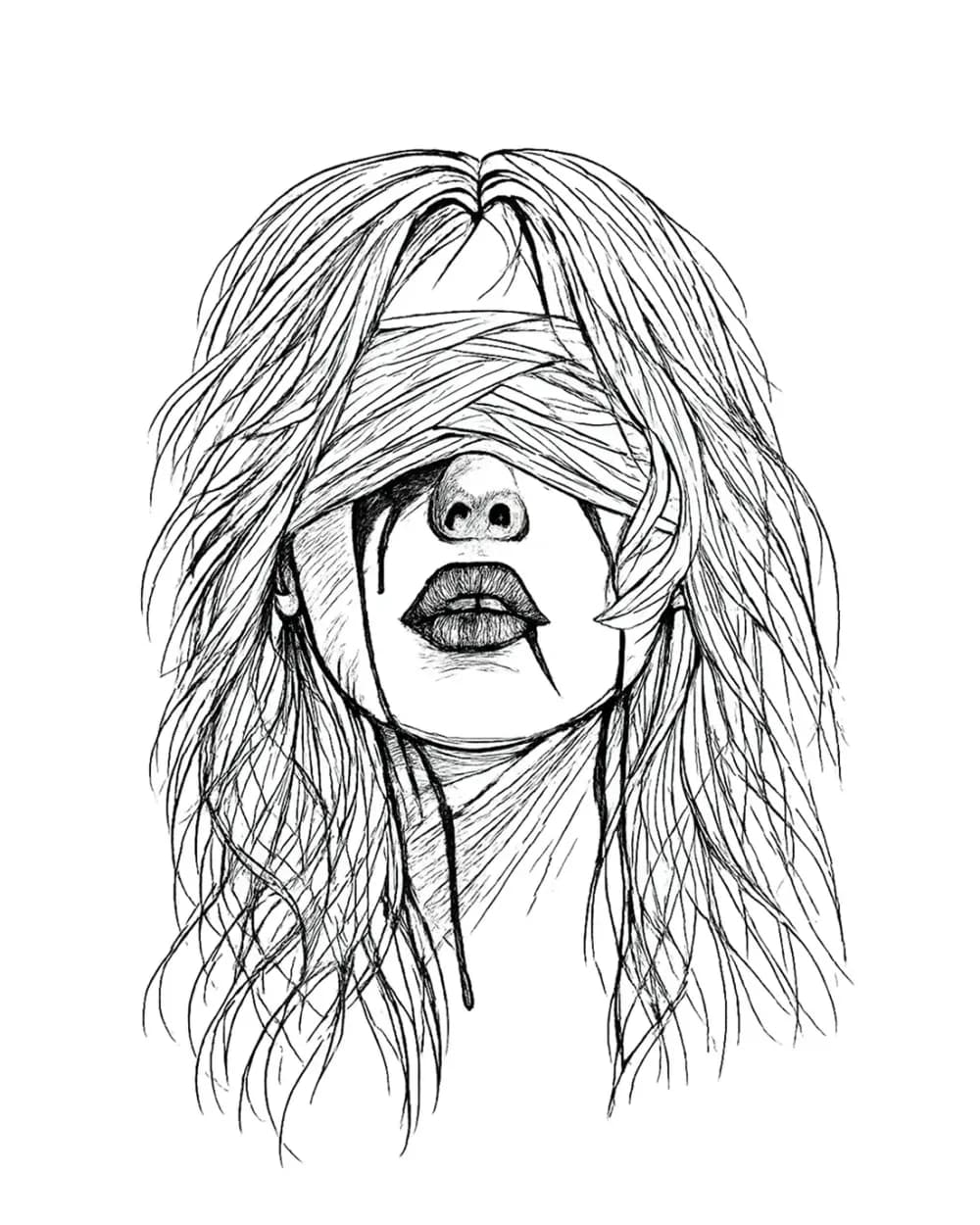
A detailed portrait direction where delicate hair, fabric, facial landmarks, and drip lines stay separated without a heavy perimeter outline.
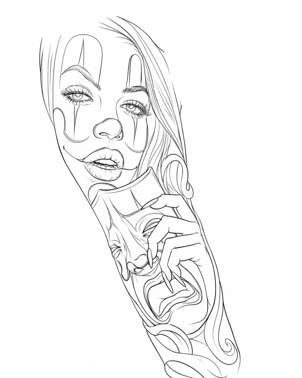
An intricate face-led composition that stays light by using selective contours and open space instead of thick black construction.
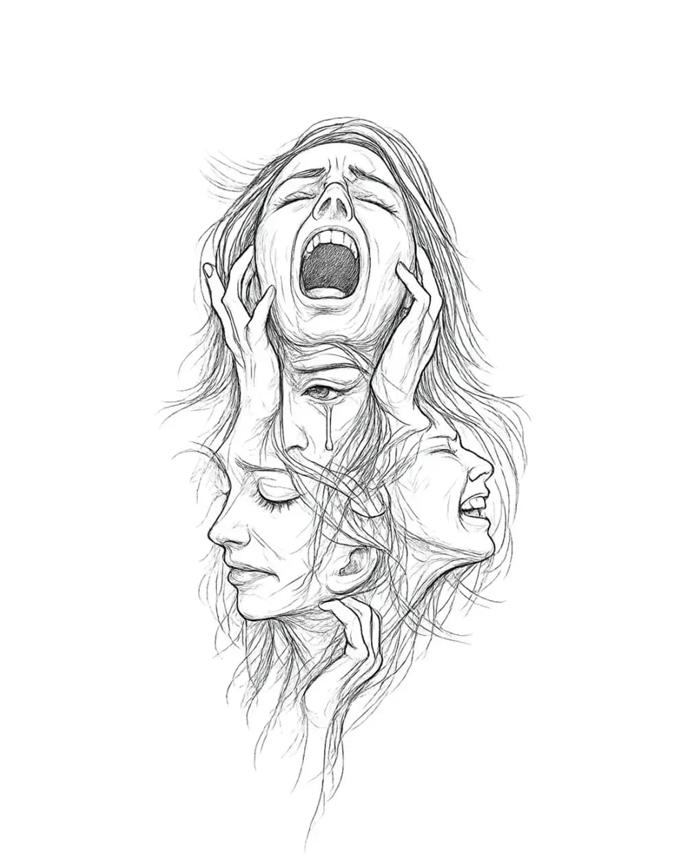
A more expressive fine-line direction where several faces stay distinct through selective sketch marks rather than black mass.
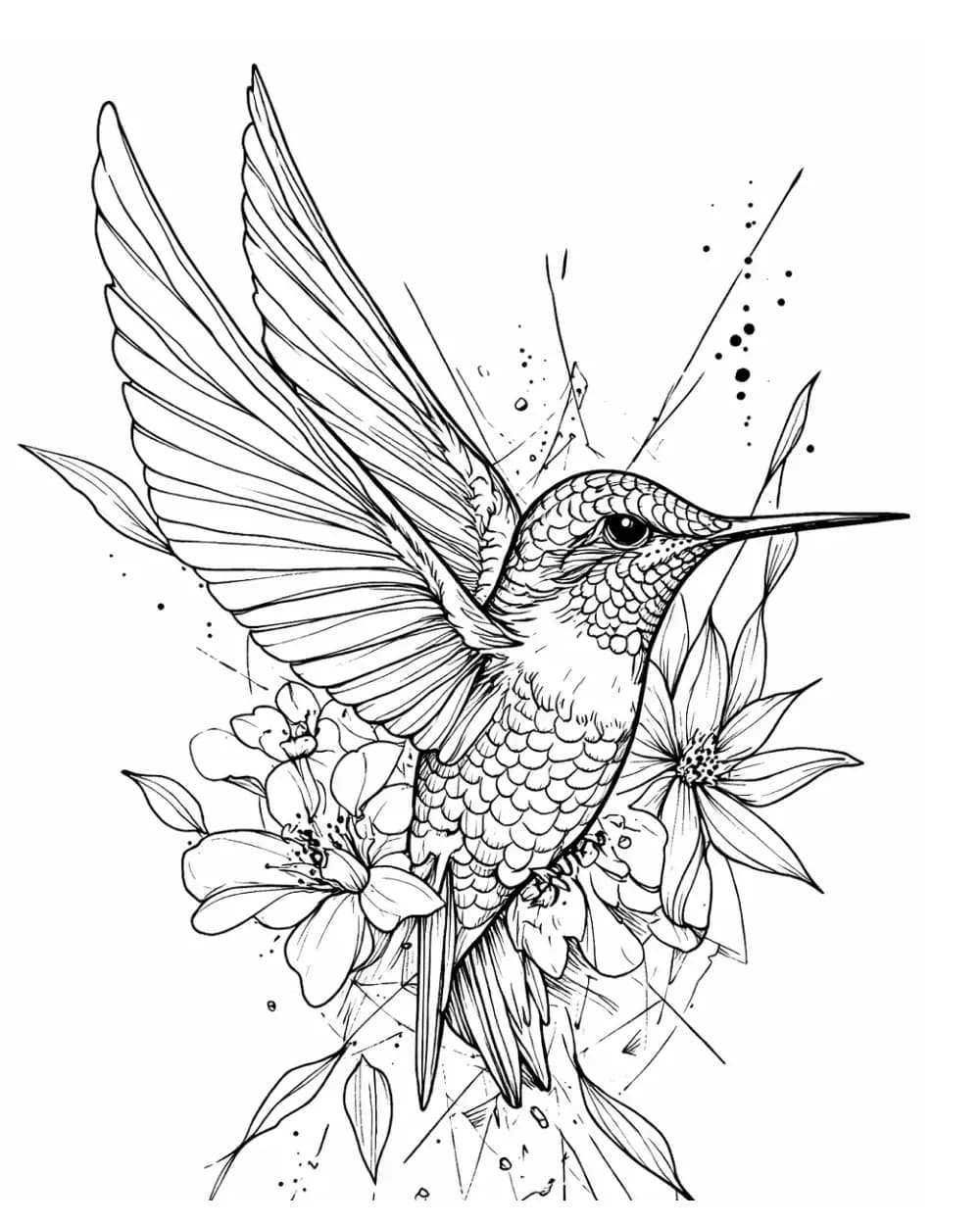
Thin feather, petal, and contour systems stay airy because solid black is minimal and the negative space remains part of the drawing.
A botanical example where small petal marks and branch changes remain readable because open space carries as much visual weight as the lines.
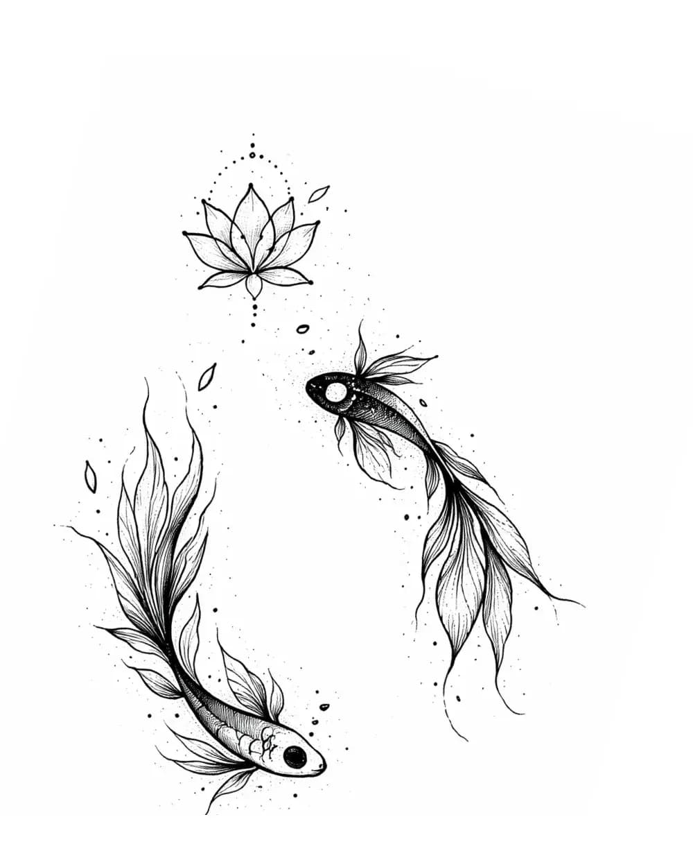
A vertical fine-line composition where flowing contours, sparse interior marks, and open spacing do more work than heavy outlines.
Fine-line construction
A Fine-line stencil stays light because structure, detail, and empty space are deliberately selected. Simply shrinking line weight cannot create that hierarchy after the fact.
Keep
The few outer and structural lines that establish the subject, gesture, and main overlaps
Reduce
Automatic heavy perimeter outlines around every form
Verify
The subject still reads before you inspect the smallest interior marks
Keep
Open channels between hair, petals, feathers, facial detail, ornament, and repeated contours
Reduce
Extra lines that fill breathing room without adding a new structural decision
Verify
The narrowest important gap remains visibly open at the intended tattoo size
Keep
Selective landmarks, texture direction, folds, veins, feather breaks, or ornament that genuinely help the design
Reduce
Uniform micro-detail distributed across every surface
Verify
Interior marks stay subordinate to the main read instead of flattening the hierarchy
Keep
Sparse stipple, short directional marks, and light tonal guides when they explain form
Reduce
Dense shading bands or black masses that change the design into another style
Verify
The stencil still feels open and line-led when viewed at normal working distance
Do not confuse the controls
One changes the design. The other changes the visual mass of lines that already survived. Treating them as the same control is how delicate stencils become either empty or crowded.
Style construction
Decides which contours, negative spaces, interior landmarks, texture cues, and tonal marks belong in the design.
Output mass
Changes how much visual weight the surviving marks carry. It does not invent or remove Fine-line construction by itself.
Use the Fine vs Normal vs Bold line-weight guide when the design is already correct and the problem is printed line mass or closing negative space.
Workflow
Do not start by thinning everything. Decide what deserves to remain, protect breathing room, and only then tune how the surviving marks reproduce.
01
Start from the subject, gesture, and important overlaps. Fine-line is not achieved by making every contour thin; the structure still needs a clear first read.
02
Keep the lines that change recognition, direction, overlap, or texture. Drop repeated information that narrows negative space without adding a useful decision.
03
Simple, Standard, and Detailed decide how much information survives. Fine, Normal, and Bold change the mass of the surviving lines. Neither control by itself defines Fine-line style.
04
Final size is the real stress test. A delicate line can disappear while a nearby channel closes, even when both look perfect on a zoomed screen.
Final-size preflight
Fine-line fails first at the edges of visibility: the weakest mark disappears, or the narrowest gap closes. Test both.
The subject should still be obvious from the structural contours, gesture, and large separations. If it only reads after every edge is reinforced, the construction is not ready.
Fine-line depends on breathing room. Check that empty channels around petals, feathers, hair, ornament, and facial detail are doing useful compositional work.
Small detail should explain a landmark, overlap, texture direction, or visual rhythm. Remove marks that simply make the stencil look busier.
If the construction is right but the printed lines are visually heavy, test Fine weight. If important marks disappear, return to Normal rather than deleting structure accidentally.
Inspect petal channels, feather separations, hair strands, eye corners, mask detail, and repeated ornaments at the dimensions you plan to transfer.
Use the right owner
Fine-line owns how the stencil is constructed. Move to a narrower page when the main risk is likeness, subject browsing, or preparing your own reference.
Use Realism when value landmarks, dark cores, anatomical planes, and rendering guidance matter more than delicate line-led construction.
Realism stencil workflowUse the subject directory when you want to compare how one depicted subject can be organized across several stencil directions.
Browse stencil subjectsIf the style and subject are already decided, prepare the actual reference instead of browsing more examples.
Photo-to-stencil workflowFAQ
The important distinction is whether you are changing the design, the amount of information, or only the mass of the printed lines.
Fine-line is a design and construction problem, not only a line-width setting. The stencil usually depends on selective delicate contours, useful negative space, restrained interior detail, and light texture or stipple cues. The main structure still has to read clearly without relying on heavy perimeter outlines.
Try the workflow
Protect the design hierarchy, check the narrowest gaps at final size, and use line weight as a separate output decision.