

Stencil Gallery

Anime Tattoo Stencil Gallery

Compare five curated anime tattoo stencil directions built around character readability, masks, graphic silhouettes, and controlled interior detail. Use the gallery to see which identity cues need to survive the transfer, which lines can stay secondary, and where small-scale detail starts competing with the main read.

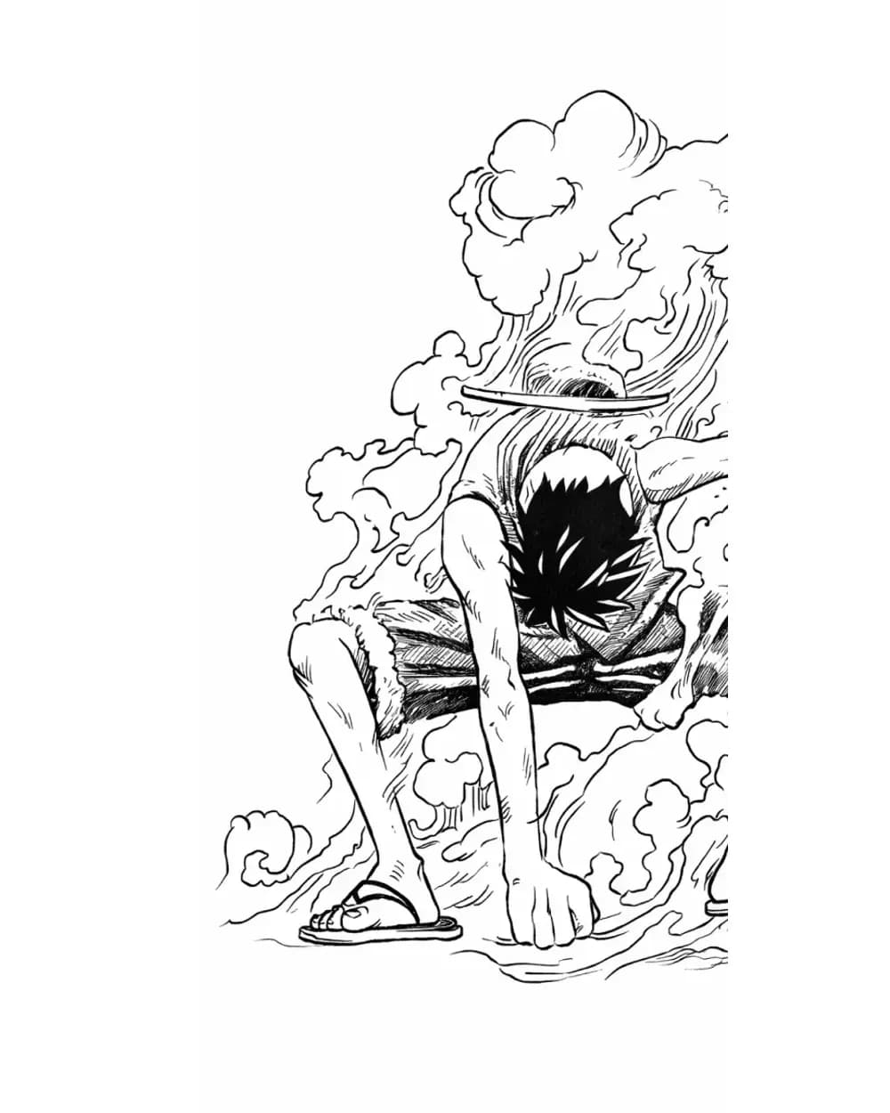
Luffy anime tattoo stencil with character-focused linework
5
Visual
Practical

Examples

Browse the stencils.

Scan the images first. Open the notes when you want to see why a composition stays readable or where detail gets risky.

Luffy anime tattoo stencil with character-focused linework

Character portrait example for comparing identity landmarks with secondary detail.

The character read is established before the smaller interior marks, so the stencil can keep recognition even when secondary detail is reduced.
Studying how a recognizable anime character can keep identity without giving every source line equal weight.
Treat the tightest interior clusters as optional until the final tattoo size proves they stay separated on paper and skin.
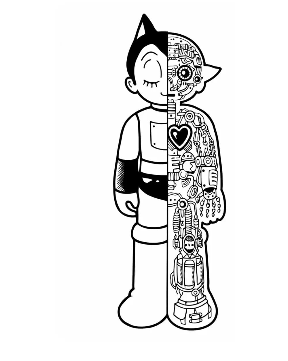
Astro Boy anime tattoo stencil with clean graphic linework

Graphic character example where large shapes carry more of the recognition work.

The simpler graphic construction makes the outer contour and major internal shapes do most of the recognition work instead of relying on texture.
Comparing a cleaner, lower-density anime stencil against more detailed portrait and mask compositions.
Do not add decorative linework merely to make a sparse stencil look more complex; extra marks can weaken the clean character read.
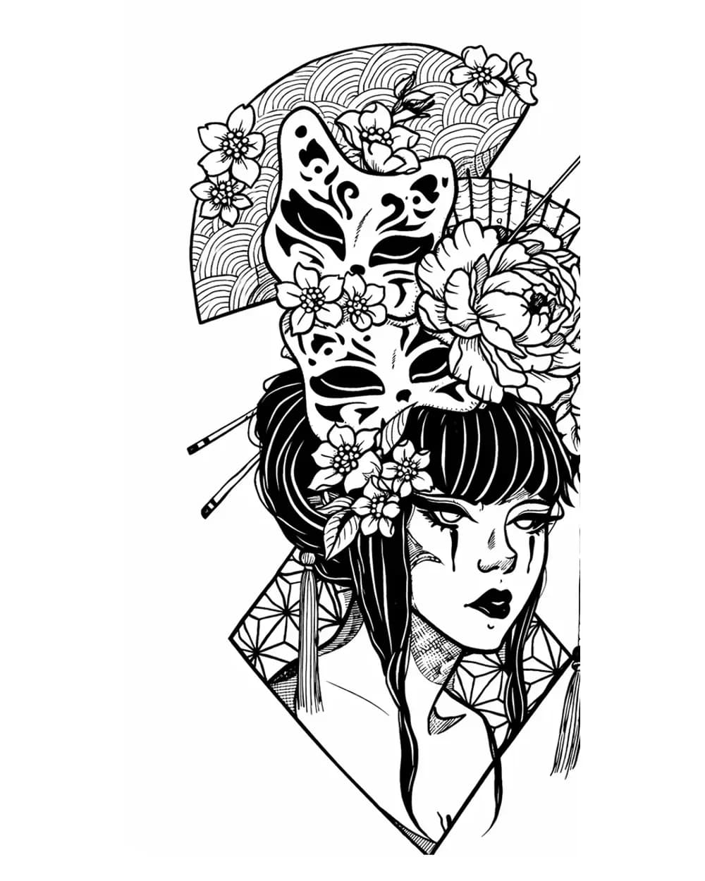
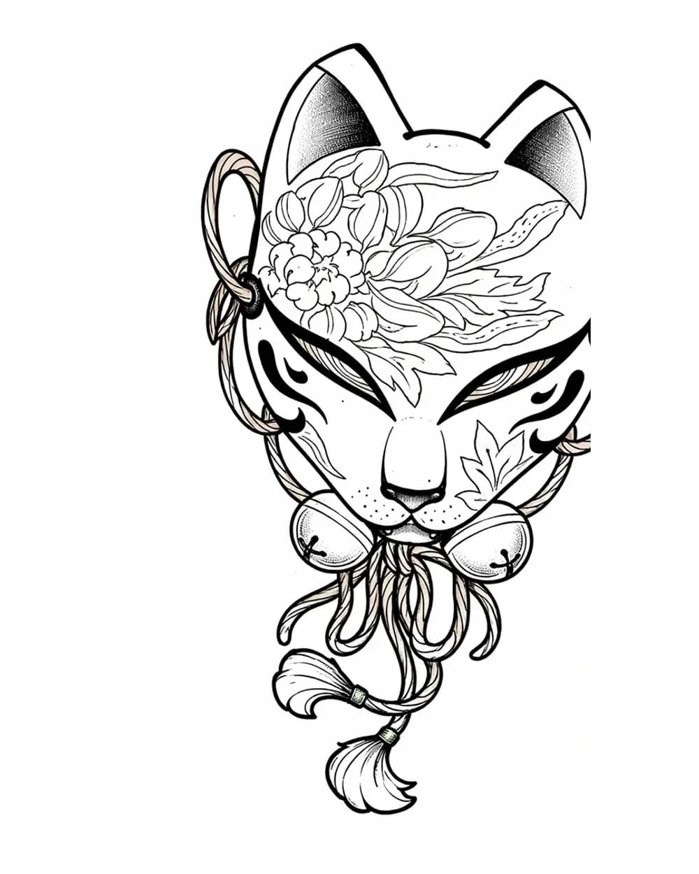
Geisha and kitsune mask anime tattoo stencil composition

Multi-focus example for separating a face, masks, and supporting ornament without flattening the hierarchy.

Multiple focal elements remain useful because the face and mask shapes can be read as separate structures instead of one continuous field of detail.
Planning anime-inspired compositions that combine a portrait with masks or secondary symbolic elements.
At smaller sizes, repeated mask contours and ornamental edges can compete with the main face; protect the focal hierarchy before preserving decoration.
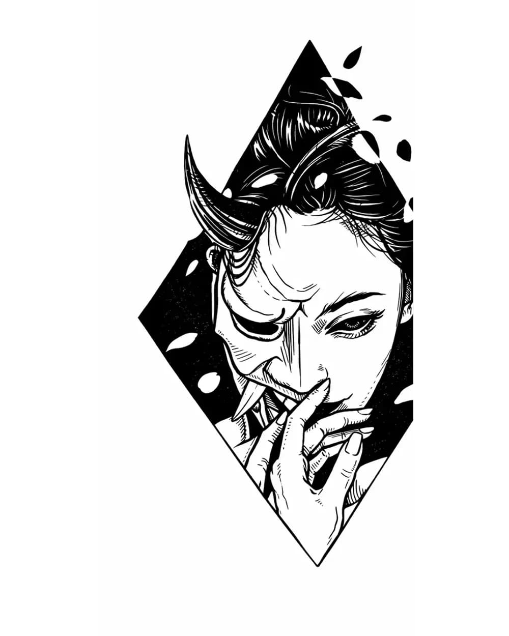
Oni portrait anime tattoo stencil with high-contrast facial structure

Mask-like portrait example for testing which facial landmarks need the strongest separation.

The portrait is carried by a strong face-shaped structure and high-contrast landmarks, which gives the stencil a clear hierarchy before shading is considered.
Studying high-contrast anime and mask portraits where expression depends on a few dominant landmarks.
Dense facial marks can close together quickly when the piece is reduced; preserve open channels around the most important expression cues.
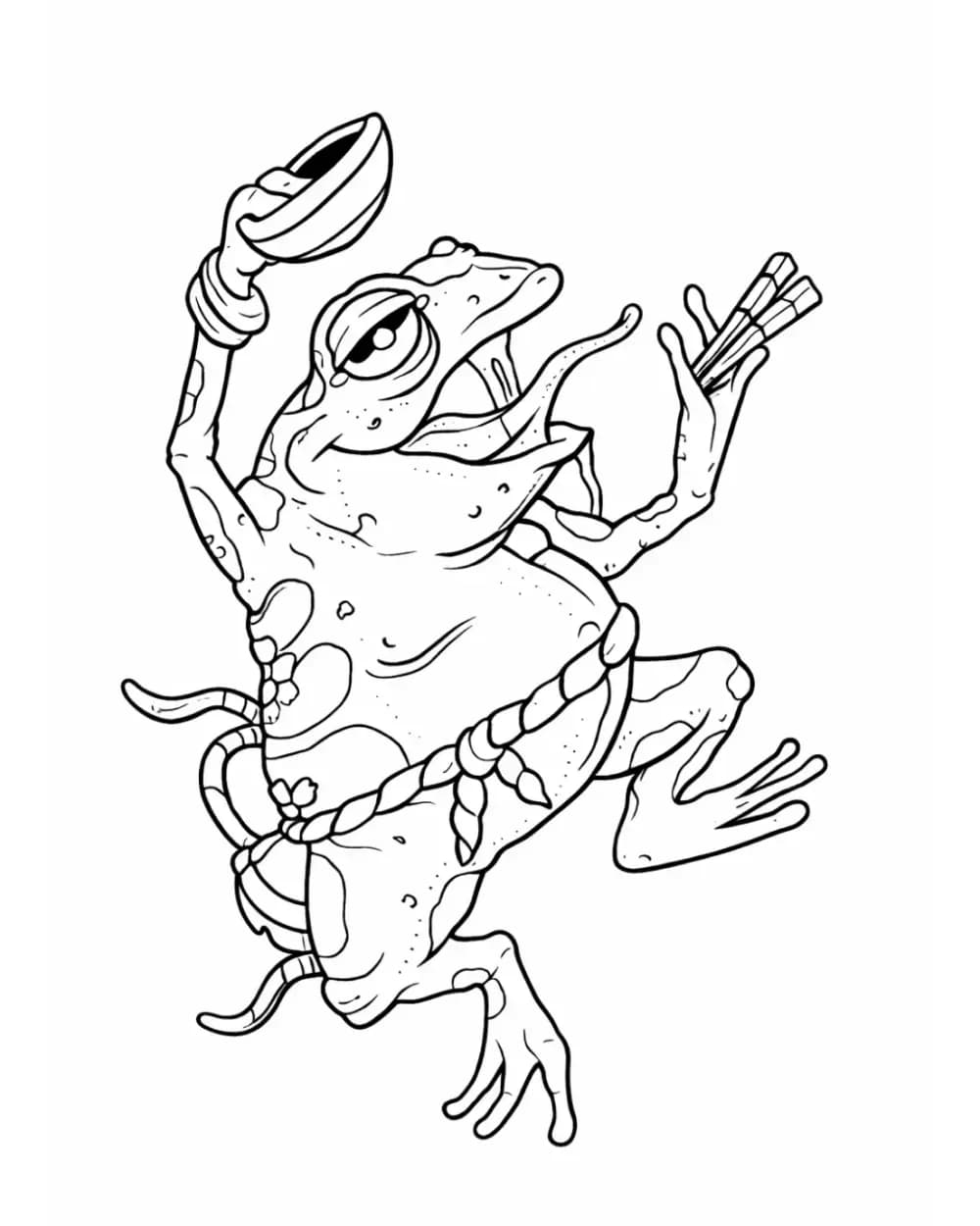
Frog yokai anime tattoo stencil with readable creature silhouette

Creature example for seeing how silhouette and facial cues can carry recognition without a human portrait structure.

The non-human character still has a clear primary read because the creature silhouette and face cues stay more important than secondary texture.
Comparing anime and yokai creature references where silhouette matters more than portrait likeness.
Small accents should not break the negative space that separates the face, limbs, and outer contour at the intended tattoo size.

Artist notes

What holds up in the stencil.

Start with the big read, then check the details that can merge, disappear, or compete at final size.

Protect the few cues that make the character unmistakable

Anime faces can be visually simple and still be extremely identity-sensitive. Eye shape and spacing, brows, mouth direction, face framing, hairline, mask edges, and one or two signature features often carry more recognition than dozens of small source marks. Build the stencil hierarchy around those landmarks first, then decide which secondary lines genuinely help the transfer.
Do not treat every line in an anime reference as the same job

Hair strands, manga hatching, smoke, speed lines, clothing folds, and graphic effects can all exist in one reference, but they should not automatically receive equal stencil weight. Keep the large hair mass and direction readable, use only enough internal strands to explain form, and let effects stay secondary unless they are essential to the composition.

Check negative space before making weak details darker

When an anime stencil gets smaller, the first failure is often not a missing line but lost separation between nearby lines. Inspect eyes, mouths, hair clusters, mask openings, fingers, weapon details, and effect lines at the intended physical size. If a channel is already narrow, adding global line weight can close it instead of fixing the stencil.

Use the reference as a hierarchy, not a tracing checklist

A useful anime stencil does not need to reproduce every contour visible in the source. Separate must-transfer identity landmarks from optional rendering information. That gives the artist a cleaner map for placement and transfer while leaving shading, texture, and final rendering decisions where they belong: in the tattoo workflow, not baked indiscriminately into the stencil.

FAQ

Quick questions about anime stencils.

Compare silhouette, key landmarks, spacing, and where detail starts to crowd across these 5 examples. The useful question is what still reads clearly at the size you plan to work at.

Next step

Turn your own anime reference into a stencil draft

Upload your own reference, choose the amount of structure you need, and compare the generated stencil before moving into placement, print, or transfer.