
Om stencil evaluation

Vet the Om glyph before it becomes a stencil

Om lives or dies on correct construction and one small gap. Check the five glyph parts, the dot separation, and the curve proportion at your exact height, then clear placement and reverent use before transfer.

Built for working artists preparing Om pieces. This page covers Om glyph vetting, Om-specific size and gap floors, and orientation plus reverent-use triage only, not tattoo application or healing advice. Generic linework method, religious family comparison, and print mechanics stay in the linked owners.

What makes an Om stencil-viable

Construction, gaps, and disposition decide the result.

An Om stencil is one written character with five named parts and one strict orientation. These three pillars predict whether that character survives reduction, print, and transfer with its meaning intact.

Glyph construction continuity

Om reads as one written character with five named parts: a large lower curve for waking life, an upper curve for deep sleep, a middle curve reaching outward for the dream state, a chandrabindu crescent for illusion, and a separate bindu dot above it for the fourth state. Stencil viability comes from keeping every part present, correctly proportioned, and correctly separated, not from smoothing the shape into a decorative swirl.

Check: Name all five parts on the reference before judging line weight. If the dot touches the crescent, the crescent has become a swoosh, the lower curve is no longer the largest, or a part was dropped for a cleaner look, the reference needs redrawing before any size check.
Counter and gap openness

The dot-to-crescent gap, the openings between the three lower curves, and the space around the crescent tips carry the stencil read. Screens forgive crowding that paper and skin do not, and ink spread closes the smallest gap first, which on Om is almost always the dot separation.

Check: Trace each separation from open skin to open skin at the exact physical height. If the dot gap, a curve mouth, or a crescent tip clearance closes at 1:1, widen it or enlarge the whole glyph before touching stroke mass anywhere else.

Orientation and reverent disposition

Om has one correct upright orientation with the dot above the crescent and the curves seated below. Placement and orientation are part of construction soundness here, because a tilted, inverted, stretched, or below-the-waist Om can be technically clean and still be the wrong stencil for a reverent client.

Check: Confirm the glyph sits upright, undistorted, and above the waist on a named placement before print. When the request points below the waist, onto feet or ankles, or into a distorted orientation, pause and discuss an upper-body alternative or a different motif before preparing the transfer.

Om evaluation framework

Score the reference in minutes, then act on the weakest check.

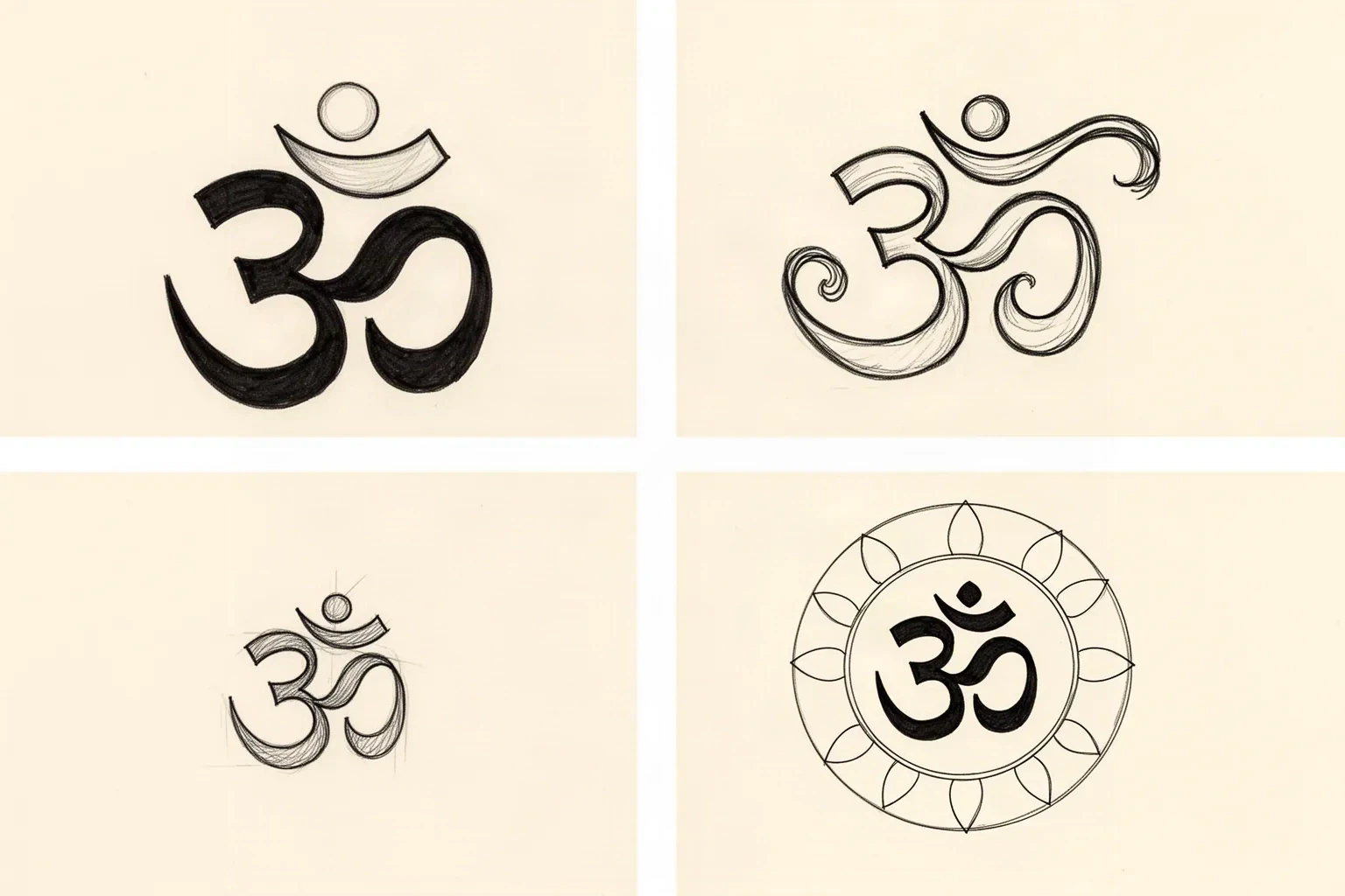
Four Om constructions at labeled heights. Each one names the protected structure, the fix, and the go or no-go verdict at that exact size. Confirm with a measured 1:1 print.

Synthetic ink line study of four Om constructions: a sound upright glyph with a detached dot above a seated crescent, a decorative variant with a swoosh crescent and equalized curves, a crowded hairline micro glyph, and an Om held inside one open-petal ring.
Synthetic ink line study, not client work or app output. Top left: a construction-sound single Om with the dot held clear of the seated crescent. Top right: a decorative variant whose swoosh crescent and near-equal curves make it a redraw case, not a sizing case. Bottom left: a correct glyph crowded into hairline mass, where the dot gap closes first. Bottom right: one restrained ring with open petal tips, so the glyph stays separated from every repeat. Judge your own reference against the five parts before trusting any single panel, and confirm at 1:1 on a measured print.

HOLDS AT STATED SIZE

Classic single Om at 9 cm

Intended height 90 mm

Source
Clean single Om with the lower curve clearly largest, a defined crescent seated above the curves, and a round dot held visibly separate from the crescent. Confident even stroke with no interior texture, shading, or added ornament.
Protect
Curve proportion with the lower curve dominant, the crescent shape and position, the detached dot with its full gap, and the outer contour of all three curves.
Fix
Hold the dot gap exactly as drawn and check it on a 1:1 print with a ruler. If one curve prints weakly, add a small amount of mass to the outer contour only, then recheck the nearest gap before approving.
Candidate stencil
Same Om with glyph construction verified, dot gap protected, and companion structure held at transferable mass.
Final-size verdict
Holds at 9 cm once the dot gap, every curve mouth, and both crescent tip clearances read as open skin at true size. This is the reference standard the other three examples are judged against.

REDRAW BEFORE SIZING

Decorative Om with swoosh crescent at 7 cm

Intended height 70 mm

Source
Attractive swirl-style Om from an image search with an elongated swoosh in place of the crescent, a dot merged into the swoosh tail, and lower and upper curves drawn near equal size. Reads as an Om-like flourish on screen but changes the character a reader expects.
Protect
Only the general curve idea and the requested height. None of the distorted separations are worth preserving as drawn.
Fix
Redraw from a correct glyph: restore the crescent to its defined seated shape, detach the dot with a full gap, and rebuild the lower curve as the largest of the three. Do not try to rescue this reference by thickening lines or enlarging alone, because enlargement preserves the wrong construction.
Candidate stencil
Same Om with glyph construction verified, dot gap protected, and companion structure held at transferable mass.
Final-size verdict
Not stencil-ready at any size until the crescent and dot are reconstructed. Enlarging a merged dot keeps a merged dot, only larger.

ENLARGE OR RECROP

Micro wrist Om forced to 2.5 cm

Intended height 25 mm

Source
Correctly drawn single Om reduced to a small wrist mark with hairline strokes and a tight dot gap near one millimeter on the print. Perfect on day one on screen with every gap technically open.
Protect
The correct construction and the wrist placement idea. The height and the hairline mass are what fail.
Fix
Enlarge past the point where the dot gap stays countable after ink spread, move to a confident rather than hairline stroke, or relocate the small mark to a slightly larger flat span such as the inner forearm. Do not keep hairline mass plus a tight dot gap at this height.
Candidate stencil
Same Om with glyph construction verified, dot gap protected, and companion structure held at transferable mass.
Final-size verdict
At 2.5 cm the dot gap is the first closure point as pigment settles, and the glyph then loses part of its meaning. Enlarge, strengthen the stroke, or choose a larger placement for this construction.

SIMPLIFY COMPOSITION FIRST

Om inside mandala and bead ring at 6 cm

Intended height 60 mm

Source
Seated Om centered inside a layered mandala ring with dot bands, petal repeats, and a bead arc. Strong symmetry on screen with hairline separations between the glyph, petals, dots, and beads sharing the same small field.
Protect
The Om construction itself with dot gap and curve proportion, plus the outer mandala circle that carries the composition.
Fix
Keep one petal rhythm with open tips and remove the dot band and bead arc first, or enlarge past the point where the Om dot gap, every curve mouth, and one petal rhythm each transfer as open skin. Do not keep the full glyph plus two fine repeat families at 6 cm.
Candidate stencil
Same Om with glyph construction verified, dot gap protected, and companion structure held at transferable mass.
Final-size verdict
At 6 cm the mandala reads as one textured band and dot rows print as broken scratches around a crowded Om. Enlarge, simplify to one ring family, or recrop to the single Om for this height.

Broad compact-symbol comparison stays on the symbols collection and generic linework method stays on the linework owner. Cross-family religious comparison stays on the religious owner. This framework exists to judge Om glyph construction, dot and curve gaps, and reverent disposition at a stated height, not to replace those owners.

Dot, curves, stroke, and companions at final size

Judge the white space at the height you will print.

Screens forgive crowding that paper and skin do not. Set the height first, then inspect each feature below at true physical size with scaling off.

About 5 cm and below

Wrist accents, nape marks, small gap fillers.

Carry a correctly drawn single Om only, with confident strokes and no mandala, beads, script, or trishul pairing. If the dot gap or any curve mouth closes at 1:1, enlarge or move the piece rather than forcing reduction.

About 6 to 10 cm

Common inner forearm, upper arm, nape, and chest Om pieces.

The most flexible band. A single Om or an Om with one restrained companion such as a lotus edge can work when the dot gap, every curve mouth, crescent clearance, and stroke mass are verified at true size.

About 10 cm and above

Upper back, shoulder blade, large chest, and thigh devotional compositions.

Room for an Om with a mandala ring, lotus base, or trishul pairing, but only when open skin separates the glyph from every petal, bead, and shaft edge to edge. Larger height does not rescue a merged dot, a swoosh crescent, or filled curve mouths.

Om feature checks by height band
FeatureAbout 5 cm and belowAbout 6 cm and above
Bindu dot and chandrabindu crescentKeep the dot fully detached with a countable gap at 1:1 and the crescent in its defined seated shape. If the dot touches the crescent or the crescent reads as a flourish, redraw before any other fix.Same separation rule. Larger height allows a slightly finer crescent, but detachment still beats uniform thinness.
Three lower curves and their mouthsKeep the lower curve largest with each curve mouth visibly open at 1:1. Equal-size curves or pinched mouths merge first at small heights.Curve rhythm can carry more modulation when each mouth stays open at true size. Check proportion with a squint test at 1:1.
Stroke weight and fill riskUse one confident stroke family, not hairline. Hairline plus a tight dot gap is the fastest path to a merged glyph after healing.Slightly finer strokes can work when every gap is verified at 1:1, but bold still reads longer than delicate at the same height.
Mandala, lotus, bead, and trishul companionsOmit companions or keep one lotus edge maximum. Dot bands, full petal beds, bead arcs, and shafts crowd the glyph first.One ranked companion family can work when each repeat keeps open skin between neighbors and the Om dot gap stays the clearest separation on the stencil.

Reference to clean stencil

Build from the glyph outward, then protect the dot.

Work in this order so one change at a time can be judged at the same height. Stop when construction, gaps, orientation, and disposition each read correctly.

  1. 01

    Lock height, placement, and intent first

    Set the intended physical height in millimeters, name the body area, and name the intent in one line: quiet devotion, yoga lineage, memorial, or protection. An Om that holds at 9 cm on an inner forearm can fail at 2.5 cm on a wrist with no line being wrong on its own. Confirm the placement sits above the waist and upright before any gap work. Use the size calculator when target dimensions are still open.

  2. 02

    Verify glyph construction against the five parts

    Confirm the lower, upper, and middle curves with correct size relationship, the seated crescent, and the detached dot. Reject swoosh crescents, merged dots, dropped parts, stretched or tilted geometry, and decorative image-search approximations. Ask someone who reads the script to confirm the form when the source is uncertain, before the reference becomes a stencil.

  3. 03

    Set glyph-versus-companion roles

    Assign every mark a role: Om structure that carries the first read, support that frames it, and texture that can be removed. Strengthen the outer curve contour and protect the dot gap first, keep one companion rhythm second, and mark one removable repeat such as an inner dot band, bead arc, or petal row that can go if gaps close.

  4. 04

    Simplify repeats and verify gaps at 1:1

    Reduce dot, petal, and bead repeats before thinning contours, hold the crescent clear of the curves, and keep each curve mouth open. Run a squint check: step back until fine marks disappear and confirm the Om still reads as the correct character with its dot separate. The line-weight guide covers fine, normal, and bold behavior on the same stencil.

  5. 05

    Verify print and transfer path

    Export a true-size PDF with no fit-to-page scaling, inspect the dot gap, the tightest curve mouth, and the smallest companion contact on plain paper, then measure the physical print with a ruler. If the digital file passes and only paper fails, move to print-stage evidence instead of simplifying again.

Placement and reverent-use triage

Upright glyphs want flat upper-body skin

An Om is a compact upright character with a strict top and bottom. Flat upper-body placements preserve it with little compensation, while wrapped or lower-body placements force a harder conversation.

Inner forearm and upper arm

Flat, low-friction fields that suit the single Om best. The limb axis keeps the upright orientation natural and the dot gap stays inspectable at stencil size.

Check: Align the glyph upright along the flattest span, hold the dot above the crescent with no tilt, and verify the dot gap and curve mouths at 1:1 before print.

Nape, upper back, and chest

Broad flat panels with room for a single Om plus one restrained companion such as a lotus edge or mandala ring. The body midline and collarbone curve become part of the design on chest and sternum-adjacent work.

Check: Center the glyph on the flattest span, keep the crescent and dot clear of neckline or shoulder-blade edges, and preview on a body photo before locking a companion ring.

Wrist and small curved spans

Narrow wrapped fields with higher friction and faster visual crowding. The dot gap that holds on a forearm can close here at the same drawn size because the printable height is shorter.

Check: Carry a single Om only with confident strokes, keep the glyph inside the flattest panel, and enlarge or relocate to the forearm when the dot gap closes at the requested height.

Respectful placement boundary

Many Hindus hold that sacred symbols should not be worn below the waist, and particularly not on the feet, calves, or near private areas. Orientation matters too: tilted, stretched, or inverted geometry changes a reverent character into a decorative mark.

Check: Keep the figure upright and above the waist, undistorted and coverable where temple visits matter. When a client requests a lower placement or a distorted orientation, pause and discuss an upper-body alternative or a different motif before preparing the transfer.

Stencil-ready checklist

Approve the Om only when every line passes

Run this short sequence with scaling off and a ruler in hand. One failed line means fix, enlarge, recrop, or reselect before transfer.

  • Confirm intended height in millimeters, the named placement above the waist, and the one-line intent.
  • Confirm all five glyph parts are present with the lower curve largest and the crescent correctly seated.
  • Confirm the bindu dot sits fully detached above the crescent with a countable gap at 1:1.
  • Confirm every curve mouth and crescent tip clearance traces to open skin at true size.
  • Confirm one confident stroke family with at most one ranked companion repeat and no merged contacts.
  • Export a true-size PDF with scaling off and measure the physical print with a ruler.
Reverence first Verify gaps at 1:1 Dot stays separate

FAQ

Om stencil decisions, answered

Short answers for the glyph, size, gap, placement, variant, and print checks that recur when an Om reference moves toward transfer-ready output.

It is correct when all five parts are present and separated: a largest lower curve, an upper curve, an outward middle curve, a seated crescent, and a dot held fully apart above the crescent, all upright and undistorted. Reject swoosh crescents, merged dots, dropped parts, equal-size curves, and decorative image-search approximations before judging size. When the source is uncertain, have someone who reads the script confirm the form before it becomes a stencil.

Next steps

Use the neighboring owners for adjacent jobs.

This guide covers Om glyph checks, height-tied dot and curve gap rules, upright placement-size decisions, reverent-use triage, and reference-to-stencil preparation. Use the links below for related jobs such as sizing, print checks, paper, and placement.

Cross-symbol method, religious family comparison, generic detail levels, broad gallery browsing, paper manufacturing detail, and placement mechanics stay in their specialist owners. The links above hand off instead of repeating that detail.

From evaluated reference to working stencil

Turn the approved Om into a stencil draft.

Start from the Om that passed the glyph, gap, orientation, and reverent-use checks, then continue on iPhone for body fit, exact-size print, mirror and professional export.