Covered here
Dollar-sign variant choice for stencil readability, S-stroke and slash-gap retention with small-size thickness rules at 2 to 4 cm, and mirror and transfer-ready prep specific to dollar-glyph failure modes.


Dollar-glyph stencil triage
Compare single vs double-stroke dollar constructions through a stencil lens, hold slash-gap and S-bowl separation at 2 to 4 cm, then mirror and prep one transfer-ready glyph with a verifiable checklist.
Built for working artists prepping a client-requested dollar mark. This page covers dollar-glyph variant choice, slash-gap and small-size thickness rules, and mirror and transfer-ready prep only. Bill, stack, bag, and coin compositions stay with the money owner, cross-symbol comparison stays with the symbols hub, and lettering composition stays with the lettering owner.
Dollar glyph versus neighboring jobs
A dollar sign is one compact glyph judged on variant construction, slash-gap retention, and mirror correctness at final size. These boundaries keep it out of neighboring owners that solve different stencil problems.
Covered here
Dollar-sign variant choice for stencil readability, S-stroke and slash-gap retention with small-size thickness rules at 2 to 4 cm, and mirror and transfer-ready prep specific to dollar-glyph failure modes.
Neighboring owners keep
Bill, stack, bag, and coin composition stays with the money owner, cross-symbol silhouette comparison stays with the symbols hub, script and wording composition stays with the lettering owner, and generic body-fit mechanics stay with the placement guide.
Money owner for wealth compositions, symbols hub for cross-symbol comparison, and lettering triage for wording work.
Four dollar constructions compared
Four dollar constructions judged on the same job: transfer cleanly at 2 to 4 cm and stay legible after healing. Pick the family first, then run the retention checks below.
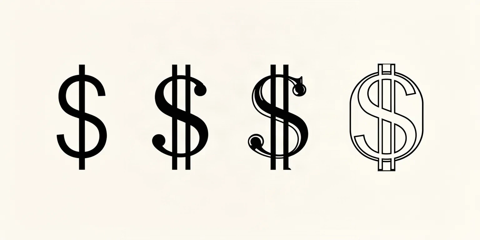
MOST FORGIVING AT 2 TO 4 CM
A lean sans S crossed by one straight vertical slash, with one open channel on each side of the slash and open upper and lower S bowls.
CLASSIC BUT GAP-HUNGRY
An S crossed by two parallel slashes, the familiar banknote-style construction, with four narrow channels between slash edges and S curves.
DECORATIVE, NEEDS WIDTH
A dollar built from a serif or display face: bracketed feet, ball or wedge terminals, stroke contrast, sometimes an inline or shadow line.
GAP-DEPENDENT, PROOF TWICE
Each stroke drawn as an outline shell with open interior, sometimes with stipple, hatching, or grey-wash texture inside the S or around the slash.
Wealth-scene composition, cross-symbol silhouette comparison, and wording composition stay in their owners. This framework exists to judge dollar-glyph construction, slash-gap separation, and small-size survival at a stated width, not to replace those guides.
Slash-gap and stroke retention system
Closing slash channels, pinched S bowls, and thin strokes that drop on thermal paper decide the glyph before style preference matters. Run each check below at the exact millimeter width.
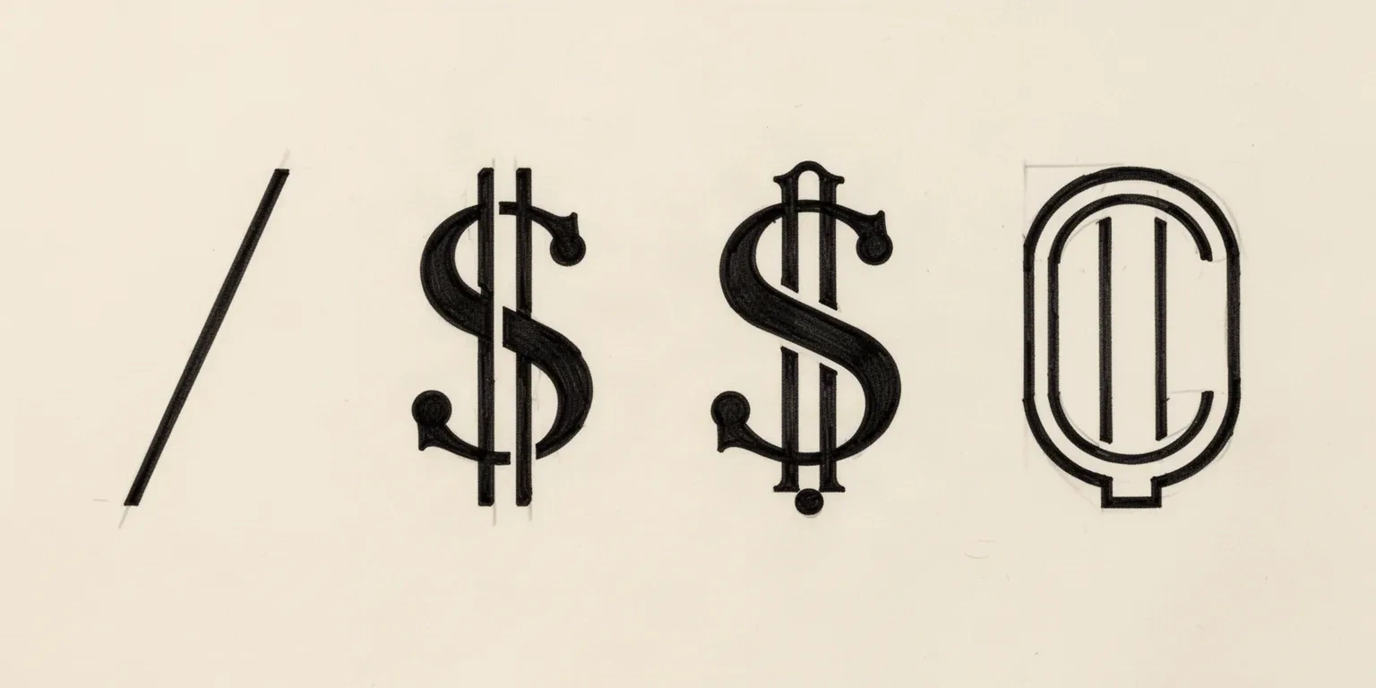
Slash-gap channels
Every slash needs its own open skin channel on both sides at the final width. On a single-stroke glyph that is two channels; on a double-stroke glyph it is four, including the narrow channel between the paired slashes, which is always the first to close.
Check: Trace each channel on the 1:1 proof with scaling off. If any channel touches or bridges on plain paper, widen the slash spacing, straighten the slash, or drop to a single stroke before transfer.
S counter openings
The upper and lower bowls of the S are enclosed counters that fill from the inside at small sizes. A condensed or high-contrast S pinches its bowls shut while the slash channels still look open, so the glyph fails after the gaps pass.
Check: Confirm daylight inside both S bowls at arm's length on the measured print. If either bowl reads as a slit, open the S, reduce contrast, or enlarge before approving the slash work.
Stroke-mass floor
The thinnest stroke decides the glyph: slash tips, thin S spine segments, and serif hairlines carry the least ink on the stencil and spread fastest on skin. Thermal transfer drops marks below reliable mass without warning.
Check: Squint at the 1:1 print at arm's length. If the thinnest part of the glyph disappears while the heaviest part dominates, rebuild the thin mass or choose a plainer construction.
About 2 cm
Finger, behind-ear, and small gap-filler dollar marks.
Single-stroke sans construction only, one slash, no terminals, no outline, no texture. Both S bowls and both slash channels must read open at the exact millimeter width, or enlarge rather than forcing the reduction.
About 3 to 4 cm
Common wrist, ankle, and hand dollar pieces.
The most flexible band. A single-stroke glyph holds comfortably; a double-stroke glyph holds only when all four slash channels verify open at 1:1 with a ruler. Strip terminals and inline detail before shortening the width.
Above 4 cm
Forearm, calf, and chest dollar pieces with room for style.
Room for serif, outlined, or double-stroke constructions with ranked detail, but only when slash channels, S bowls, and terminal clearances all verify open at true size. Extra width never rescues a slash that touches the S spine.
Gap diagnostic
Follow one closing slash channel or S bowl when a single separation is the blocker.
Density diagnostic
Use the final-size density check when terminals, outlines, and texture compete for the same small glyph.
Line-weight guide
Compare fine, normal, and bold behavior on the same dollar glyph before changing slash or S mass.
Reference to clean glyph
Dollar prep is sequencing work. Lock the variant, rank the structure, open gaps at true size, mirror once, then prove the print.
Name the variant family from the comparison above, set the intended physical width in millimeters, and name the body area before judging the reference. A double-stroke glyph that holds at 4 cm on a forearm can fail at 2 cm on a finger with no line being wrong on its own. Use the size calculator when target dimensions are still open.
Assign every mark a role: the S silhouette carries the first read, the slash carries the currency read, and terminals, outlines, and texture are removable. Protect the S bowls and the slash channels first, then decide which decorative family earns its room at this width.
Widen or straighten slash channels, open pinched S bowls, and rebuild thin slash tips and hairlines to transferable mass on the measured proof. Run a squint check: step back until fine detail disappears and confirm the dollar still reads as a dollar.
Mirror the approved file a single time for transfer and check the mirrored result, not the screen original: slash lean flips direction, and a slash that cleared the S spine before mirroring can touch it after. Confirm every channel is still open on the mirrored proof with a ruler.
Export a true-size PDF with no fit-to-page scaling, inspect the narrowest slash channel and the tightest S bowl on plain paper, and measure the physical print with a ruler. If the digital file passes and only the paper print fails, move to print-stage evidence with the print checker and the paper guide below.
Placement and size guardrails
A dollar is one compact asymmetric glyph with narrow internal channels. Flat placements preserve slash separation, while curves and flex zones compress the channels that matter most.
Long flat runs where a 3 to 4 cm dollar sits level and slash channels hold with little compensation. The flattest fields in this size range.
Check: Align the slash near vertical to the limb axis, keep every channel inside the flat run, and verify the mirrored proof at 1:1 before print.
Small curved fields where only lean single-stroke glyphs survive at 2 to 3 cm. Curvature compresses slash channels on the inside of the curve first.
Check: Carry one slash family only, keep S bowls open, and confirm every separation at the exact millimeter width with a dry wrap when the field curves.
Minimum-width recessed fields where double-stroke, serif, and outlined constructions merge first. The smallest dollar fields in studio work.
Check: Approve a plain single-stroke glyph at the measured width or enlarge. Remove every terminal, inline, and texture mark before transfer.
Movement zones where skin flex distorts the slash-to-S relationship after transfer. Folds drawn for style compete with real skin folds.
Check: Keep the slash and both S bowls clear of every flex line, and confirm with a dry wrap in a bent position before print.
Transfer-ready checklist
Run this sequence with scaling off and a ruler in hand. One failed line means fix, enlarge, simplify the construction, or reselect before the session.
Glyph composition and mirror
Compose the approved dollar glyph with mirror control and true-size PDF export.
Exact width and true-size PDF
Set physical width and calibration so the 1:1 check measures what the stencil will be.
Print preflight
Inspect fine slash tips, tight channels, and S bowls at the intended width before blaming the printer.
Body-fit preview
Check glyph level and channel compression on curved placements while edits are still cheap.
Next steps
This guide covers dollar-glyph variant choice, slash-gap and small-size retention rules, and mirror and transfer-ready prep. Use the links below for related jobs such as sizing, print checks, and specialist depth.
Exact size and true-size PDF
Set physical width, calibration, and page layout for the evaluated dollar glyph.
ContinueFinished-file preflight
Check fine slash tips, tight channels, and S bowls at the intended width.
ContinueGlyph composition and mirror
Compose the approved dollar glyph with mirror control and export at one width.
ContinueCreate a stencil draft
Start from the evaluated dollar reference once the go decision is made.
ContinueMoney composition owner
Use the money owner when the request is a bill, stack, bag, or coin scene rather than the glyph.
ContinueSymbols collection
Use the symbols hub for generic compact-symbol gap comparison outside dollar-glyph work.
ContinueLettering triage
Use the lettering owner when the job is script, blackletter, or wording composition.
ContinueBody-fit preview
Preview glyph level and channel compression on a real body photo while edits are still cheap.
ContinuePaper choice
Match the media family to the production method after the glyph file passes.
ContinueGap diagnostic
Follow one closing slash channel or S bowl when a single separation is the blocker.
ContinueDensity diagnostic
Use the final-size density check when terminals and texture compete for the same small glyph.
ContinueLine-weight guide
Compare fine, normal, and bold behavior on the same dollar glyph before changing mass.
ContinueWealth-scene composition, cross-symbol comparison, wording composition, paper manufacturing detail, and placement mechanics stay in their specialist owners. The links above hand off instead of repeating that detail.
FAQ
Short answers for the variant, small-size, mirror, placement, and tooling checks that recur when a dollar-sign request moves toward transfer-ready output.
Choose a single-stroke sans S with one straight slash for 2 to 4 cm work because it has two slash channels to hold instead of four, so small transfers keep separation with less width. Choose a double-stroke classic only for flat placements at 3 to 4 cm and above where all four channels verify open at 1:1. Reserve serif, outlined, and textured constructions for generous widths where terminals and interiors keep clearance, and convert to a plainer family whenever any channel or bowl closes on the measured proof.
From evaluated glyph to working stencil
Start from the variant that passed the slash-gap, S-bowl, mirror, and placement checks, then continue on iPhone for body fit, exact-size print, mirror, and professional export.