

Grunge stencil evaluation

Keep the grain, lose the marks that will not transfer

Compare distressed, splatter, grain, and typography grunge variants at stencil size, simplify broken lines and spray with value decisions, then prep one transfer-ready stencil that holds its texture on skin.

Built for working artists preparing grunge references. This page covers grunge variant choice, final-size readability, and transfer-ready prep only, not tattoo application or healing advice. General photo conversion, paper manufacturing, and placement mechanics stay with their own owners, linked below.

Why grunge fails on skin

Continuity, value, and gaps decide the result.

A grunge image uses interruption, noise, and tone for mood. A stencil needs deliberate contours, countable marks, and open skin between neighbors. These three checks predict the failure.

Broken-line continuity

Grunge references read through interrupted contours, scratched edges, and eroded borders. On screen the eye completes the gaps, but on transfer paper each gap is a separate segment that can vanish or drift. Stencil viability comes from deciding which breaks are structural texture and which breaks are accidental noise, then rebuilding the survivors as deliberate segments with working line mass.

Check: Cover all speckle and splatter. If the lead silhouette still reads from its broken contour alone, continuity is sound. If the shape needs the texture to be recognized, rebuild the contour first.
Value clumping over speckle

Photocopy grain, spray speckle, and distress noise carry dozens of grey values that thermal and hand transfer flatten into either solid marks or nothing. A stencil that keeps every faint dot carries marks that print patchily, smudge on application, and hide the lead shape. The grunge job is grouping nearby tone into a smaller number of deliberate dark clusters with open skin between them.

Check: Squint at the reference until only dark clusters remain. If three or fewer cluster shapes still carry the grunge mood, the value plan is sound. If the mood needs the full noise field, clump harder before print.

Protected skin gaps

Grunge fails first in its white space: hairline scratches close into grey smears, splatter dots merge into one blotch, and eroded borders bridge to their neighbors. Every surviving texture mark needs visible separation from the next mark and from the lead contour at true physical size with scaling off.

Check: Find the tightest scratch gap, the densest splatter cluster, and the narrowest border erosion at 1:1. All three must read as background at arm's length, or that zone needs widening, removal, or enlargement.

Variant comparison at size

Match the texture to the width you actually have.

Four grunge constructions judged on the same job: stay legible after print and transfer. Pick the family first, then simplify it with the rules below. Confirm with a measured 1:1 print.

HOLDS AT STATED SIZE

Distressed outline emblem at 12 cm

Intended width 120 mm

Source
Bold emblem or badge built from a thick outline with scratches, edge erosion, and a few detached tick marks around it. Strong on screen because the outline dominates; demanding on paper because every scratch competes with the contour for the same narrow band.
Protect
Full outer contour direction, the positions of the two or three deepest erosion notches, and the spacing rhythm of the detached ticks.
Fix
Rebuild the outline as one continuous heavy contour, keep the two or three deepest notches as deliberate gaps, and convert the remaining scratches into spaced ticks outside the contour with countable gaps at 1:1. Do not keep hairline scratches riding on the contour itself.
Candidate stencil
Same grunge direction with a rebuilt lead contour, clumped countable texture marks, protected skin gaps, and gradients moved to shading after transfer.
Final-size verdict
Holds at 12 cm once the contour runs unbroken and erosion reads as a small set of deliberate notches. The emblem keeps its badge read while the grunge character survives in the notch shapes and tick rhythm.

CLUMP OR REMOVE

Splatter and spray field at 10 cm

Intended width 100 mm

Source
Central motif, word, or skull surrounded by spray dots, drips, and overspray fading outward. Attractive on screen because density gradients feel photographic, but most dots sit below transferable mass and print as faint patchy marks or vanish while a few large drops dominate.
Protect
Central motif silhouette with its own clearance ring, plus the positions of the three to five largest drops that set the splatter direction.
Fix
Set a clear zone around the lead motif, clump surviving dots into a small number of countable drops at working line mass, and remove the fine spray tail entirely. Keep at most a short gradient of five to eight drops that the design reads without.
Candidate stencil
Same grunge direction with a rebuilt lead contour, clumped countable texture marks, protected skin gaps, and gradients moved to shading after transfer.
Final-size verdict
Holds at 10 cm as a clumped splatter accent, not as a photographic spray field. If the piece needs the full gradient to feel grungy, enlarge past the point where the smallest survivor prints, or move the gradient to shading after transfer.

SIMPLIFY VALUES FIRST

Photocopy and Xerox grain portrait or figure at 14 cm

Intended height 140 mm

Source
High-contrast black and white figure with heavy grain, crushed shadows, and blown highlights. Rich on screen because grain models the form, but mid-tone grain prints as dirty texture: solid in hot areas, absent in light areas, with no controlled middle.
Protect
Lead silhouette, the largest shadow masses that shape the form, and the positions of the brightest preserved highlights inside dark areas.
Fix
Reduce the reference to two values plus skin: solid dark clusters, open skin highlights, and one sparse stipple row for the transition. Convert grain inside shadow masses to solid fill with carved highlight slits, and remove grain from skin fields. Do not keep continuous grain gradients across the whole figure.
Candidate stencil
Same grunge direction with a rebuilt lead contour, clumped countable texture marks, protected skin gaps, and gradients moved to shading after transfer.
Final-size verdict
Holds at 14 cm once shadows are deliberate masses with protected highlights and grain survives only as one sparse transition row. The photocopy mood comes from harsh contrast and carved highlights, not from keeping every grain dot.

ENLARGE OR RECROP

Grunge typography lockup at 5 cm

Intended width 50 mm

Source
Distressed word or short phrase with eroded letterforms, broken stems, texture inside counters, and splatter around the baseline. Compelling on screen, but erosion narrows joins, texture fills counters, and splatter touches stems at small widths.
Protect
Word direction with letter order, and the positions of the tallest ascenders that carry the word shape.
Fix
Enlarge past the point where every counter, join, and stem gap stays open at 1:1, or recrop to fewer letters with the texture removed from inside counters. Keep splatter clear of stems or drop it. Do not keep eroded joins plus textured counters plus baseline splatter together at 5 cm.
Candidate stencil
Same grunge direction with a rebuilt lead contour, clumped countable texture marks, protected skin gaps, and gradients moved to shading after transfer.
Final-size verdict
At 5 cm most distressed lockups function as filled slots with touching stems. Enlarge, shorten the wording, or choose a bolder distressed cut with open counters for this width.

Heavy-black mass planning stays with the goth owner, bubble and wildstyle letter construction stays with the graffiti owners, and broad visual browsing stays on the stencils and subject hubs. This framework exists to judge grunge texture readability at a stated size, not to replace those owners.

Simplification with value guidance

Fewer, heavier marks read as more grunge on skin.

Work these four rules in order on the 1:1 print. Stop when the lead shape, cluster shapes, and gaps each read correctly at arm's length.

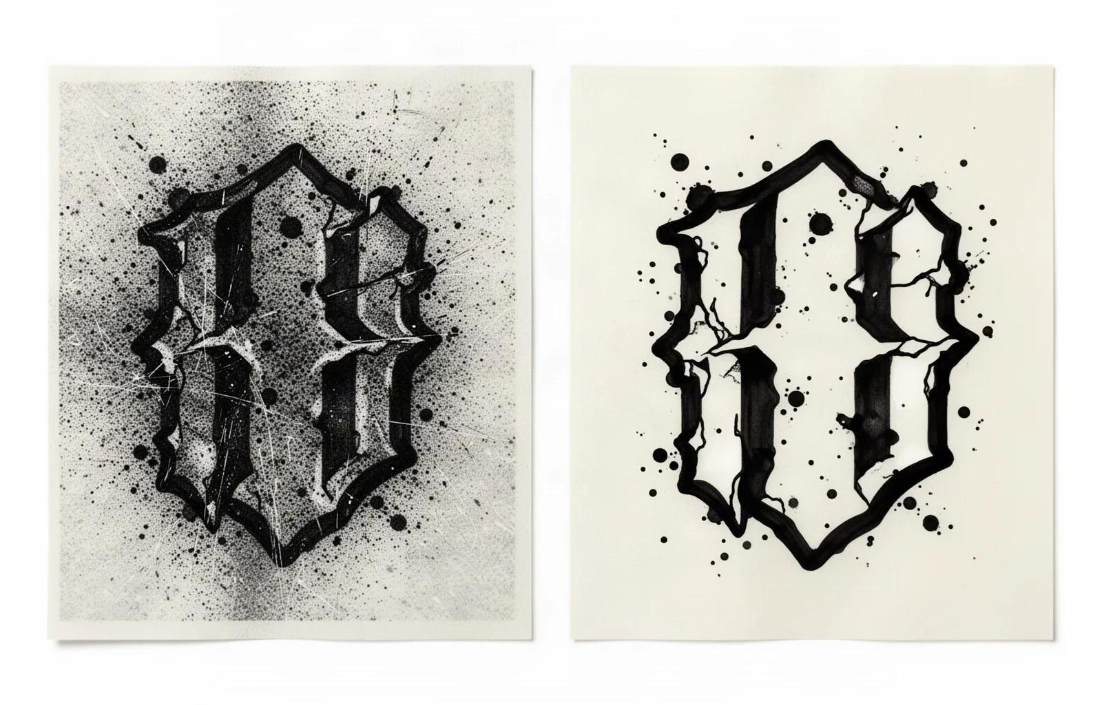
Side-by-side ink study on transfer paper: the left panel shows a grunge motif crowded by dense photocopy grain, fine spray speckle and hairline scratches, while the right panel shows the same motif rebuilt with one continuous bold contour, a few deliberate erosion notches and five to eight larger countable drops separated by open white gaps.
Left: grain, spray and hairline scratches competing with the contour. Right: rebuilt contour, deliberate notches, and countable drops with open gaps. Original illustration for this guide, not StencilStudio app output.

Rebuild the lead contour first

Draw the emblem, motif, or letterform as if the texture did not exist: one continuous working contour with no hairline segments. Then reintroduce grunge as deliberate interruptions: a small set of erosion notches, a spaced tick row, or a short scratch set outside the contour. Texture applied to a weak contour fragments the stencil; texture applied to a strong contour reads as intent.

Check: Cover every texture mark. If the bare contour still identifies the subject at arm's length, the rebuild is correct.

Clump value into countable marks

Group nearby speckle and grain into a smaller number of larger marks at working line mass: five to eight drops instead of fifty dots, one stipple row instead of a grain wash, solid shadow clusters with carved slits instead of crushed tone. Fewer, heavier marks transfer reliably and still read as grunge at viewing distance.

Check: Count the surviving texture marks in the densest zone. If they can be counted at a glance on the 1:1 print, the clump is right. If they blur into one tone, clump harder or remove more.

Move gradients to shading after transfer

Fade-out spray tails, grain gradients, and distress washes are tonal effects, not stencil marks. Keeping them on the stencil forces the printer to render greys it cannot hold. Keep the stencil to structure plus a short accent gradient, and leave the long fade for needle shading once the transfer is down.

Check: Cover the gradient tail. If the stencil reads the same without it, leave it off the stencil and plan it as shading.

Protect every gap at true size

Thermal transfer carries enclosed islands as one image, so this is not cut-stencil bridge work. The job is keeping every scratch gap, drop separation, notch opening, and letter counter visibly open at final size. Widen the single tightest gap first, then the next, before touching line mass.

Check: Print at 100 percent with scaling off, measure with a ruler, and confirm the tightest three gaps read as background at arm's length.

About 6 cm and below

Wrist accents, ankle fields, behind-ear marks, finger-adjacent panels, and small gap fillers.

Carry one recrop only: a simplified emblem, one motif with clumped drops, or lettering without interior texture. No spray gradients, no grain fields, no erosion riding on contours. If any scratch gap, counter, or drop separation closes at 1:1, enlarge or reselect.

About 7 to 13 cm

The common grunge band: forearm emblems, calf panels, shoulder badges, and medium word lockups.

The most flexible band. Distressed outlines, clumped splatter accents, and two-value grain figures hold when every texture mark keeps separation at true size. Confirm the tightest scratch gap and the densest drop cluster before booking.

About 14 cm and above

Chest panels, back pieces, thigh spreads, and large grain figures.

Room for erosion notches, a short drop gradient, and carved highlight slits, but only when each mark keeps open skin at 1:1. Larger size never rescues merged spray tails, filled counters, or grain gradients left unclumped.

Reference to transfer-ready stencil

Rebuild, clump, then verify.

Work in this order so one change at a time can be judged at the same size. Stop when structure, texture, and gaps each read correctly.

  1. 01

    Lock size, placement, and grunge variant first

    Write down the intended physical width or height in millimeters, name the body area, and assign the reference to one variant above: distressed outline, splatter accent, grain figure, or typography lockup. A splatter field that holds at 10 cm on a flat forearm can merge the same drops at 5 cm on a wrist with no drop being wrong on its own. Use the size calculator when target dimensions are still open.

  2. 02

    Rebuild structure before styling texture

    Redraw the lead contour, motif silhouette, or letterforms as clean working lines with no hairline segments. Rank every mark as structure, support, or removable texture, and mark one texture row that can go if gaps close. Do not evaluate grain or splatter until the bare structure reads at arm's length.

  3. 03

    Simplify distress with value decisions

    Convert erosion to a small set of deliberate notches, clump speckle into countable drops or one stipple row, reduce grain figures to two values plus skin with carved highlights, and clear texture out of letter counters. Confirm each survivor with the cover test: the design must read the same or better with only the survivors present.

  4. 04

    Set gaps and run the 1:1 checks at size

    Print at 100 percent with scaling off, measure the physical print with a ruler, and run the squint check: step back until fine marks disappear and confirm the lead shape, cluster shapes, and word order still read. Widen the tightest gap first. Enlarge the piece when protected letterforms or notches start changing shape.

  5. 05

    Verify print, then transfer in one calm contact

    Export a true-size PDF with no fit-to-page scaling and confirm the plain-paper print before committing transfer paper. Apply a light even solution layer, set the stencil down without sliding, and anchor flat placements from the middle outward. Diagnose a faint first contact with the transfer troubleshooter instead of pressing harder, which spreads small texture marks first.

Transfer-prep checklist

Approve the grain only when every line passes

Run this sequence with scaling off and a ruler in hand. One failed line means simplify, enlarge, or reselect before transfer.

  • Confirm the intended size in millimeters, the named placement, and one grunge variant: distressed outline, splatter accent, grain figure, or typography lockup.
  • Confirm the lead contour traces unbroken at working line mass with no hairline segments at 1:1.
  • Confirm texture survives only as countable marks: notches, spaced ticks, clumped drops, or one stipple row.
  • Confirm the three tightest gaps read as background at arm's length on the measured print.
  • Confirm letter counters and joins stay open with splatter clear of stems, or the lockup is enlarged or recropped.
  • Export a true-size PDF with scaling off and measure the physical print before transfer.
Contour first, texture second Verify gaps at 1:1 Countable marks only

Next steps

Use the neighboring owners for adjacent jobs.

This guide covers grunge variant choice, distressed and splatter simplification with value guidance, and size plus transfer prep. Use the links below for related conversion, style, and production work.

General reference conversion, paper manufacturing detail, placement mechanics, heavy-black and tracery construction, graffiti letter skeletons, and broad gallery browsing stay in their specialist owners. The links above hand off instead of repeating that detail.

FAQ

Grunge stencil decisions, answered

Short answers for the variant, simplification, size, and transfer checks that recur when a grunge reference moves toward transfer-ready output.

It holds when three checks pass at the exact physical size: the lead contour traces unbroken at working line mass, texture survives only as countable marks with open skin between neighbors, and the three tightest gaps read as background at arm's length on a measured 1:1 print. Spray gradients, grain washes, and hairline scratches are the first marks to fail, so clump or remove them before judging the lead shape.

From evaluated grunge to working stencil

Turn the approved grain into a stencil draft.

Start from the grunge direction that passed the contour, gap, and value checks, then continue on iPhone for body fit, exact-size print, mirror and professional export.