

Handwriting Stencil Preparation
How to Prepare Real Handwriting for a Tattoo Stencil
Prepare a signature, note, or real handwriting for a tattoo stencil while preserving letter shapes, joins, spacing, baseline, and writer-specific irregularities.
handwriting tattoo stencil · signature tattoo stencil · memorial handwriting tattoo · tattoo lettering preparation
- August 24, 2026
- 11 min
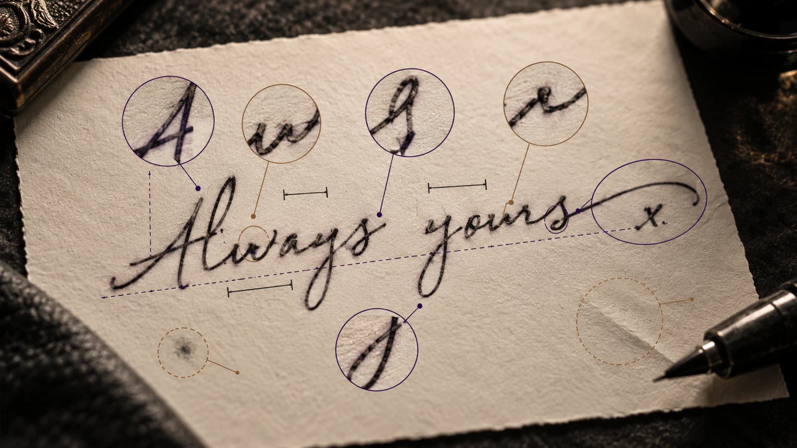
When the handwriting itself is the reason for the tattoo, the goal is not to make it look like cleaner lettering. The goal is to keep the parts that make it recognisably that person's writing while removing the paper, shadows, stains, and other noise around it.
That means a signature, note, recipe card, or memorial phrase needs a different workflow from choosing a script font. Uneven spacing, a drifting baseline, an odd capital, a shaky curve, or a short terminal stroke may be exactly what gives the writing its character.
The safest rule is simple:
Clean the image, not the person out of it.
Keep the best original untouched, work on a copy, and compare every cleanup pass back to the original before you print or transfer it.
Start with the best original you can find
Use the clearest version of the handwriting available. A useful order is:
- the original physical note or signature;
- a good scan or straight-on photo of that original;
- a photocopy, screenshot, message-app image, or compressed copy;
- an already sharpened, traced, or AI-enhanced version only when you can still compare it with a less altered source.
Do not overwrite the only original file. Keep one untouched copy with its original color and orientation, then make crops and cleanup versions separately.
If several family members or clients have different copies of the same note, check them before trying to repair a weak screenshot. A better capture is usually more useful than a more aggressive edit.
Map the features that carry the writer's identity
Before cleaning anything, look for the small habits that make the writing feel like this person rather than generic script.
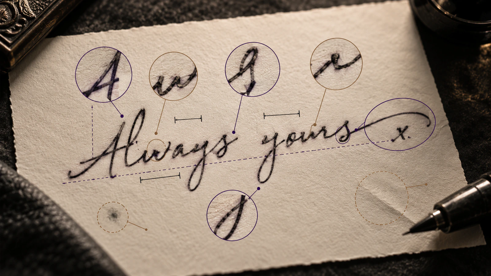
Pay attention to:
- unusual letter shapes and capitals;
- where letters join and where they do not;
- narrow or wide spaces between letters and words;
- baseline rise, fall, or bounce;
- overall slant and individual letters that break that pattern;
- loops, ascenders, descenders, hooks, and terminal strokes;
- dots, t-crosses, punctuation, and flourishes;
- repeated letters that are visibly different from each other;
- naturally heavy, light, shaky, or uneven strokes.
You do not need to preserve every dark pixel in the photograph. Paper texture, scanner dust, table edges, shadows, creases, and compression artifacts are not handwriting just because they are dark.
Repeated letters are a useful warning sign
If three e characters are different in the original and become identical after cleanup, the process has probably normalised the writing too far.
The same is true when a faint pen lift becomes a solid connection, a short terminal gets extended, or a small open counter inside a letter closes up. Those changes can make the result look cleaner while making it less like the original.
Capture the page as straight and evenly as possible
A poor photo can change the handwriting before cleanup even starts.
With a phone:
- keep the page as flat as practical;
- hold the camera close to perpendicular to the paper;
- use even light and avoid hard shadows or reflections;
- focus on the writing rather than using digital zoom;
- keep one wider photo before making a tight crop.
If the page was photographed at a strong angle, taking another photo is usually safer than forcing a heavy perspective correction later. Strong perspective can change letter width, spacing, and slant even when the image looks sharp.
Keep the color version when it helps separate ink from a stain, fold, yellowed paper, or shadow. You can make the working stencil monochrome later.
Separate handwriting from paper and capture noise
Before deleting a questionable mark, decide what it probably is.
| What you see | What to do | |---|---| | Clearly part of the handwriting | Keep it. | | Clearly paper, dust, shadow, crease, or unrelated background | Remove it from the working copy. | | Faint or uncertain mark | Check the best original before deciding. | | Missing or hidden part that you choose to rebuild | Treat it as an intentional edit, not as recovered handwriting. |
This distinction matters most around old notes. Folds, stains, bleed-through, ruled paper, faded ink, and uneven lighting can all create marks that look like strokes after a hard black-and-white conversion.
Be careful where ruled lines cross the writing
Removing a notebook line is easy until that line passes through a real handwritten stroke.
At the crossing, do not erase straight through and redraw whatever seems likely. First inspect the original in color or grayscale. If possible, take another photo under different lighting. If the hidden part still cannot be seen clearly, keep that uncertainty rather than inventing a precise curve and calling it original.
Another handwriting sample from the same person can help you understand how they often formed a letter, but it cannot prove the exact hidden shape in this specific note.
Correct the photo, not the handwriting
A tilted photograph and naturally slanted handwriting are different problems.
It is reasonable to rotate the page so the capture is level. It is not automatically reasonable to straighten the person's letters or flatten a naturally uneven baseline.
The same applies to spacing. If two words are unusually close in the original, spreading them apart is a design change. It may be a good tattoo decision at the chosen size, but it should not happen unnoticed during basic cleanup.
Crop a working copy as tightly as useful, but keep the wider original. A wider view can help you tell whether a faint line is part of the writing, a fold, a border, or background clutter.
Thresholding changes what survives
Turning a photo into dark marks on a clean background always involves a cutoff: which pixels stay and which disappear.
Push the threshold too far one way and faint real strokes vanish. Push it too far the other way and paper shadows become ink. Small dots can disappear, counters can close, nearby strokes can merge, and thin terminals can shorten.
The Preserve Handwriting workspace shows the original beside the cleaned result, gives you a threshold control, crops the retained marks, and can export PNG or a true-size PDF. It does not generatively redraw missing handwriting.
Use the automatic result as a starting point. While adjusting it, check:
- Did a faint intended stroke disappear?
- Did two separate marks join?
- Did a dot, cross, or punctuation mark vanish?
- Did a loop or counter close?
- Did a short terminal change length?
- Did paper texture turn into false ink?
The cleanest-looking setting is not always the best one. The best setting is the cleanest result that still looks like the original writing.
Compare every cleaned version to the original
Do not judge the cleaned version by itself. Put the original and the cleaned result side by side at a similar scale and orientation.
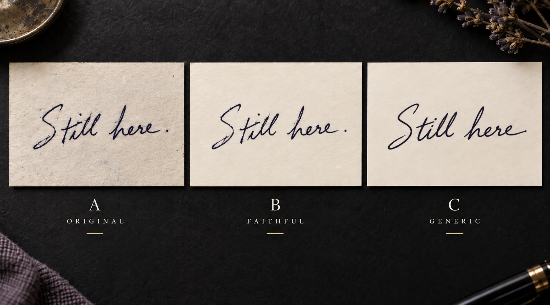
Move across the writing from left to right and check the actual features:
| Feature | Original | Cleaned result | What to do | |---|---|---|---| | Capital shape | Rounded | Same | Keep it. | | Dot over i | Faint but visible | Missing | Adjust cleanup until it returns. | | Paper fold | Not handwriting | Still visible | Remove it. | | Letter join | Unclear | Automatically connected | Revert and inspect again. | | Baseline | Naturally rises | Flattened | Restore the original relationship. |
The Stencil Version Compare tool can help with overlay, blink, or difference views between prepared versions. For handwriting, keep the original on one side of the comparison whenever you are judging whether the cleanup still matches it.
Keep cleanup and intentional tattoo changes separate
Sometimes the most faithful digital version is not the version you finally tattoo. A tiny counter may close at the intended size, two strokes may sit too close together, or a delicate terminal may need a practical adjustment.
That is fine, but make it a conscious second step.
First keep a version that stays as close as practical to the original. Then, if the artist and client decide a tattoo-specific adjustment is needed, make a separate version and identify the change clearly.
Common intentional changes include:
- opening a tiny counter slightly;
- increasing space between two strokes that would merge at final size;
- simplifying a damaged area that cannot be reproduced reliably;
- thickening or reducing selected marks for the chosen tattoo size;
- rebuilding a missing piece when the client explicitly wants an interpretation rather than strict preservation.
Do not silently turn repeated letters into matching copies, level the baseline, regularise spacing, smooth characteristic curves, or swap a damaged letter for a nicer one from another note.
If the tattoo is supposed to reproduce one specific note or signature, that specific note remains the reference. Other samples can help resolve questions, but they should not quietly replace it.
Signatures are graphic forms, not just text
A signature can be difficult to read and still be instantly recognisable to the person who knows it.
Its compressed letters, overlaps, initials, underlines, loops, and flourishes may matter more than whether every character is easy to type out. Confirming the wording is useful, but a typed transcription should not become the design.
If the source includes unusual spelling, punctuation, lowercase letters, or another apparent mistake, decide explicitly whether the goal is to preserve it or correct it. Both choices can be valid. They are not the same tattoo.
Do not assume vector means more accurate
Vector tracing can be useful for scaling and editing, but automatic tracing can also smooth curves, move endpoints, remove small marks, merge narrow gaps, or regularise corners.
A clean vector path is not automatically closer to the original than a carefully prepared bitmap.
If you trace the handwriting, compare the traced result back to the original at the same checkpoints: letter shapes, joins, spacing, baseline, endpoints, dots, crosses, and uncertain areas.
Check the handwriting at the real tattoo size
A faithful digital copy can still become too dense when reduced to the intended physical size.
Check the piece at 1:1 scale rather than only zoomed in on a screen. Look for:
- counters that are closing;
- two strokes that become one dark mass;
- punctuation or dots that become too fragile;
- word spacing that becomes visually compressed;
- small loops or terminals that stop reading clearly.
If the whole piece is too dense, use the final-size detail diagnostic. If one important opening is closing, use the negative-space diagnostic. If the geometry is right but the printed marks need a different visual weight, use the line-weight guide.
Change the smallest thing that solves the real size problem. Do not globally smooth or rewrite the handwriting because one local area is tight.
Keep mirror state and physical size obvious
Judge whether the handwriting still matches the original before mirroring it.
Mirroring is a print and transfer step. If your workflow needs a horizontal flip, keep the two states easy to distinguish: source-facing and print/transfer. The mirror guide explains where to flip and how to avoid mirroring twice.
Also set a real physical width or height instead of relying on "about this big." The Preserve Handwriting workspace can export a true-size PDF after cleanup. The Size & Print Calculator can help verify exact print dimensions for other files and layouts.
Final handwriting stencil check
Before handoff or print, confirm:
- the best original is still saved untouched;
- distinctive letter shapes still match;
- joins and intentional gaps have not changed accidentally;
- spacing, baseline, and slant still feel like the original;
- dots, crosses, punctuation, endpoints, and flourishes are present where they should be;
- stains, folds, shadows, and paper texture are not being mistaken for ink;
- any rebuilt or intentionally changed area is known and approved;
- the source-facing and mirrored versions are clearly distinguishable;
- the physical print size is intentional.
The stopping rule is straightforward: remove what is clearly not handwriting, preserve what clearly is, and make any creative reconstruction a visible choice rather than a hidden cleanup step.
FAQ
Can a tattoo artist copy handwriting exactly?
A stencil can preserve the visible shapes of a good handwriting source very closely, but scanning, cleanup, printing, transfer, and tattooing are separate steps. The goal of preparation is to avoid unnecessary changes before the artist works on skin, not to promise a pixel-identical final tattoo.
How do I turn a signature into a tattoo stencil?
Start from the clearest original scan or straight-on photo you can find. Keep an untouched copy, remove the paper and obvious capture noise without changing the signature's shapes, compare the cleaned result with the original, then set the intended tattoo size and print size.
Should I clean up handwriting before tattooing?
Yes, when cleanup means removing paper, shadows, stains, dust, or other unrelated marks. Do not automatically smooth, straighten, reconnect, or regularise the handwriting. Those can change the character of the writing.
Should I use a similar font instead of the real handwriting?
Not when the point of the tattoo is the person's actual writing. A font can reproduce the words while replacing the person's letter shapes, spacing, joins, baseline, and irregularities. Use a font when you want new lettering, not when you want to preserve an existing note or signature.
Can AI recreate a missing part of the handwriting?
It can create a plausible replacement, but that replacement is an interpretation, not the missing original stroke recovered. If exact preservation matters, keep any generated reconstruction separate and make sure the client knows what was changed.
Related Guides
Keep reading from here
How Small Can Tattoo Lettering Be? A Readability Guide
Size tattoo lettering by the geometry that must stay open: counters, joins, spacing, and fine strokes. Compare at real width and know when to print a test.
tattoo lettering size · small tattoo lettering
Read guide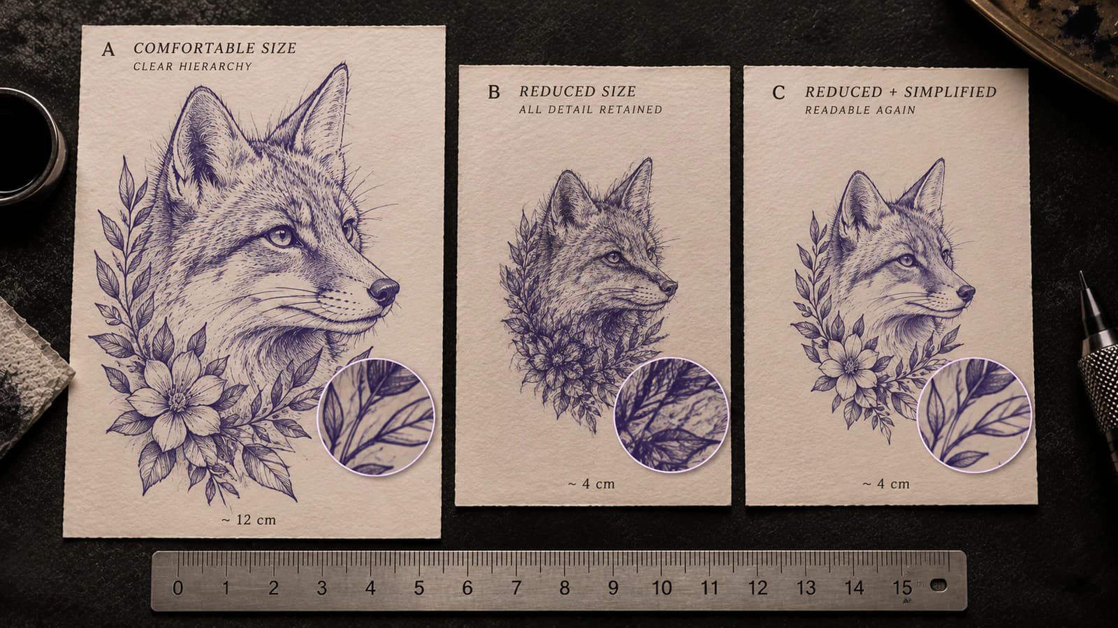
Tattoo Stencil Too Detailed for the Final Size
Tell whether a tattoo stencil has too much information for its intended physical size by checking line separation, gaps, landmarks, and texture before printing.
tattoo stencil too detailed · final size readability
Read guide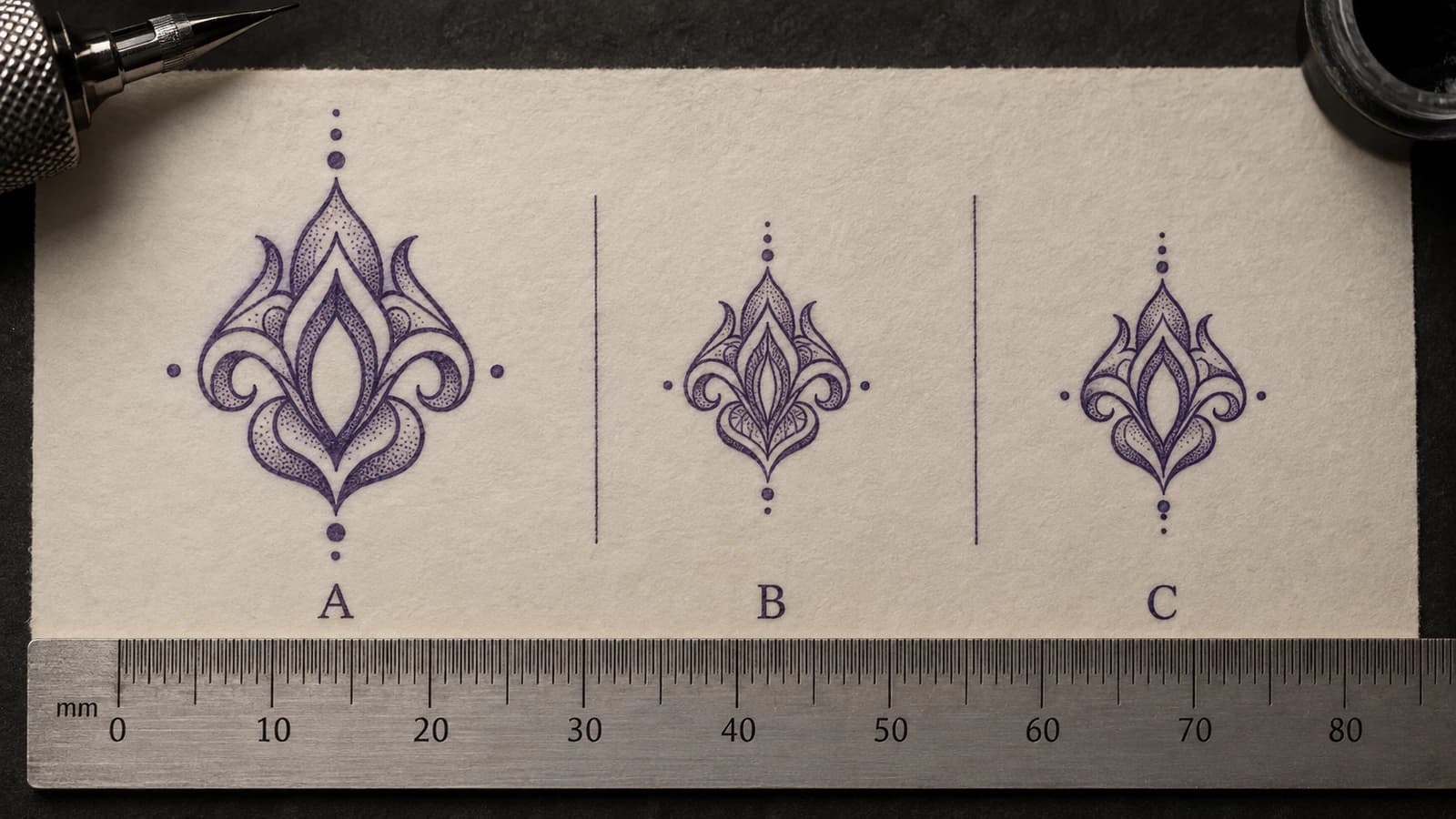
Tattoo Stencil Negative Space Too Tight at Final Size
Diagnose tattoo stencil gaps, counters, and openings that become too tight at intended physical size, then decide what geometry to protect or change.
tattoo stencil negative space · tattoo stencil gaps
Read guideAuthor
Andrea Mezzadra
Founder and product builder at StencilStudio
Andrea builds StencilStudio and tests how the tools fit into real stencil prep, using real references and outputs to document what works, what changes, and where artist judgment still matters.
In the App
Clean the real handwriting without redrawing it
Use Preserve Handwriting to compare the original with a threshold-cleaned version, set physical width, and export PNG or true-size PDF in your browser.