

Abstract stencil evaluation

Judge any abstract reference before it becomes a stencil

Freeform abstract work lives or dies on directed motion. Compare fluid linework, brushstroke, and splatter-inspired directions, vet flow and balance at your exact size, then prepare a stencil whose irregular gaps and soft edges transfer cleanly.

Built for working artists preparing freeform abstract pieces. This page covers direction choice, final-size flow and balance vetting, and irregular-gap and soft-edge transfer prep only, not tattoo application or healing advice.

What makes freeform abstract work stencil-viable

Flow, balance, and deliberate irregularity decide the result.

Abstract tattoos are motion-first compositions placed on moving skin. These three pillars predict whether that motion survives reduction, print, and transfer.

Directed flow

Freeform abstract work reads as intentional motion, not random marks. Every composition needs one dominant travel direction that the eye can follow from entry to exit, with secondary gestures supporting it rather than competing with it. When two gestures pull with equal force in different directions, the transfer reads as scattered even if single strokes look attractive.

Check: Trace the dominant gesture with one finger at final size. If the path runs cleanly across the piece with a clear entry and exit, flow holds. If the finger stalls, jumps, or has to choose between equal paths, recompose the lead gesture before judging edges or gaps.
Asymmetric balance and negative space

Abstract pieces balance without symmetry. Weight comes from stroke mass, mark density, and dark pockets, and it must be answered by open skin somewhere in the composition. Negative space is the material that keeps irregular marks readable, and screens forgive crowding that paper and skin do not.

Check: Squint at the 1:1 print until detail drops out. If one dark zone still anchors the piece with open skin around it, balance holds. If the whole shape merges into one gray mass, remove or relocate a mark family before touching size.

Transfer-safe irregularity

Irregular gaps and soft edges are the point of freeform work, and they are also its failure surface. Gaps between disconnected shapes must stay open as skin lines, and soft feathered edges must resolve into a stencil mark the transfer can actually carry. Irregularity survives only when each gap and edge is deliberate at true size.

Check: Print at 100 percent with scaling off and find the narrowest must-keep gap plus the softest edge. If every gap reads as open skin at arm's length and every soft edge has a placeable core, the irregularity is deliberate. If gaps close or edges dissolve, simplify before print.

Freeform abstract here means non-repeating composition with no required mirror axis, no radial center, and no fixed repeat unit. If the piece depends on mirrored halves, use the geometric owner. If it radiates from one center, use the mandala owner. If it builds overlapping sigil-like junctions, use the cybersigilism collection.

Direction comparison

Pick the direction that fits the placement and the size.

Three freeform constructions, three different risk profiles. Choose one before vetting, because each direction fails in a different place.

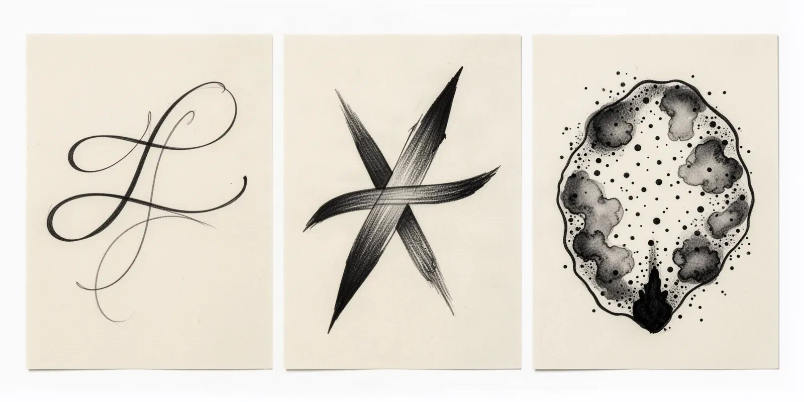
Editorial ink illustration of three freeform abstract constructions: fluid continuous linework with open gaps, tapered brushstrokes crossing with a clear over-under order, and a bounded splatter-inspired field of dots and soft blobs with open paper between marks.
Left to right: fluid linework, brushstroke, and a bounded splatter-inspired field. This is an editorial illustration of the three constructions, not app output, a generated stencil, or client work. Read the structural difference first, then choose a direction and vet it at final size.

Fluid linework

Continuous flowing contours, looping ribbons, and calligraphic gestures drawn as open line. The line itself is the subject, with weight variation carrying the movement. No fill carries the design.

Strengths: Clearest stencil translation of the three directions, because line is what transfer prints best. Easiest to rescale and reposition, and the simplest to vet since every gap between lines is either open or closed at true size.

Constraints: Line quality is fully exposed, so hesitant or uneven strokes show immediately. Dense overlapping loops close into one dark knot first at small sizes, and long gestures need room to travel.

Choose when: Choose it when the brief names flow, movement, or minimal gesture work, when the placement is small or curved, or when the stencil must stay simple enough to prep and place fast.

Brushstroke

Marks with visible attack and release: tapered strokes, dry-brush texture, and weighted gestures that read as painted movement. Each stroke has a direction, a pressure profile, and a defined stop.

Strengths: Strongest sense of energy and hand, with natural focal points where strokes overlap or terminate. Mid-range translation difficulty, since each stroke has a solid core the stencil can hold even when texture softens.

Constraints: Dry-brush texture and ragged stroke edges merge first at small sizes. Strokes that cross without a clear over-under order read as muddy, and too many competing stroke directions break the dominant flow.

Choose when: Choose it when the client wants painterly energy with a readable gesture, on mid-size placements where strokes have room to taper, and when one or two lead strokes can carry the piece.

Splatter and watercolor-inspired shapes

Detached dots, flecks, soft-edged blobs, and wash-like fields arranged as a composed field around or between linear gestures. The composition reads as dispersed energy rather than one traveling line.

Strengths: Most expressive range and the best fit for filler fields, background energy, and pieces that should feel dispersed. Works well as an accent layer paired with one linear anchor.

Constraints: The hardest direction to stencil, because isolated micro-dots and feathered fades vanish first while clustered dots merge into one patch. Needs the largest minimum size and the strictest bounds of the three directions.

Choose when: Choose it when the brief names splatter, dispersion, or wash-like effect, when the final size allows countable marks with open skin between them, and when a linear anchor can hold the composition together.

Wash tonal translation, including anchor structure and wash-zone separation for watercolor work, stays with the watercolor owner. This comparison exists to choose among freeform abstract constructions by flow and transfer behavior, not to judge color washes.

Final-size vetting framework

Score the reference in minutes, then act on the weakest check.

Four freeform constructions at labeled sizes. Each one names the protected structure, the fix, and the go or no-go verdict at that exact size. Confirm every verdict with a measured 1:1 print.

HOLDS AT STATED SIZE

Three-gesture fluid linework panel at 14 cm

Intended width 140 mm

Source
Three traveling line gestures with clear entry and exit points, weight variation along each stroke, and open skin between every pass. One lead gesture sets the travel direction.
Protect
The lead gesture path, the weight variation along it, and every open gap between the three passes.
Fix
Adjust nothing structural. Confirm gaps at 1:1 and keep line mass unchanged.
Candidate stencil
Same abstract intent with one lead gesture, asymmetric balance set, crossings resolved, and gaps plus edges adjusted for the stated size.
Final-size verdict
Holds at 14 cm. Flow travels cleanly, gaps stay open at true size, and the lead gesture carries the read.

RECOMPOSE THE LEAD

Competing brushstrokes with no dominant direction at 13 cm

Intended width 130 mm

Source
Energetic tapered strokes with good individual character, but three strokes pull with equal force in different directions and two crossings have no clear over-under order.
Protect
The single strongest stroke and its taper direction as the rebuild reference.
Fix
Promote one stroke to lead by extending it and lightening the competitors, then resolve each crossing so one stroke passes over. Do not thicken strokes to force order.
Candidate stencil
Same abstract intent with one lead gesture, asymmetric balance set, crossings resolved, and gaps plus edges adjusted for the stated size.
Final-size verdict
Not stencil-ready until one gesture leads. Texture cannot compensate for competing flow.

BOUND THE FIELD

Splatter-inspired field with unbounded micro-dots at 12 cm

Intended width 120 mm

Source
Appealing dispersed field on screen, but micro-dots scatter past the composition edge, two soft blobs touch with no skin divider, and the smallest dots resolve only when zoomed in.
Protect
The intended dispersion direction and the darkest anchor pocket where the field concentrates.
Fix
Compose one closed field boundary, delete or relocate every dot outside it, cut a skin divider between the touching blobs, and remove micro-dots that vanish at 1:1. Keep fewer countable marks with open skin between them.
Candidate stencil
Same abstract intent with one lead gesture, asymmetric balance set, crossings resolved, and gaps plus edges adjusted for the stated size.
Final-size verdict
Not stencil-ready until the field is bounded and the micro-detail is removed. The dispersion idea can stay, but the marks need edges before transfer.

ENLARGE OR RESELECT

Dense looped linework knotted at 6 cm

Intended width 60 mm

Source
Attractive looping linework with many overlapping passes, but at wrist-accent size the overlaps merge into one dark knot and the gaps between loops close on paper.
Protect
The single most readable loop and its travel direction.
Fix
Enlarge past the point where at least two loops stay separated at 1:1, or reselect to one open gesture with a single pass. Do not keep five overlapping passes at 6 cm.
Candidate stencil
Same abstract intent with one lead gesture, asymmetric balance set, crossings resolved, and gaps plus edges adjusted for the stated size.
Final-size verdict
At 6 cm the loops function as one mark. Enlarge, simplify to one gesture, or choose a different construction for this width.

Geometric symmetry and repeat evaluation stays on the geometric owner. Mandala center alignment and radial repetition stays on the mandala owner. Cybersigilism axis and junction-density comparison stays on the cybersigilism collection. Broad visual browsing stays on the stencils and subject hubs. This framework exists to judge freeform direction fit, flow and balance, and irregular transfer readiness at a stated size, not to replace those owners.

Gesture, gaps, and edges at final size

Judge the irregularity at the size you will print.

Screens forgive crowding that paper and skin do not. Set the dimensions first, then inspect each feature below at true physical size with scaling off.

About 7 cm and below

Wrist accents, behind-ear marks, finger-adjacent panels, and small gap fillers.

Carry one open gesture maximum with generous gaps. Allow one short stroke family or a few countable dots only when each mark stays separated at 1:1. If any gap closes, enlarge or reselect rather than forcing reduction.

About 8 to 14 cm

Common forearm panels, calf work, shoulder pieces, and thigh accents.

The most flexible band. A lead gesture plus one support family, or a bounded splatter field around one linear anchor, can work when flow, balance, and every gap are verified at true size.

About 14 cm and above

Upper back panels, large thigh pieces, full shoulder compositions, and sleeve energy fields.

Room for layered gestures and real dispersed fields, but only when open skin separates every mark family and one dark pocket anchors the composition. Larger size does not rescue competing flow or unbounded splatter.

Freeform feature checks by size band
FeatureAbout 7 cm and belowAbout 8 cm and above
Lead gesture and line massKeep one traveling line with clear entry and exit. If the gesture cannot travel without crossing itself twice, simplify first.Layered gestures can work when one still leads. Confirm the lead path survives a squint test at true size.
Irregular gaps and skin linesEach must-keep gap must read as open skin at 1:1. Merge means fewer passes or a larger piece, not thinner lines.Gaps can sit closer relative to size, but each one must still survive print and transfer as a separate opening.
Soft edges and feathered textureSoften only where a solid core already holds the mark. Remove feathering that has no placeable center at true size.Feathered passages can work when the core mark transfers first and the texture is confirmed dot by dot at 1:1.
Splatter dots and detached marksKeep isolated dots with visible skin between them or remove the field. Micro-dots that vanish at arm's length are not detail.Plan the field as dense anchor fading into open skin with falling density. If the field reads as one patch at 1:1, reopen it.

Reference to clean stencil

Build from the lead gesture outward.

Work in this order so one change at a time can be judged at the same size. Stop when flow, balance, gaps, and edges each read correctly.

  1. 01

    Lock size, placement, and direction first

    Set the intended physical dimensions in millimeters, name the body area, and commit to one direction (fluid linework, brushstroke, or splatter-inspired) before judging the reference. A dispersed field that holds at 14 cm on a thigh can fail at 6 cm on a wrist with no mark being wrong on its own. Use the size calculator when target dimensions are still open.

  2. 02

    Establish one lead gesture and asymmetric balance

    Name the dominant travel direction, then place the dark anchor pocket and its answering open skin. Confirm the squint read: one dark zone plus breathing room, not two equal competitors. An abstract piece with a clear lead and a clear anchor is already halfway to stencil-ready.

  3. 03

    Resolve crossings and competing marks

    Give every overlap an over-under order, reduce competing stroke directions to support roles, and bound any dispersed field inside one closed zone. Mark one removable family that can go without changing identity, and remove it early if balance stays unresolved.

  4. 04

    Simplify edges and reopen gaps at 1:1

    Reduce dot count and pass count before thinning lines. Give every soft edge a placeable core, confirm each irregular gap stays open, and run a squint check at true size. The density and negative-space guides help when marks compete for the same room.

  5. 05

    Verify print and transfer path

    Export a true-size PDF with no fit-to-page scaling, inspect the narrowest gap and the softest edge on plain paper, then measure the physical print with a ruler. If the digital file passes and only paper fails, move to print-stage evidence instead of simplifying again.

Placement and size decisions

Open fields preserve flow, small curves demand restraint

A freeform gesture is drawn flat and worn curved. Open placements preserve its travel with little compensation, while small or high-movement areas need fewer passes and wider gaps.

Outer forearm and calf

Long, fairly stable fields where traveling gestures read well. The limb axis becomes the flow axis, so gestures crossing the limb crowd fast.

Check: Align the lead gesture with the limb axis and confirm every gap keeps open skin at the exact width.

Shoulder, thigh, and upper back

Broad fields with room for layered gestures and bounded dispersed fields. The most forgiving areas for freeform balance.

Check: Confirm the full composition fits between body landmarks without clipping, then check anchor placement and gap separation at 1:1.

Ribcage and torso side

Curved breathing fields where long gestures stretch and compress with movement. Balance shifts as the body moves, so the anchor must sit on the most stable span.

Check: Preview the lead gesture on a live body photo in a neutral pose, then confirm the anchor still reads when the torso turns.

Wrist, hand, and behind ear

Small high-visibility fields where micro-dots vanish and dense loops knot. The hardest common freeform placements.

Check: Restrict to one open gesture with generous gaps, or move the dispersed intent to a larger placement.

Stencil-ready checklist

Approve the abstract piece only when every line passes

Run this short sequence with scaling off and a ruler in hand. One failed line means recompose, bound, simplify, enlarge, or reselect before transfer.

  • Confirm intended dimensions in millimeters, the named placement, and the chosen direction.
  • Confirm one lead gesture with clear entry, travel, and exit at final size.
  • Confirm asymmetric balance: one dark anchor plus answering open skin in a squint test.
  • Confirm every irregular gap stays open at 1:1 with scaling off.
  • Confirm every soft edge has a placeable core and no micro-mark vanishes at arm's length.
  • Export a true-size PDF with scaling off and measure the physical print.

Freeform transfer prep

Transfer without losing the irregularity

Abstract transfers fail at four predictable points. Each one below names the early sign and the prevention that keeps the piece deliberate.

Competing flow after placement

Early sign: The piece looks scattered on the body even though single strokes looked good on paper.

Prevention: Lock one lead gesture on the live placement photo before print, anchor the entry end first, and smooth toward the exit in short passes. Lift to confirm the travel direction before the full piece touches skin.

Irregular gap closure

Early sign: Gaps that looked open on screen print as one connected mass on paper or skin.

Prevention: Judge gaps on the measured 1:1 paper print, not the screen. Enlarge the piece or remove a neighboring pass when the tightest must-keep gap closes, and re-check after any line-weight increase.

Soft-edge disappearance

Early sign: Feathered passages transfer as faint smudges with no readable core, or vanish entirely.

Prevention: Give each soft passage a solid center the transfer can carry, and confirm the smallest surviving mark at arm's length on paper. Remove texture that has no placeable core instead of pressing harder.

Splatter drift and staining

Early sign: Detached dots land past the composition edge or crowd nearby work and read as staining rather than brushwork.

Prevention: Compose one closed field boundary on the stencil margin, delete every dot outside it, and confirm falling density away from the anchor on the body preview before transfer.

Prerequisites before the transfer touches skin

Confirm the measured 1:1 paper print with a ruler, a clean dry placement area, and the planned anchor point (gesture entry for linework, dark pocket for dispersed fields). Transfer in sections from the anchor so the free end cannot drag the flow off course. If the first contact looks faint or patchy, diagnose the layer with the transfer troubleshooter instead of pressing harder.

Open the transfer troubleshooter
Lead with one gesture Verify gaps at 1:1 Keep edges placeable

FAQ

Abstract stencil decisions, answered

Short answers for the direction, scope, gap, and transfer checks that recur when a freeform reference moves toward transfer-ready output.

Match the direction to size and placement. Fluid linework translates most cleanly and suits small or curved areas where the stencil must stay simple. Brushstroke suits mid-size placements where tapered gestures have room to resolve. Splatter-inspired fields need the largest minimum size, countable marks with open skin, and usually one linear anchor. The comparison on this page names the structure, strengths, and constraints of each direction so the choice happens before stencil prep.

Next steps

Use the neighboring owners for adjacent jobs.

This guide covers freeform abstract direction choice, final-size flow and balance vetting, and irregular-gap and soft-edge transfer prep. Use the links below for related jobs such as sizing, print checks, paper, and placement.

Geometric symmetry method, mandala radial method, cybersigilism junction analysis, ornament frame method, watercolor tonal planning, board organization, generic conversion, broad gallery browsing, paper manufacturing detail, and placement mechanics stay in their specialist owners. The links above hand off instead of repeating that detail.

From evaluated reference to working stencil

Turn the approved abstract piece into a stencil draft.

Start from the direction that passed the final-size check, then continue on iPhone for body fit, exact-size print, mirror and professional export.