

Lettering Prep
Best Tattoo Fonts: Pick Lettering That Holds on Skin
Compare script, blackletter, serif, sans and handwriting tattoo fonts by construction, aging, size and placement, then run a short checklist that routes to the right generator.
best tattoo fonts · tattoo lettering styles · tattoo font aging · script tattoo font · blackletter tattoo font · tattoo lettering placement
- November 6, 2026
- 13 min
A tattoo font is not a screen font placed on skin. It is a set of ink shapes that will soften, spread slightly, move with the body, and be read at arm's length for years. Most "best tattoo fonts" roundups show pretty specimens at large sizes and stop there. That tells you almost nothing about which family survives your wording, your size, and your placement.
This guide works the other way. Start from the construction of each lettering family, learn the four aging rules that decide whether lettering stays readable, apply size and placement thresholds, then run a short checklist that narrows the choice to one or two families and points you at the right generator to execute. The generators themselves, and the detailed sizing proof, live on their own pages and are linked where the decision lands.
The five families, judged for skin
Every tattoo lettering job falls into one of five families. Each has a structural reason it works, a structural reason it fails, and a kind of wording it suits. Rule families in or out on those grounds before falling in love with a specimen.
| Family | Structural strength | Structural risk | Suits best |
|---|---|---|---|
| Script / cursive | Connected flow follows body curves; personal tone | Thin connectors and tight joins close up | Names, short phrases, memorial lines |
| Blackletter | Heavy outer strokes hold for decades | Dense counters and repeated verticals clog | Short bold words, chest and back pieces |
| Serif (roman / inscriptional) | Self-contained capitals read at distance | Fine serifs and high contrast soften | Dates, initials, memorial wording |
| Sans / modern | Even strokes and open forms age predictably | Ultra-thin weights blur like hairlines | Single words, coordinates, minimal lettering |
| Real handwriting | Carries the writer's identity | Irregular joins need space to survive | Signatures, notes, memorial script |
Script and cursive: flow with a fragile middle
Script earns its popularity honestly. Connected letters move the way bodies move, so a name along a forearm or collarbone looks settled rather than stamped on. A restrained monoline script, where strokes keep roughly one width throughout, is the most forgiving direction: with no dramatic thick-thin transitions there are no fragile hairlines waiting to disappear.
High-contrast calligraphic scripts trade durability for drama. Thick downstrokes beside hairline connectors and flourished capitals look striking fresh, but the thin parts carry the least ink and sit closest to neighboring strokes. Loops that return near another stroke, exit swashes that dive into the next letter, and lowercase counters in words like "forever" are the first places to lose separation.
Choose script when the wording is short and the tone should feel personal. Give it more physical width than you think it needs, and keep native joins intact rather than pulling letters apart with tracking, which breaks the connection the style depends on.
Blackletter: heavy outside, crowded inside
Blackletter has the heaviest outer strokes of any family, which is why old blackletter tattoos still read after decades. The risk is entirely interior. Lowercase forms pack many small openings and repeated vertical strokes into a narrow band, so a word can look commanding overall while its counters are already competing for space.
Denser historic Fraktur directions need the most room and the shortest words. More open gothic constructions trade some ceremony for readability and handle mixed-case words better. In both cases, judge the exact wording, not the category label: a short word in capitals behaves nothing like a long lowercase word in the same face.
Choose blackletter when the message is short and the intent is impact: a single word across the chest, stomach, or back. Avoid it for long quotes, small wrists, or any placement where the full width is under roughly a hand span.
Serif and inscriptional capitals: the memorial default
Roman-style serif capitals, in the tradition of carved inscriptions, suit dates, initials, and memorial wording because each letter stands alone. There are no joins to clog and word rhythm stays legible at distance. Moderate, well-bracketed serifs hold up; fine unbracketed serifs and extreme thick-thin contrast (the fashion-serif look) soften and thicken over time.
This family is also the most predictable at small sizes for short content: a four-digit year or three initials in sturdy serif caps survives where the same content in delicate script would not. Watch repeated verticals and diagonal intersections in strings like MCMXCIV, and check the spacing around narrow letters such as I before assuming all-caps automatically solves readability.
Sans and modern lettering: quiet and durable
Even-stroke sans faces say the words matter more than the presentation. Without serifs, joins, or contrast to degrade, aging becomes a simple function of stroke weight and spacing, which makes this family the easiest to plan. Medium to bold weights with generous spacing hold predictably; ultra-thin minimal weights fail exactly like hairline serifs.
Narrow condensed sans faces earn their place when a longer word must fit a limited horizontal band, such as along a forearm or down the spine. They stay compact without ornamental detail stealing width from the core letters.
Choose sans when legibility outranks decoration: coordinates, single words, dates in plain numerals, or any tattoo that must read from several meters away.
Real handwriting: a different starting point
A signature or note from a specific person is not a font choice at all. Its uneven spacing, drifting baseline, odd capitals, and shaky curves are the content, and redrawing them into clean lettering destroys the reason for the tattoo. Handwriting needs its own preparation workflow that cleans the image while preserving the writer's habits, plus extra size to protect the irregular joins.
If the source is an actual person's writing, stop comparing fonts and use the real-handwriting preparation guide instead. Everything below assumes typed lettering.
The four construction rules that decide aging
Strip away style preference and tattoo lettering survives on four measurable traits. Inspect them in the exact wording at the intended width. A family passes only when its weakest trait passes.
1. Stroke weight consistency
Ink spreads a little over time on every tattoo. Strokes that start with similar widths spread into each other gracefully; strokes that mix heavy stems with hairline connectors degrade unevenly, because the thin parts vanish while the heavy parts remain. Monoline scripts, bold sans faces, and heavy blackletter outer strokes share one advantage: there is no thin detail to lose. Before choosing a high-contrast face, find the single finest stroke that carries meaning and ask whether the design still reads without it. If it does not, that stroke sets the minimum size, not the average letter.
2. Counter openness
Counters are the enclosed or partly enclosed spaces inside letters such as a, e, o, d, and p. They are usually the first thing to fail because shrinking a word shrinks the white openings along with the black strokes. Dense blackletter lowercase and tightly looped scripts pack the smallest counters; open sans and inscriptional caps keep the largest. Check the smallest counter in the actual wording, not a generic alphabet, and compare candidates at the same physical width. A face that looks larger on screen may simply be spending more of that width on decoration.
3. Join and crossing behavior
Connected scripts add a failure point other families lack: the handoff between letters. Look for two joins landing close together, a loop crossing a neighboring stroke, an exit swash returning into the next letter, and repeated verticals merging into one dark rhythm. These are local problems, so judge them locally. Adding global letter spacing to fix one tight pair stretches the whole word without opening its smallest counter, and on connected scripts it can visibly break the joins the style needs. When one pair collides while the rest sits comfortably, change the capitalization, the face, or the wording before widening everything.
4. Spacing as separation insurance
Spacing protects separation as ink settles. Check the narrowest gap between neighboring forms and judge word spaces independently from letter spacing: a phrase can have comfortable letters yet read as one unit when word gaps close. Spacing rescues avoidable crowding, but it cannot rescue a face whose internal geometry is too intricate for the width. If generous spacing still leaves counters pinched and joins touching, the lettering direction is wrong for the size, not under-spaced.
Skin adds one more variable these rules already account for. Areas that stretch, crease, or take friction and sun challenge fine detail faster, so a construction that is marginal on the upper arm is a bad bet on fingers or feet. Placement does not change the rules; it decides how much margin they need.
Size minimums by style
There is no universal minimum letter height, because a compact sans capital and a dense blackletter lowercase carry completely different geometry at the same measured height. What experienced artists converge on instead are starting thresholds per family, always verified against the exact wording at final size. Treat the numbers below as planning rules from commonly cited shop guidance, not as guarantees: set the wording at its real width and inspect the four construction traits before committing.
- Simple sans capitals and numerals: the most forgiving. Plan for roughly 8 to 10 mm of cap height for short content; single words and dates can sit at the lower end when strokes are medium or bold.
- Serif and inscriptional capitals: plan for roughly 10 to 15 mm of cap height. Fine serifs and high-contrast faces belong at the upper end or larger, since their terminals are the limiting feature.
- Restrained monoline script: plan for a word width that keeps lowercase counters visibly open, often around 60 to 80 mm for a single short word. Longer words need proportionally more width, not smaller letters.
- High-contrast or flourished script: the least forgiving typed option. Plan for generous widths (often 100 mm or more for a name) and rule out micro placements entirely; hairlines and returning swashes set the floor.
- Blackletter: plan by word length. Short words in open gothic constructions can work from around 80 to 100 mm wide; dense Fraktur lowercase and multi-word phrases need substantially more. Long quotes in blackletter at small sizes fail on counters before anything else.
- Real handwriting: size to the writer's smallest distinctive feature, then add margin. Irregular joins and light strokes need more room than an equivalent typed word, so start larger than the typed-script band for the same text length.
Two corollaries matter more than the numbers. First, shortening the copy beats shrinking the letters: one strong word at a safe size outlasts a full sentence compressed past its geometry. Second, splitting long copy into intentional stacked lines beats compressing one horizontal run, provided word spacing still reads. When the design sits near any threshold, the detailed sizing proof belongs to the readability and size guide: compare candidates at one physical width and confirm with a plain-paper 1:1 print.
Placement pairing: match the family to the body area
The same lettering ages differently depending on where it lives. Pair stable, low-movement areas with the families that need the least margin, and reserve demanding families for placements that give them room and rest.
- Inner and outer forearm, upper arm, calf, shoulder blade, thigh: the most forgiving placements for lettering. Stable surface, easy healing, readable at natural viewing distance. All five families are viable here within their size bands; this is where to put script or blackletter that needs width.
- Chest and back: large flat areas that suit blackletter statements and multi-line serif memorials. Watch breathing movement across the ribs and sternum for long connected scripts.
- Collarbone and neck: visible and curved. Short scripts follow the line well; keep flourishes clear of the core letters and confirm spacing survives the curve rather than the flat preview.
- Wrist and ankle: small circumference, frequent movement. Restrict to short words in sturdy sans or serif caps, or one compact script word verified at size. Long phrases here fail on spacing first.
- Fingers, side of hand, feet, behind the ear: the highest-risk placements for lettering. Fine detail, friction, and thin or high-turnover skin close small gaps fast. Keep to minimal bold lettering or reconsider the placement; delicate script and dense blackletter are poor bets regardless of artist skill.
- Spine (vertical): narrow condensed sans and stacked serif lines work downward well. Connected scripts set vertically lose the horizontal rhythm they were designed around, so prefer families drawn for upright reading.
Confirm the pairing the way the decision will actually be read: hold the 1:1 print on the body area, check it at arm's length and in a mirror, and watch what happens when the area moves. Screen zoom inspects structure; only the body shows fit. For the full fitting workflow, use the placement guide.
The selection checklist
Work top to bottom. The first step that rules a family out saves every step after it.
- Name the content type. A real signature or note routes to handwriting preparation, not to font comparison. A date or number worth styling in roman form routes to the Roman Numeral Tattoo Generator. Everything else continues below.
- Write the exact wording. Include capitals, punctuation, accents, and numerals. "MOM 1997" and "Amor Fati" stress different geometry; never choose a family on placeholder text.
- Pick one intent. Personal and flowing points to script; bold and declarative points to blackletter; solemn or memorial points to serif caps; maximum legibility points to sans. When two intents compete, the placement decides: small or high-movement areas follow legibility.
- Eliminate on construction. Inspect the exact wording for the family's known weak point: counters and joins for script, interior density for blackletter, serif fineness and contrast for serif faces, stroke thinness for sans. A family whose weak point already looks tight at planning size is out.
- Apply the size band. Check the family's starting threshold above against the width the placement actually gives. If the wording only fits by shrinking past the band, shorten the copy, stack the lines, or switch families. Do not negotiate with geometry.
- Apply the placement pairing. Confirm the family suits the body area's movement, curvature, and aging behavior. Demanding families on high-risk areas fail even with a good artist.
- Compare finalists at one width. Take one or two surviving directions and compare the real wording at the same physical width in the Lettering Stencil Maker, which keeps typed lettering and handwriting preservation in one workspace. Use the script generator when the finalist is cursive, and the Old English generator when it is blackletter; each compares its own family's constructions at a fixed width without rebuilding the decision made here.
- Confirm stencil line behavior separately. If the letterforms read but the stencil itself looks heavy, faint, or uneven, that is a line rendering question, not a font question. Route it to the stencil line-weight guide instead of restarting font selection.
FAQ
Which tattoo font style lasts the longest?
Durability comes from construction, not from a brand name. Even-stroke sans faces, monoline scripts, sturdy serif caps, and heavy blackletter outer strokes age the most predictably because they have no hairline detail to lose. High-contrast scripts, fine serifs, and dense historic blackletter need larger sizes and calmer placements to match that longevity.
Should I get script or blackletter?
Choose on message length and tone. Script suits short personal wording and follows body curves; blackletter suits short bold statements and needs more width per word. Long quotes suit neither at small sizes and usually belong in serif or sans. Decide by inspecting the exact wording at its real width, not by preference for a specimen poster.
How big should tattoo lettering be?
Big enough that the smallest counter, tightest join, finest meaningful stroke, and narrowest gap stay clearly open at the final width. As planning bands, simple sans caps start around 8 to 10 mm of cap height, serif caps around 10 to 15 mm, and scripts and blackletter are better planned by word width (roughly 60 to 100 mm or more depending on ornament and density). Always verify with the exact wording at 1:1 before transfer.
What placement is best for lettering tattoos?
Forearm, upper arm, calf, shoulder blade, and thigh hold lettering detail best because they are relatively stable and easy to heal. Chest and back suit larger statements. Wrists, fingers, hands, feet, and behind the ear challenge fine lettering through movement, friction, or thin skin, so keep lettering there short, sturdy, and generously sized, or move the piece.
Can I use any font I find online for a tattoo?
Any font can be printed as a reference, but not every font should be tattooed at a given size and placement. Extremely thin weights, intricate detail, and highly condensed faces lose legibility as ink settles. Bring the reference to the decision framework above, compare it at real width in a generator, and let the artist adjust weights and spacing for skin. The artist's judgment on how ink behaves in the planned area outweighs any specimen.
Where do I turn the chosen style into a stencil?
Once the family is decided, generate from the exact wording rather than re-browsing fonts. Use the Lettering Stencil Maker for general typed lettering, the script generator for cursive directions, the Old English generator for blackletter, and the Roman Numeral Generator for dates and numerals. This guide covers the choice; those tools own type-and-compare, mirroring, and true-size export.
Related Guides
Keep reading from here
How Small Can Tattoo Lettering Be? A Readability Guide
Size tattoo lettering by the geometry that must stay open: counters, joins, spacing, and fine strokes. Compare at real width and know when to print a test.
tattoo lettering size · small tattoo lettering
Read guide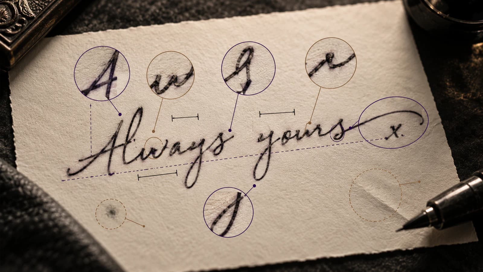
How to Prepare Real Handwriting for a Tattoo Stencil
Prepare a signature, note, or real handwriting for a tattoo stencil while preserving letter shapes, joins, spacing, baseline, and writer-specific irregularities.
handwriting tattoo stencil · signature tattoo stencil
Read guide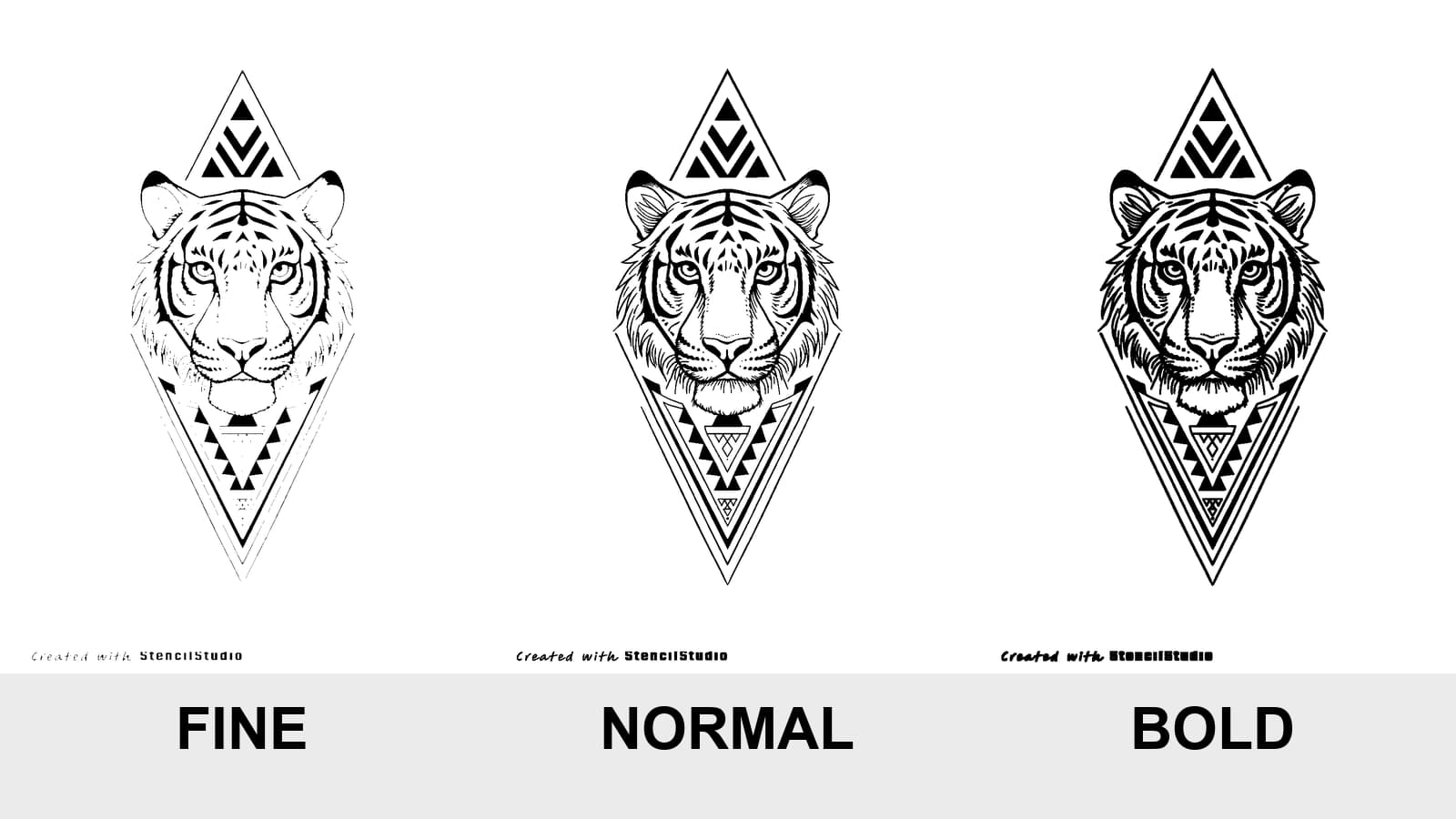
Tattoo Stencil Line Weight: Fine vs Normal vs Bold
Compare Fine, Normal, and Bold on the same tattoo stencil, see where lines disappear or merge, and test the result at the size you will actually print.
tattoo stencil line weight · fine normal bold stencil
Read guideAuthor
Andrea Mezzadra
Founder and product builder at StencilStudio
Andrea builds StencilStudio and tests how the tools fit into real stencil prep, using real references and outputs to document what works, what changes, and where artist judgment still matters.
In the App
Compare your wording at its real target width.
Set the exact text at one physical width, compare lettering directions side by side, then export a true-size stencil when the geometry reads.