

Mountain Tattoo Stencils: Variant Vetting and Transfer-Ready Prep
Vet any mountain reference for stencil work by deciding the variant first, checking readability at the exact final size, and locking band or vertical layout before trans…

- 6
- Practical
- Artist-first
Vet any mountain reference for stencil work by deciding the variant first, checking readability at the exact final size, and locking band or vertical layout before transfer. This collection compares six structural studies drawn from reviewed stencil work: a vertical ridge-recession study, a single-peak leader study, a snow-cap separation study, a layered-range overlap study, a forested-ridge restraint study, and a band-wrap rhythm study. The depicted flowers and wave lines are honestly labeled lotus, rose, branch, peony, and abstract-wave analogues, not mountain photography; each one isolates a construction lesson that mountain references most often fail.
Choose the Mountain Variant Before Drawing Anything
A mountain is a family name, not one design. Commit to one of four stencil architectures before touching line weight, because each one fails differently at final size.
- Single peak: one dominant summit with supporting slopes ranked clearly below it. Best when the placement is narrow (inner forearm, calf, ribs) or the brief needs a compact emblem. Stencil viability comes from one unbroken summit contour that survives alone; if covering the base detail still leaves a readable peak, the variant holds. The single-peak leader study above is the baseline: one focal mass, one direction, everything else subordinate.
- Layered range: two to four ridges receding in depth, each one a separate station with open gaps between tiers. Best for broad fields such as the outer thigh, upper back, or shoulder cap where recession can breathe. Stencil viability comes from countable tiers at the planned width; if two ridges merge into one band at true size, remove one tier or open one gap before changing any line mass.
- Snow-cap: a light summit mass held open against darker rock faces. The cap is negative space discipline, not shading: one clear cap edge with visible skin between cap and slope detail. Best at medium sizes and above where the cap edge and the first rock separation stay open. Below that, merge the cap into a clean single-peak silhouette instead of keeping a fretted edge that will fill.
- Forested ridge: ridge contours plus tree-mass texture where the trees must stay clearly subordinate. Best when the reference has honest tree masses (bands or clusters with open sky between them), not photographic treeline noise. If covering the tree marks leaves no readable slope, the reference is a forest piece wearing a mountain name; either simplify the trees to a few deliberate marks or reselect the variant.
Count check before committing: trace the reference at the intended width and count distinct ridge tiers (one for a single peak, two or more for a range), confirm one open cap edge or one clean summit if snow is claimed, and confirm ridge contours still read with tree marks covered. If the count fails on paper, reselect the variant before drawing.
Run the Final-Size Readability Check
Judge the finished stencil at the exact physical width with scaling off, because screens forgive crowding that paper and skin do not. Work through these checks in order and fix the first failure before moving on.
- Ridge overlap order: near ridges must overlap and sit lower while far ridges sit higher and read smaller. Use the layered-range study as the model: tiers behave as ordered stations along one recession, never as equal-weight bands. If every ridge carries equal mass, the range collapses into stripes; demote one tier or open one inter-ridge gap first.
- Snow-cap skin breaks: protect one continuous cap edge, one open channel between cap and the first rock line, and open sky above the summit. The snow-cap study sets the standard: the outer ring logic that keeps a bloom separable is the same logic that keeps a cap from welding to the slope. Use the line-weight guide when the question is which close lines merge first.
- Line-weight floor and detail restraint: establish one primary contour weight for summits and ridge crests, one lighter weight for secondary slopes, and drop tertiary texture (scree ticks, tree stipple, snow fretting) first when anything closes. As an example at a common 3 to 4 inch width, tertiary marks are typically the first casualty, so delete or consolidate them before thinning a crest that carries the silhouette. There is no universal minimum size; inspect the file at a real physical size with the size calculator and simplify the tightest cluster first.
- Forested-slope triage: cover the tree marks with your hand. If the ridge still reads as a mountain, the hierarchy is sound; if it does not, the trees are carrying identity they should not carry. Thin tree counts to a few deliberate masses with open gaps (never thinner lines doing the same crowded job) before touching any ridge contour.
Set Band vs Vertical Layout and Handle Wrap Before Transfer
Mountains are landscape subjects, so placement decides the stencil structure as much as the ridgeline does. Lock these three decisions while edits are still cheap.
- Band layout: a horizontal ridge run that travels around a limb (forearm bands, armbands, wrist wraps). Use the band-wrap study as the baseline: even rhythm with protected negative-space channels between ridges. Bands need consistent ridge spacing across the full circumference, a planned seam or focal peak where the wrap meets, and gaps that stay open at the taper (the narrow end closes first). Keep ridge counts low; a band that needs five tiers at 2 inches tall will read as texture, not landscape.
- Vertical layout: a peak-led composition that runs with the limb (outer forearm, calf, thigh, ribs) or stacks on a broad field (back, chest). Use the vertical ridge-recession study for recession logic and the single-peak study for leader logic: one dominant summit, tiers receding behind it, no competing second summit unless the width supports two focal masses. Align the primary ridge axis with the limb axis on forearms and calves; reserve full multi-tier ranges for broad fields.
- Wrap and taper handling: preview on a body photo with Fit to Body before locking width, since a ridge that fights the limb will distort at transfer no matter how clean the linework is. For bands, test the seam placement and confirm the focal peak lands where the eye should land. For vertical pieces, confirm the summit does not slide off the muscle crown when the limb rotates.
Pre-transfer checklist: variant locked and counted at true width, ridge overlap order verified with far tiers subordinate, snow-cap edge and channels open, tertiary detail triaged, band seam or vertical axis placed on a body preview, and a true-size print measured with a ruler. Only then export the transfer.
Compare Mountain Examples Before Preparing Your Own Reference
These are curated structural studies for mountain stencil vetting, not a separate mountain generator and not mountain photography. Browse the broader floral tattoo stencil collection for vertical flow and tier logic, the symbol stencil collection for band rhythm and negative-space discipline, or compare every curated direction from the subject index when the job might belong to a different subject. See the full stencil gallery only when you need cross-family comparison; this page stays on mountain variant, ridge, cap, and layout decisions. If you are starting from your own photo, drawing, or reference, use the photo-to-stencil workflow first, then generate one stencil online when the source is ready. Keep generic simplification and transfer mechanics in their prep owners; this page owns only the mountain variant decision, the final-size mountain checks, and the mountain placement flow.
FAQ
Which mountain variant should I commit to for a clean stencil?
Commit by architecture, not by photo appeal. Choose a single peak when the placement is narrow or the brief needs one compact summit with a countable contour; choose a layered range when you have a broad field and can keep two or more ridge tiers separable with open gaps; choose a snow-cap treatment only when the cap edge and the first rock separation stay open at your width; choose a forested ridge only when tree masses stay subordinate to ridge contours with the hand-cover test passed. Run the tier and cap count at the intended width before drawing.
Will my mountain design stay readable at the intended size?
It will when four checks pass at the exact physical width: near and far ridges overlap with separable tiers instead of equal-weight stripes, the snow-cap edge holds one open channel against the slope, tertiary texture is triaged before any crest is thinned, and every inter-ridge gap stays open. Reduce the finished file to true size, find the first cluster that closes, and simplify that cluster first. There is no universal minimum size; the output-size test is the decision.
Band or vertical: which layout fits my placement?
Choose a band when the design must travel horizontally around a limb and you can keep ridge rhythm even across the full circumference with a planned seam and open taper channels. Choose a vertical layout when one summit should lead with the limb axis or when a broad field supports stacked recession. Confirm the choice on a body preview before transfer, because wrap distortion and taper closing are placement failures no linework can fix afterward.
How do I keep snow-caps and trees from ruining the transfer?
Treat both as subordinate systems. For snow, protect one continuous cap edge and one open channel to the slope, and merge fretted edges into a clean silhouette when small. For trees, keep a few deliberate masses with open gaps and verify the ridge still reads with trees covered. In both cases simplify the subordinate marks first and never weaken a summit or crest contour to save texture.
Can I turn my own mountain reference into a stencil here?
This page is a vetting and comparison guide, not a separate mountain generator. Use the photo-to-stencil workflow or the online generator for your own reference, then use the variant framework, the final-size checklist, and the band-versus-vertical flow above to judge ridge overlap, snow-cap breaks, detail restraint, and wrap handling before print.
Why are flower and wave examples on a Mountain page?
They are labeled structural studies, not mountain depictions. No mountain photography sits in the reviewed stencil inventory yet, so each example isolates one construction lesson mountains need: vertical recession, single-leader dominance, cap separation, overlap order, tier restraint, and band rhythm. Captions and commentary disclose the depicted subject on each piece. When the actual job is floral or symbolic rather than landscape, the floral and symbol collections remain the right owners.
Examples
Mountain stencil examples
Compare the linework, spacing and detail choices that make each stencil read differently.
A lotus-and-flow composition used here as a vertical ridge-recession study: the broad petal rhythm shows how stacked mountain tiers should read as one receding movement before inner ridge detail matters, the same check a layered range needs.
Explore more floral tattoo stencil group stencils
- The larger petal movement stays readable before smaller decorative turns take over, which is exactly the hierarchy a mountain range needs: far ridge first, near ridge second, surface detail last.
- Artists vetting a layered range who need to see how far tiers stay separable before ridge texture enters.
- This depicts a lotus, not mountains; use it for recession and movement logic only. Tight internal turns crowd first when reduced, so protect the outer tier rhythm before keeping inner ridge edges.
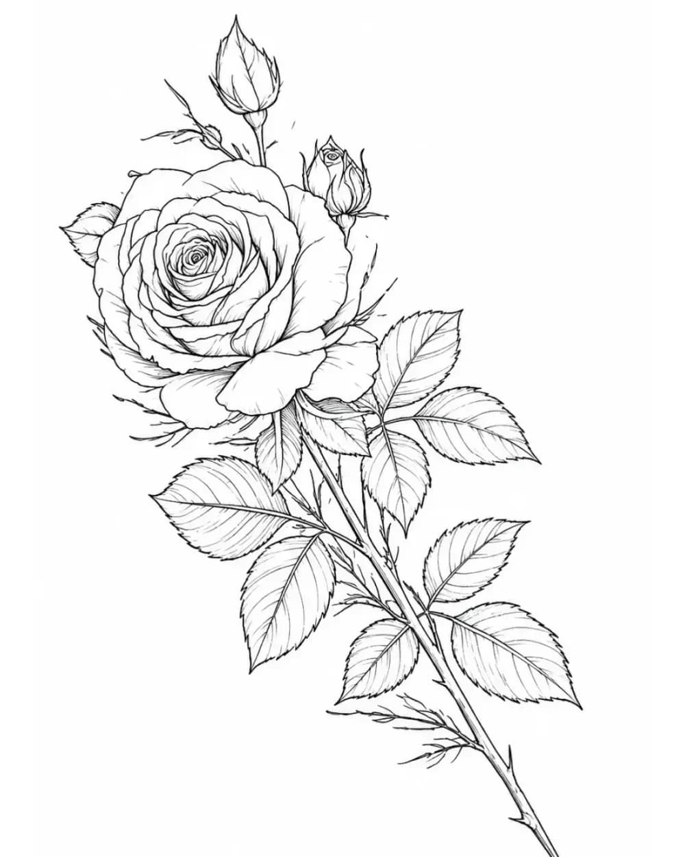
A single long-stem bloom used here as a single-peak study: bloom, stem, and leaves form one vertical structure, the same single-leader logic a lone peak needs before slope texture or base detail matters.
Explore more floral tattoo stencil group stencils
- The flower head leads while the stem creates one directional line, which models how a single peak should dominate with supporting slopes ranked clearly below it.
- Artists planning a single-peak mountain for forearms, calves, or ribs where one summit must carry the whole read.
- This depicts a rose, not a mountain; use it for leader-line and vertical-flow logic only. Inner petal folds crowd first when undersized, so protect the outer peak map before fine slope marks.
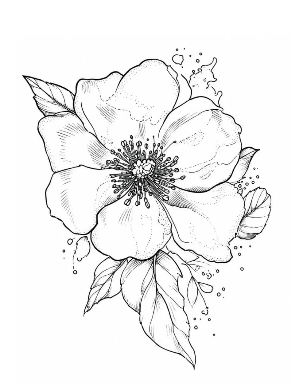
A compact single bloom used here as a snow-cap study: one clear outer ring carries the read without directional support, the same separation test a snow-cap must pass against dark rock faces.
Explore more floral tattoo stencil group stencils
- The bloom holds legibility through a clear outer ring with visible separations, which is the standard to apply when judging whether a snow-cap stays open instead of merging into the slope.
- Artists checking whether a snow-cap keeps an open light mass at a compact size for shoulders, calves, or ankles.
- This depicts a wild rose, not snow; use it for outer-ring separation logic only. Stippled shading and tight inner folds close first, so protect the cap edge before interior rock texture.
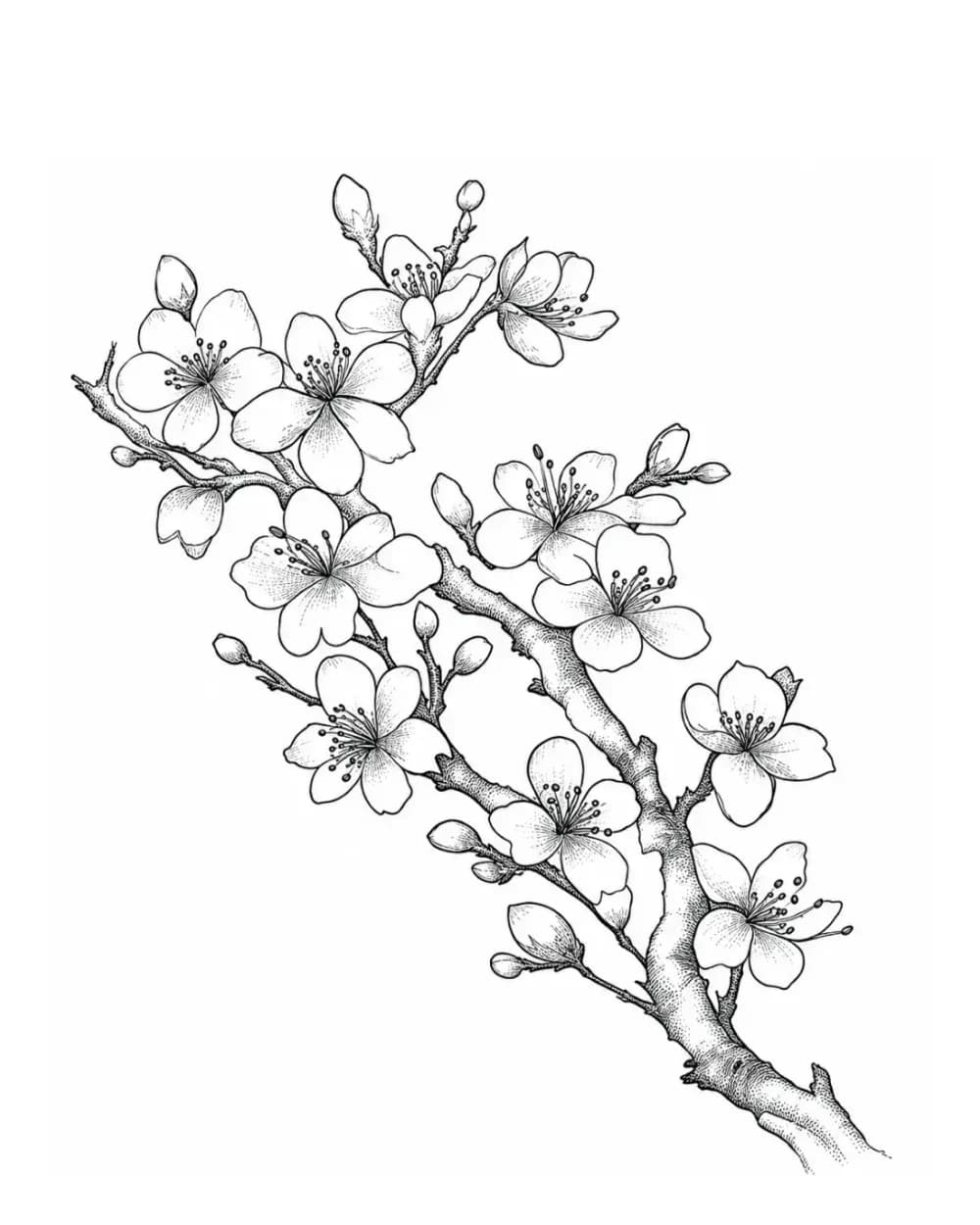
A diagonal branch used here as a layered-range study: buds and open blooms sit as stations along one woody line with open gaps between them, the same ordering overlapping ridges need before transfer.
Explore more floral tattoo stencil group stencils
- The diagonal branch gives the composition one built-in direction, so tiers read as ordered stations in depth instead of competing marks at equal weight.
- Artists composing a multi-ridge range for shoulders, ribs, or thighs where ridge runs most often cause crowding.
- This depicts a cherry branch, not ridges; use it for overlap-order and gap logic only. Bud clusters and overlapping edges crowd first, so protect open gaps between ridges before keeping every tier.
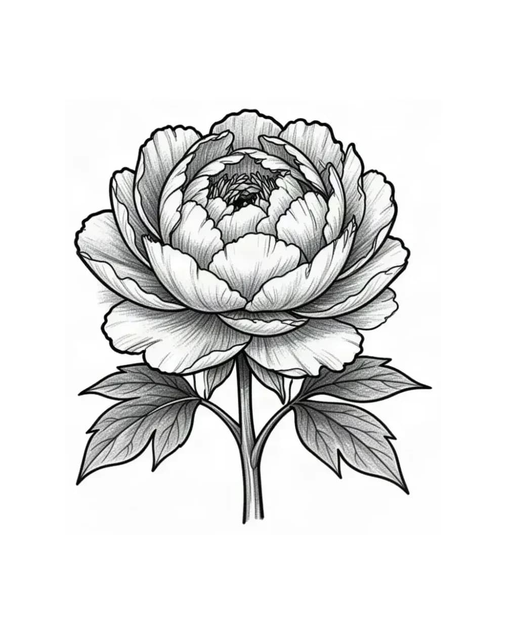
A fine-line layered bloom used here as a forested-ridge study: stacked tiers show where tree-mass detail must stay subordinate to ridge contours, the core restraint check in any forested slope.
Explore more floral tattoo stencil group stencils
- The layered tiers keep a first read through the largest outer shapes before secondary detail competes, which models how ridge contours must outrank tree marks.
- Artists vetting a forested ridge where tree texture threatens to erase the slope read at final size.
- This depicts a peony, not forest; use it for tier-restraint logic only. The tightest tier cluster closes first, so reduce tree-mark counts before thinning the outer ridge contours.
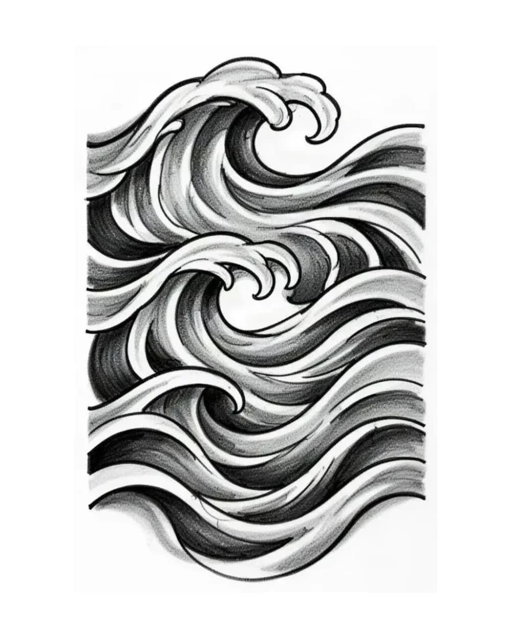
Flowing horizontal wave lines used here as a band-wrap study: even line rhythm with negative-space gaps shows how a mountain band must keep ridge separations open across taper and wrap, the same check a forearm band needs.
Explore more tattoo symbol stencils stencils
- The flowing lines keep a first read through rhythm and open gaps before secondary detail competes, which is the standard a wrap band must meet at true circumference.
- Artists planning a mountain band or armband who need to see how horizontal ridge rhythm survives wrap and taper.
- This depicts abstract waves, not ridgelines; use it for band rhythm and gap logic only. The tightest line cluster closes first around the taper, so protect open channels before keeping every ridge tick.
FAQ
Quick questions about mountain stencils.
Commit by architecture, not by photo appeal. Choose a single peak when the placement is narrow or the brief needs one compact summit with a countable contour; choose a layered range when you have a broad field and can keep two or more ridge tiers separable with open gaps; choose a snow-cap treatment only when the cap edge and the first rock separation stay open at your width; choose a forested ridge only when tree masses stay subordinate to ridge contours with the hand-cover test passed. Run the tier and cap count at the intended width before drawing.
Next step
Turn your own reference into a clean stencil draft.
Use what reads clearly here as direction, then start from your own reference.