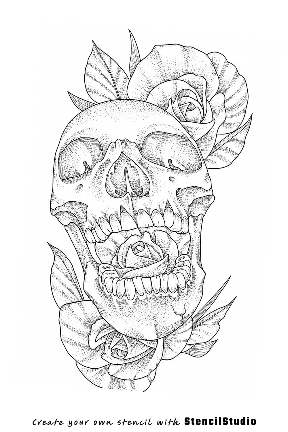
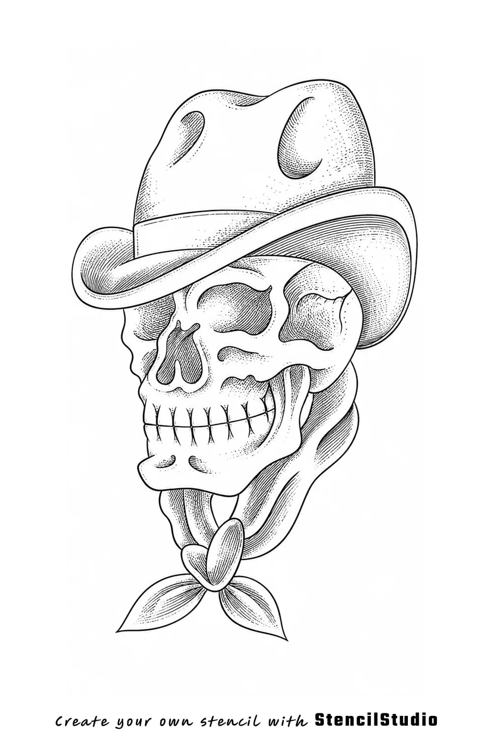
Stencil Gallery

Skull Tattoo Stencil Group

Skull imagery stays useful at the stencil stage when the outer read lands before cracks, hair, teeth, or surrounding faces start fighting for attention. This group is still compact, but it now covers three genuinely different skull directions: a bold graphic emblem, a deer-skull structure study, and a human-skull portrait composition. That makes the page more practical than a one-note skull dump because you can compare where drama comes from silhouette and where it comes from supporting anatomy or surrounding figures.

3 examplesUpdated April 24, 2026Collection

Examples

Browse the collection

Use the gallery first, then read the notes where the subject needs extra context

Skull tattoo stencil example featuring a central human skull framed by two women
Human-skull composition that stays skull-first even with two surrounding portrait faces.

What works: The skull remains dominant because the eye sockets, teeth, and cranial shape still land before the hair and side faces do.

Best for: Larger surreal skull concepts that need one clear center subject instead of three equal faces.

Watchouts: Hair lines and cheek contours should stay secondary or the skull starts to lose control of the composition.

Skull tattoo stencil example featuring a deer skull figure
Deer-skull example focused on structure, silhouette, and spacing around the antler form.

What works: The antler and skull relationship stays readable because the silhouette breaks remain clear instead of collapsing into one dark mass.

Best for: Medium placements where shape hierarchy matters as much as the darker illustrative mood.

Watchouts: Antler detail can become crowded if too many small turns are preserved at a reduced size.

Skull tattoo stencil example featuring a bold graphic skull emblem
Graphic skull example built around a darker outer read and a simpler silhouette-first structure.

What works: The dominant skull shape lands fast because the heavier outer read stays ahead of the interior accents.

Best for: Artists who want a bolder skull read before later shading or texture decisions.

Watchouts: Small inner fragments can pile up if the design is reduced too far for a tighter placement.

Reading notes

What to pay attention to in this category

These notes stay secondary to the gallery, but they help explain where the subject reads well and where it starts to collapse

Dominance

Why the skull itself has to win before mood does

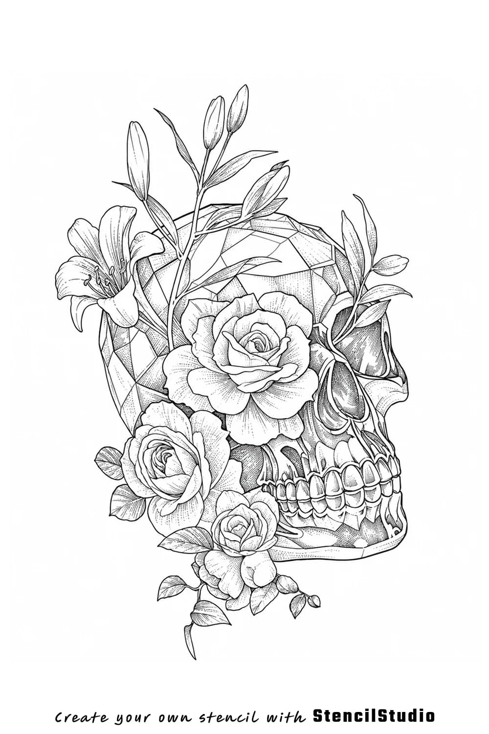
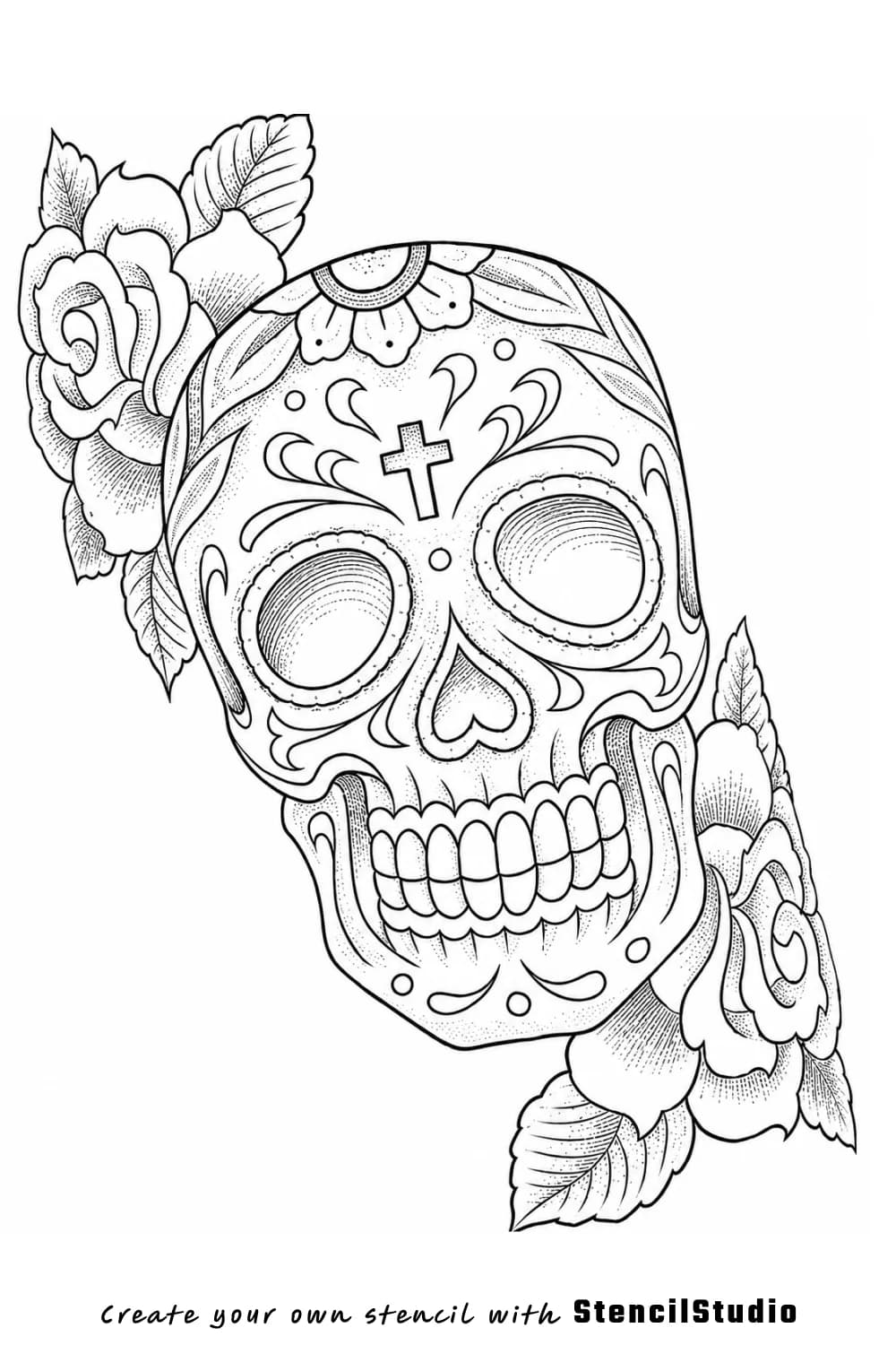
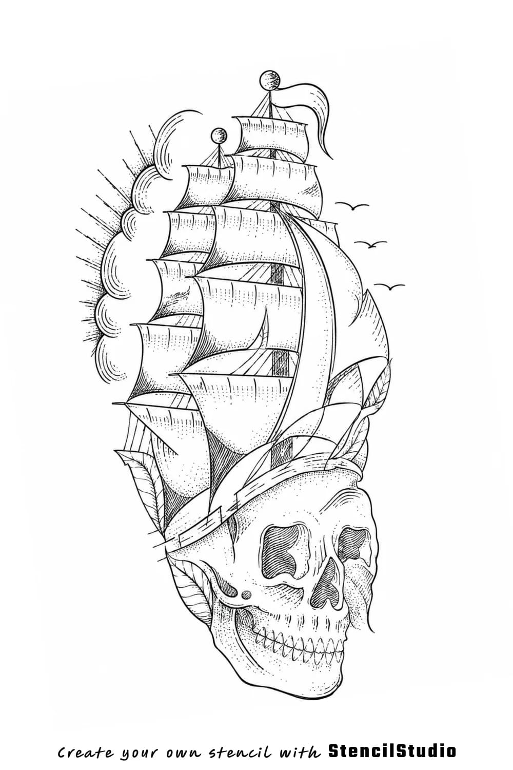
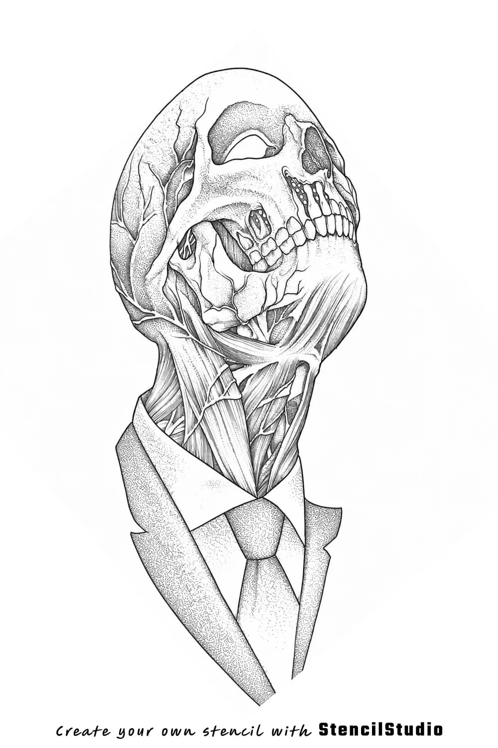
Skull designs weaken quickly when every crack, strand, or supporting face is given the same weight as the cranium itself. The better examples here all make the skull shape land first. That is what keeps the imagery useful as stencil reference material instead of letting the design rely entirely on atmosphere and texture.

Secondary Forms

How antlers, hair, and surrounding faces should support the read

Supporting forms can add a lot to skull-based work, but only when they reinforce the main subject instead of competing with it. The deer-skull and portrait-led human skull examples are useful because they show two different ways secondary forms can work: one through structure, one through emotion. In both cases, the skull stays in charge of the composition.

Scale Notes

Choosing size by the tightest skull detail cluster

Skull imagery often looks forgiving on screen, but it is not. Teeth spacing, antler turns, hair strands, and shadow cavities all need room to stay distinct. This small set is still practical because it shows three different density profiles, which helps you judge how large a skull-driven stencil really needs to be before the internal structure stops feeling intentional.

FAQ

Quick questions about this stencil collection

It helps you compare stencil readability, silhouette control, and detail density across 3 examples before you start drawing from your own references.

It is most useful for tattoo artists who want visual references for how this subject category holds up as stencil-first linework before transfer, placement, or final drawing decisions.

Once you know what reads clearly, move into the app workflow, open the samples page, or check pricing if you are ready for that part

Scan for silhouette strength before you care about tiny decorative details

Compare what still reads clearly when the subject is reduced into stencil-first linework

Use the commentary to spot where density helps and where it starts to collapse

When a direction feels right, jump into the app, the samples page, or pricing

Use this workflow in the app

Turn darker skull ideas into cleaner stencil drafts

Use the skull references here to decide what should stay bold and what should stay secondary, then generate your own cleaner draft in StencilStudio.